Weight Percentile Calculator
Estimate where a weight ranks for children ages 2 to 20 using CDC weight-for-age curves by sex, or for adults using a population weight model, with a z-score, percentile, category band, and median comparison. Informational estimate, not medical advice.
🎯Real Percentile Presets
📝Weight Inputs
Child mode uses CDC curves from 2 to 20 years.
Leave 0 to skip BMI. Adds a body mass index note.
Applies only to adult mode standard deviation.
🔢Method Snapshot
📊CDF Reference and Comparison
| Percentile | Z-score | Meaning | Your Weight | Group Median | Gap vs Median |
|---|---|---|---|---|---|
| Enter values above to build the percentile comparison grid. | |||||
🧒CDC Weight-for-Age Median (Children)
| Age | Boys Median (kg) | Boys Median (lb) | Girls Median (kg) | Girls Median (lb) | Approx SD (kg) |
|---|---|---|---|---|---|
| 2 years | 12.5 | 27.6 | 11.9 | 26.2 | 1.3 |
| 3 years | 14.3 | 31.5 | 13.9 | 30.6 | 1.6 |
| 4 years | 16.3 | 35.9 | 15.9 | 35.1 | 2.0 |
| 5 years | 18.5 | 40.8 | 17.9 | 39.5 | 2.5 |
| 6 years | 20.7 | 45.6 | 20.2 | 44.5 | 3.1 |
| 8 years | 25.5 | 56.2 | 25.3 | 55.8 | 4.6 |
| 10 years | 32.0 | 70.5 | 32.5 | 71.7 | 6.5 |
| 12 years | 40.0 | 88.2 | 41.5 | 91.5 | 8.6 |
| 15 years | 56.0 | 123.5 | 52.5 | 115.7 | 10.5 |
| 18 years | 66.5 | 146.6 | 57.0 | 125.7 | 11.5 |
👥Adult Weight Distribution by Sex
| Group | Mean (kg) | Mean (lb) | US SD (kg) | Lean SD (kg) | 10th to 90th (lb) |
|---|---|---|---|---|---|
| Adult men | 90.0 | 198.4 | 19.0 | 13.0 | 145 to 252 |
| Adult women | 77.0 | 169.8 | 19.0 | 13.0 | 116 to 224 |
| Men lean model | 90.0 | 198.4 | 13.0 | 13.0 | 162 to 235 |
| Women lean model | 77.0 | 169.8 | 13.0 | 13.0 | 133 to 207 |
🗂Percentile Band Interpretation
| Band | Percentile Range | Z-score Range | Common Description |
|---|---|---|---|
| Very low | Below 3rd | Below –1.88 | Well under the group median |
| Low | 3rd to 15th | –1.88 to –1.04 | Lighter than most of the group |
| Low-mid | 15th to 40th | –1.04 to –0.25 | Slightly below median |
| Middle | 40th to 60th | –0.25 to 0.25 | Near the group median |
| Mid-high | 60th to 85th | 0.25 to 1.04 | Slightly above median |
| High | 85th to 97th | 1.04 to 1.88 | Heavier than most of the group |
| Very high | Above 97th | Above 1.88 | Well over the group median |
⚙Full Formula Breakdown
📋Reference Values
| Item | Typical Entry | How It Is Used | Effect on Result |
|---|---|---|---|
| Reference group | Child or adult | Chooses CDC curve or sex mean | Sets which median and SD apply |
| Sex | Male or female | Selects the correct curve | Shifts median and percentile |
| Age | 2 to 20 years | Interpolates CDC median | Child median grows with age |
| Weight | 27 to 250 lb | Compared to median | Drives the z-score directly |
| Height | Optional | Computes BMI context | Adds a note, not the percentile |
💡Practical Percentile Tips
If you’ve ever been to a pediatrician’s office, you’ve likely glanced at a growth chart hanging on the wall. Those spaghetti-like tangles appears to be nonsense… Until you happen to be a statistician.
In truth, they’re not as complex as they appear, yet more so: most people just want to know whether their kid is doing well, and don’t care about being bogged down by clinical terminology. A weight percentile calculator eliminates all that clutter, converting a childs raw weight (in either kilograms or pounds) into how that person stacks up within a specific reference group. You’ll get a relative ranking that indicates precisely where your little one stands among their peers, versus some vague number that lacks meaning outside of context.
What Do Weight Percentiles Mean?
What does “percentile” mean? To understand that, you need to know what it’s measuring against. In the case of kids between the ages of 2 and 20, this specific calculator use CDC weight-for-age curves. These are charts depicting where all those million+ American children weighs relative to each other. After you pick your age and sex, the calculator do the math for you (rather than having to fill in the gaps between data points yourself or flip through huge reference tables).
And here’s the important bit: Boys’ and girls’ growth trajectories diverges at puberty, and also generally throughout childhood. Hence the importance of picking the right sex. A boy whose weight is at the 50th percentile might be compared to a girl of the same age who is slightly higher or lower on the scale, depending on where she is in her own development.
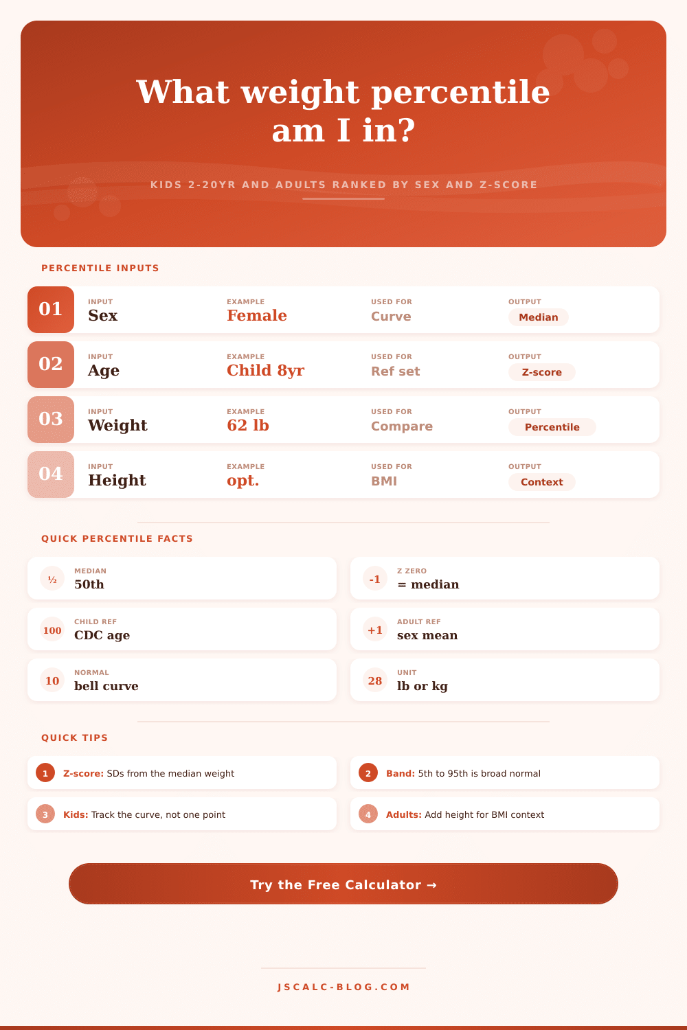
So what do you get out of it? Three things, primarily: A percentile rank is just a way of saying how many people in the reference group weigh less then the person you’re measuring. So if your kid is at the 50th percentile, then they weigh more than half of the kids her age and less than the other half. The z-score takes those numbers and tells you how far away from the median the weight fall in terms of standard deviations. A score of zero equals right at average; the higher (or lower) the number, the farther away you are. Then there’s the category band, which translates all these numbers into human language: Is she middle or high? That keeps you from panicking about small fluctuations that are totally normal.
Adults use a different model altogether. When we’re no longer growing, when our growth plates is closed and our bodies are developed, we transition from an age-based curve to one based off a population’s distribution by gender. At this point we start using separate male/female data for the average weight and standard deviation of weights in each population. You can also choose a broader starting point, which looks more like the average American, or a tighter one, which is a bit leaner than average. We’re still doing the same math, but the scenario change from monitoring growth to measuring body composition compared to other people in the same peer group.
BMI requires height, so it is optional at this stage. However, including height provides more context about whether a high percentage for your height is fat or muscle.
The biggest mistake people make is seeing one data point as a verdict. Just like one day of rain doesn’t equal the climate, one measurement doesn’t equal health.” Doctors examine trends over time. Even if your child isn’t at the median, as long as he’s consistently staying in the same range (e.g., the thirtieth percentile), that may be his own healthy curve. You’re not trying to chase a particular number on the chart. That’s why it’s about consistency. When parents panic because they saw a drop of ten points between visits, that could of been caused by seasonal variation or measurement error, and not necessarily mean anything about how healthy the child is.
The percentile is not everything either; context matters. Body shape and size have a ton to do with genetics. So if you have two big-boned parents, then it would stand to reason that your kid would show up further along on the scale, even if they’re active and eat well. But maybe you’ve got a small boned child who sits at bottom. There’s nothing wrong with them! The stat only tells you where they fall on the scale statistically; it doesn’t know anything about their family history or their lifestyle factors that may explain how they fit into that spot. Use it as a launching off point for discussion, not as a stopping place to judge from.
Once you realize what these numbers mean, it’s easier to track your own (or your kids’) without feeling stressed out about it. It’s simply a snapshot of how they compare with everyone else at a given moment in time. With the online tools available, it’s quick and accurate to get this snapshot. Once you realize that being on your own curve is almost always way more important than achieving some magic number, you don’t need a stats degree to translate the results. Think of it like a trend line, not a single point. And look at the overall picture of health for guidance, rather than focus on every small change in the rankings.