Top Score Curve Calculator
Scale any raw score by the class top score, set the target top percentage, apply a cap, convert the result to a letter grade, and preview weighted category impact.
Enter scores to calculate the top-score curve.
| Raw score | Raw percent | Curved percent | Lift | Letter |
|---|
| Class top percent | Target top | Multiplier | Raw 70 becomes | Curve feel |
|---|---|---|---|---|
| 98% | 100% | 1.0204 | 71.43% | Very small lift |
| 95% | 100% | 1.0526 | 73.68% | Gentle lift |
| 92% | 100% | 1.0870 | 76.09% | Moderate lift |
| 88% | 100% | 1.1364 | 79.55% | Strong lift |
| 84% | 100% | 1.1905 | 83.33% | Large lift |
| 80% | 100% | 1.2500 | 87.50% | Very generous |
| 92% | 98% | 1.0652 | 74.57% | Target below 100 |
| 92% | 105% | 1.1413 | 79.89% | Allows extra credit |
| Grade scale | A range | B range | C range | Pass mark |
|---|---|---|---|---|
| Standard 90/80/70/60 | 90% and up | 80-89.99% | 70-79.99% | 60% |
| Plus-minus scale | 90% and up | 80-89.99% | 70-79.99% | 60% |
| Strict 93/85/77/70 | 93% and up | 85-92.99% | 77-84.99% | 70% |
| College GPA letters | 93% and up | 83-92.99% | 73-82.99% | 60% |
| Pass/fail at 70% | Pass | Pass | Pass | 70% |
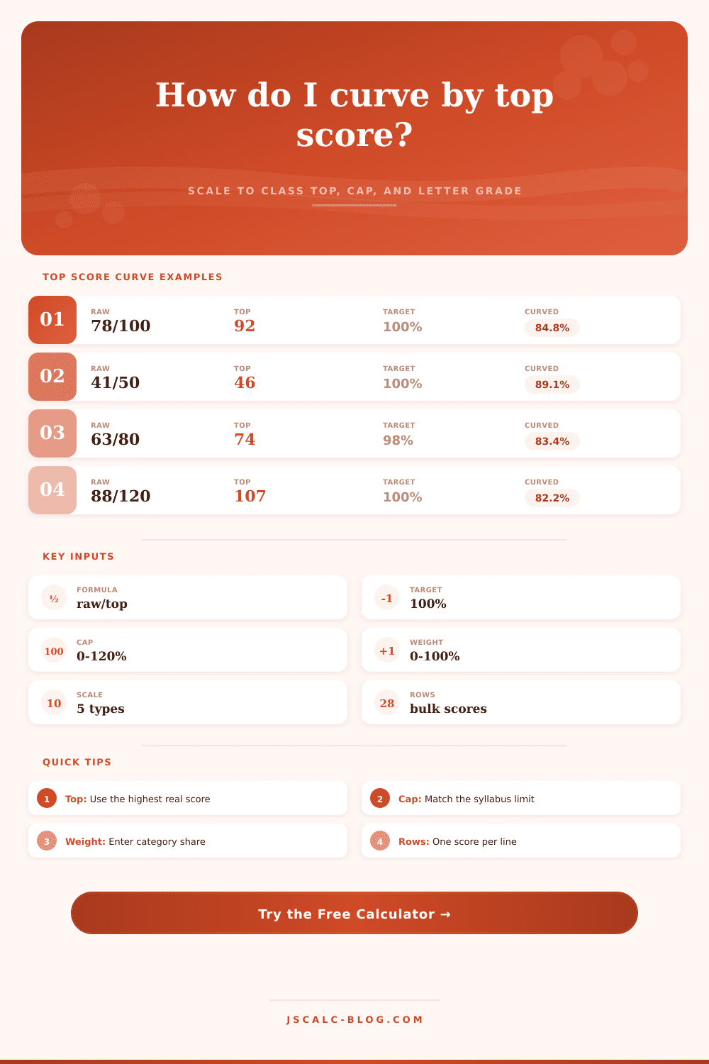
If you find that a test is more difficult than expected, you can adjusts for this with the top score curve method. It’s similar to the one described above in that it adjusts the baseline to reflect reality instead of making perfection its own standard. Simply input your scores into calculator, and let it do the rest for you. No need to convert percentages or guess at multipliers here.
How does it work? It’s quite easy: you simply set the top score in the room as one-hundred percent. In our example, if the best student got a score of ninety-two, then the curve will have an anchor at ninety-two. Every other score will scale based off that value by some amount, creating a proportional or linear adjustment that keeps distances between scores constant, yet pulls up the entire distribution. The kid who gets a worse score doesn’t suddenly get smarter, they just get a better representation of how well they did compared to the kid who got best score. That eliminates frustration over missing a question, even for the best student.
How to Use the Top Score Curve Method
The tool has another interesting feature: deciding how much lift you want to give the grades. The target top setting allow you to determine that. Some teachers top-curve with 100%, meaning that while the best-performing student receives an A, there is no bonus for them. Others might choose to have a higher number because they aim to hit a certain GPA distribution, or simply want to reward extraordinery work. By toggling the target, you can watch as changing your desired top grade shifts percentage grades by however-many points. This turns a policy decision with many possible outcomes into something you can see through numbers.
Then there’s the cap. While it may mathematically seem right that a student deserves one-hundred-and-ten percent, most syllabi prohibit grades higher than one-hundred percent. When this happens, the calculator slams on its brakes and implements a hard ceiling so resulting number doesn’t appear in final grade book. (This is a very important safeguard, since an uncapped curve might skew the average and falsely inflate the appearance of the class.) Setting the cap ensures the integrity of your grading scale remain intact but affords the required lift.
As you can see from the reference table, various top scores yields different multipliers. A small drop in the top score, say from ninety-eight to ninety-two. Only slightly adjusts other grades. However, a major drop, such as down to an eighty-four, causes the multiplier to spike up, benefitting everybody greatly. In this way, you’re balancing two competing priorities: adjusting for a tough exam versus being fair to high-achieving students.
One other thing to think about: How much does it weigh? Perhaps the exam accounts for just twenty-five percent of your final grade in a class; that means even if you do get a little curve, it won’t have as great an effect on your overall semester grade. The calculator will display this factor as well, and indicate precisely how many course points is added to your grand total from the curved exam. It’ll help keep things in perspective instead of fixating solely on individual scores.
Curving everything is another common error that dilutes your grading scale over time. Major exams should of been curved when they are more difficult than expected, but do this rarely so that students feel their grades reflect what they earned rather than just a curve. Grading should reflect how much student learned. If the top grade is low, then the curve fills in difference between reality and expectations. If the top grade is high, then the curve makes a slight adjustment. You’re not lowering the bar, you’re adjusting the lens.