Range Calculator
Enter a numeric dataset to calculate the range as max minus min, the midrange as the average of the extremes, relative range as range divided by mean, and IQR-based outlier effects.
Load a realistic dataset, then adjust labels, outlier rules, decimals, and display settings.
Enter at least two values to calculate range.
| Rank | Value | Role | Distance from min | Distance from max | IQR flag |
|---|---|---|---|---|---|
| Calculate to populate value rows. | |||||
| Scenario | Count | Min | Max | Range | Midrange | Relative Range |
|---|---|---|---|---|---|---|
| Calculate to compare raw and adjusted ranges. | ||||||
| Measure | Formula | What it uses | Outlier sensitivity |
|---|---|---|---|
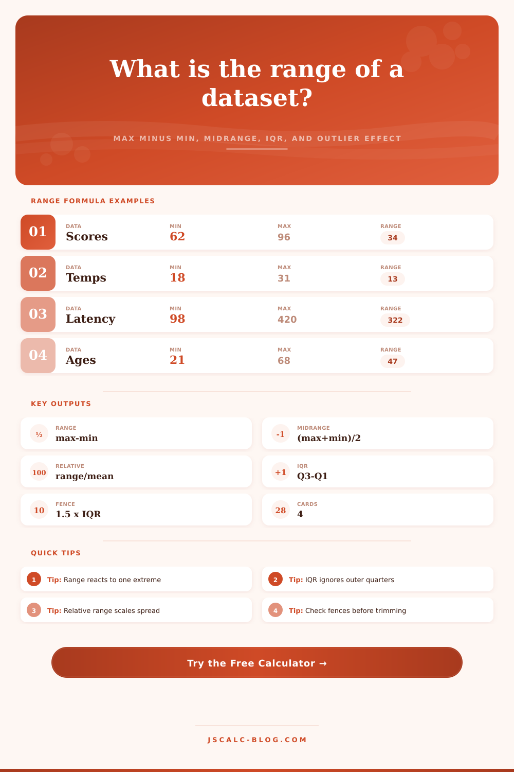
| Range | max - min | Only the two extremes | Very high |
| Midrange | (max + min) / 2 | Only the two extremes | Very high |
| Relative range | range / mean | Range and mean | High |
| IQR | Q3 - Q1 | Middle 50 percent | Lower |
| Outlier fence | Q1 - 1.5 x IQR, Q3 + 1.5 x IQR | Quartiles and IQR | Used to flag extremes |
| Trimmed range | second max - second min | Removes outer one per side | Moderate |
A teacher hands back a test, and you compare grades: an A alongside an F. You’re tempted to conclude that this class is all over the map, but this impulse depend entirely on range.
What’s the range? Quite simply: It’s the difference between your data set’s largest and smallest value. It answers the question, “How far apart do my numbers go?” It is brutally blunt. It reveals all of your wild cards, which makes it both the best and most dangerus piece of math around.
What is Range and Why It Matters
Whether you’re tracking server latency logs, examining a month’s worth of weather temperatures or surveying a test score spreadsheet, chances are you want to know what’s possible from high and low points. That gap is called the range, and it will give you the answer immediately… but it’ll ask you to consider precisely why these crazy outliers exist.
But here’s the thing, despite its simplicity: the calculation only considers two data points. The other 90% of values, those in the safe middle, gets completely ignored.
So say out of a thousand students, nine-hundred-and-ninety-nine of them got a score of precisely seventy five. But then there was one guy who got a zero. And another who got a hundred. Well the range is going to be a hundred. This tells us, according to this one metric alone, that there’s huge variability. In fact, that wasn’t true for everybody else in the room.
So what happens? We use the midrange as a sort of helpful balance against that big number. You take the max value and average it with the min value. Now we’ve located the mid point of our distribution. This is the midpoint, if your distribution are relatively symmetrical. Midrange is a rough guess at the center. Midrange is fast, but its fragile. Anything that skews your extremes, whether an anomaly or just a glitch (will pull the midrange off course). If both extremes changes, the whole thing shifts.
People typically get hung up on the raw difference. The calculator above do that math for you though. And it tells you how much those edge cases affect your data set. It divides the spread by the mean to calculate relative range. This way, it scales the amount of variation based off the average.
Because, let’s face it, a ten point difference is trivial when dealing with scores in the thousands… or even hundreds. But it’s catastrophic when your base case are small. It puts the size of the fluctuation into proper perspective. Distance, yes, but distance relative to the size of the thing you’re measuring. This allow you to compare how much a small startup’s revenues fluctuate against a corporation’s, even though their raw numbers is not directly comparable.
However, if you want to go deeper, stop looking at the tails and start looking at the middle: the body of your data. The interquartile range (IQR) represents the middle 50%, which in effect means it ignore the bottom and top quarters completely. The IQR is the reliable measure that says, this is how consistently my data behave for most of it.
If the IQR is tiny, and the raw range is huge, then you know its your outliers causing the noise. To flag those outliers, the tool has what we call fences, typically one and a half times the IQR away from the quartiles. Think of it as statistical tripwires for when your values are behaving strangely.
Whenever you have a value flagged, don’t just immediately delete it; instead, investigate it. Sometimes an outlier is a story wanting to be told, maybe a server spike because of a DDoS attack, or a student who misunderstood some key concept.
So when should you use the raw range? Use it when you want to ensure that nobody waits more than some number of seconds. That’s its best friend. Because it reveals the worst case.
And when should you use the IQR? Use it when you’re interested in how well something usually performs. In this context, the IQR shows truth behind the process’ consistency (stripping out the noise of occasional defects).
Do both. There’s no reason to choose between the two. The range tells you where your world ends. The IQR tells you what your world looks like within that space.
Ultimately it’s about more than just subtraction. It’s choosing what to put in focus and what to leave out of the picture. Do you want to know how far your system will go when stretched beyond capacity? Or how smoothly it runs on a day-to-day basis? The numbers don’t lie, but they don’t speak the same language. They’re just waiting for you to listen between the extremes, and they’ll tell you their story.
From network traffic monitoring to paper grading, it’s all in the spread. The story’s always there; you just should of listened for it.