Quartile Calculator
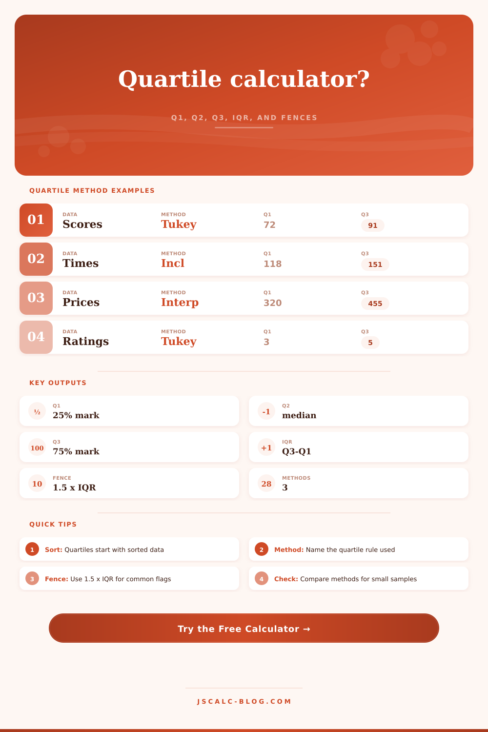
Paste numeric data to sort the values, calculate Q1, Q2, Q3, the interquartile range, and lower or upper outlier fences using Tukey hinges, inclusive halves, or linear interpolation.
Load a realistic dataset, then switch quartile rules to see how Q1 and Q3 move.
Formula: sort values, calculate Q1, Q2, Q3, then IQR = Q3 - Q1.
Tukey Hinges
Splits the sorted sample into lower and upper halves, excluding the median when n is odd. Common for hand-built boxplots.
Inclusive Halves
Includes the median in both halves when n is odd. This often pulls Q1 and Q3 slightly toward the center.
Interpolation
Uses percentile positions on the full sorted list. Many software tools use this style for quantiles.
Fence Check
After Q1 and Q3 are selected, IQR fences flag unusually low or high values with the same formula.
| Rank | Sorted value | Position share | Quartile zone | Fence status | Distance from median |
|---|---|---|---|---|---|
| Enter values to calculate the sorted table. | |||||
| Method | Q1 | Q2 median | Q3 | IQR | Lower fence | Upper fence | Outliers |
|---|---|---|---|---|---|---|---|
| Method comparison appears after calculation. | |||||||
| Measure | Formula or rule | What it marks | Use it for |
|---|---|---|---|
| Q1 | Lower quartile | About 25 percent of values are at or below it | Lower side of a boxplot |
| Q2 | Median | Middle sorted value or average of two middle values | Center of skewed data |
| Q3 | Upper quartile | About 75 percent of values are at or below it | Upper side of a boxplot |
| IQR | Q3 - Q1 | Spread of the middle half | Robust spread summary |
| Lower fence | Q1 - 1.5 x IQR | Low-side outlier review line | Flag unusually low values |
| Upper fence | Q3 + 1.5 x IQR | High-side outlier review line | Flag unusually high values |
Data sorting isn’t merely about ordering values in ascending order; that part’s easy enough. Trouble arises when you sort a list into quarters. How do you find the boundary between top and bottom twenty-five percent? Statisticians has defined this point several ways, making it seem as if there is different flavors of truth. This means: pick an approach first, then do calculations.
The website’s calculator does them. You click one of several rules depending on what you want to calculate, such as Q1, Q3, or something else.
How to Find Quartiles and Outliers
Boxplots can be drawn by conventionally including or excluding the median, such as when Tukey hinges exclude it if count is odd. For example, “Tukey hinges” are a popular option, excluding the median if number of points are odd. Other methods includes the median in each half (“inclusive”). Linear interpolation gives a value exactly between two point, though this matters less with large samples than with small ones.
Why is this difference important? This information change your understanding. It will define what affordable housing is in your community. It will redefine who might be failing exams based off their test results.
The median stay constant across these different quartile methods. It’s a stable point for the middle. But the range, i.e. The spread from the middle depend on how you set the boundary. You’re not simply discovering a number, but rather setting limits of what constitutes the middle half.
That’s where the interquartile range comes in. That’s how close together that middle set of points are. If your IQR is small, your data is tightly packed. If your IQR is large, your data are unstable.
And the IQR lets you draw fences around your data, so you can detect outliers, typically by applying a multiplier (one point five) to the IQR. These rules flags values that are far off normal and ask you to investigate further. Is a low lab reading an error with the sensor? Is a high delivery time an error with shipping? It doesn’t delete the data. It just says look closer.
However, treating outliers as noise to be removed is a mistake. Outliers is often full of useful information. For example, a spike in your customer ratings could indicate that they discovered a popular new feature. Or maybe a dip in rainfall data could signal upcoming drought conditions.
The tool calculates these fences for you, but you must decide if a value is actualy an outlier. More so than the calculation, context matter.
Quartiles can help you visualize data density. You don’t need to worry so much about how you do it as long as you’re consistent. Pick a rule, apply it to both datasets if you’re comparing them, and say what rule you applied on whatever you produce from the analysis. It’s more important that people see what you did than they know exactly what you did if variations are small.
First: start with your sort. That sets up everything else. Next, choose your slicing rule. From there, compute the spread, inspect the fences, and then probably realize that data is not doing what you’d imagined. Perhaps it has longer tails, or a narrower middle. What you’re seeing is the underlying shape of the data, not just an organization of numbers.
You should of checked for errors earlier. It feels more naturaly than other methods.