Five Number Summary Calculator
Paste a numeric dataset to calculate the minimum, Q1, median, Q3, maximum, IQR fences, outliers, and boxplot whiskers on JSCalc-Blog.com.
🎯Presets
🔢Dataset Inputs
📌Quick Summary Grid
📈Boxplot Preview
The box spans Q1 to Q3, the dark line marks the median, whiskers stop at the nearest non-outlier values, and dots mark values outside the selected IQR fences.
📋Sorted Values and Outlier Flags
| Rank | Value | Position Percent | Fence Status | Boxplot Role |
|---|---|---|---|---|
| Run the calculator to see the sorted dataset. | ||||
🧮Quartile Method Comparison Grid
| Method | Q1 | Median | Q3 | IQR | Best Use |
|---|---|---|---|---|---|
| Method comparison appears after calculation. | |||||
📚Reference Table
| Statistic | Formula | Role | Boxplot Meaning |
|---|---|---|---|
| Minimum | Lowest sorted value | First summary number | Left edge of full data range |
| Q1 | 25th percentile | Lower quartile | Left edge of the box |
| Median | 50th percentile | Center of ordered data | Line inside the box |
| Q3 | 75th percentile | Upper quartile | Right edge of the box |
| Maximum | Highest sorted value | Fifth summary number | Right edge of full data range |
| IQR | Q3 - Q1 | Middle 50% spread | Width of the box |
| Lower fence | Q1 - 1.5 × IQR | Low outlier cutoff | Values below may plot as dots |
| Upper fence | Q3 + 1.5 × IQR | High outlier cutoff | Values above may plot as dots |
📐Formula Breakdown
💡Calculation Tips
There’s a spreadsheet with fifty test scores. There’s dread. Then there’s the mean, at the top of the page. But the mean masks what happened. Who aced the test? Who didn’t? Who failed? What happened to that one kid? That’s when the five number summary comes into play.
And this little guy help break up information into five separate pieces. It is a nice little map of data.
What is the Five Number Summary
The calculator above does all the work. You input your numbers, and it figures out everything else for you. No need to guess at conversions or coefficients.
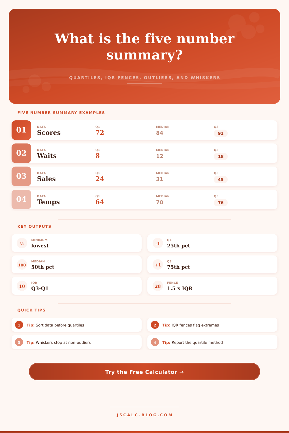
So what do we have? The values is minimum, first quartile, median, third quartile, and maximum. This include all of the data. The first and last numbers represent range of test scores from high to low. Middle three numbers tell us more about the data. Median divide the data into two equal parts. Third and first quartiles marks out the middle half of the data. Here’s where majority of the data lies.
The calculation of quartiles can be done many ways. Each software do it differently. Some count the median as part of one half; some don’t count it at all. The tool has options for Tukey hinges, exclusive percentile, and inclusive percentile. Pick whichever option most closely aligns with what your company uses or what your textbook teaches. If you’re doing a comparison, then consistency is more important then perfection. Picking the wrong method won’t ruin your analysis; it just means your numbers won’t match anyone else’s, which wastes time.
Next use the quartiles to calculate the interquartile range: the difference between third quartile and the first. This number represent how much middle half of the data stretches across the chart. It doesn’t care about extreme scores; whether someone got 100% or zero.
The interquartile range become the building block for fences. Fences are created by going one and a half times the IQR distance away from the quartiles. If something fall outside the fences, it’s considered an outlier. What does that mean? Is it a real phenomenon or an error? That’s where the boxplot visualization comes into play. It helps you see whether outliers is errors or real phenomena.
Middle Fifty Percent, That’s the box. Furthest Points (within the fences)… That’s the whiskers. Dots outside the whiskers. That’s the outliers.
A narrow box with short whiskers means data is bunched up around middle. A broad box with long whiskers mean there is more variation at the ends. A skewed box mean the median line shifts to one end. Just look at it and you will know what its shape looks like. This is easily explained by looking at the reference table on the page.
Subtracting the IQR multiple from first quartile gives the lower fence. Third quartile + the multiple are the upper fence. You can choose how loose (or strict) you want your definition of an outlier to be. If you have a tight screen, it will catch milder deviations. If you have a wider screen, then you should of save the outlier tag for extreme cases.
What do you think you’re trying to prove? In the real world data isn’t clean. It’s noisy and messy. And the five number summary provides you with a language to talk about the noise. It transforms a set of numbers into a story about its center, spread, and extremes. You no longer argue over the average; instead, you speak of the range. This is a tiny shift in perspective. But this shift change your view of the data. Yes, there are still the dots. But now there is also the box.