Relative Frequency Calculator
Convert category frequencies into relative frequency, percent frequency, and cumulative relative frequency using f divided by category total or a custom sample size n.
📌Relative Frequency Presets
🧮Frequency Inputs
Use summarized counts when you already know f for each category.
The context only changes labels and interpretation guidance.
Matched case-insensitively against category names.
Custom n is useful when the table omits blank, unknown, or outside categories.
Ignored unless custom denominator mode is selected.
Cumulative relative frequency depends on the row order you choose.
Enter one category and count per line, such as Category, 42. Separators can be commas, tabs, colons, or equals signs.
Paste observations separated by commas, new lines, tabs, semicolons, or pipes. Matching values are counted as categories.
📋Frequency Summary Grid
📊Relative Frequency Table
Cumulative Relative Frequency Table
📘Quick Reference Tables
Common Relative Frequency Setups
| Use case | Category | Frequency f | Denominator | Best cumulative order |
|---|---|---|---|---|
| Survey responses | Answer choice | Number of respondents choosing it | Total valid responses | Entered or logical order |
| Quality defects | Defect type | Number of defects in the type | Total defects or inspected units | Highest frequency first |
| Grade distribution | Letter or score band | Students in the band | Total students | Lowest to highest or highest to lowest |
| Web analytics | Traffic source | Sessions or conversions from source | Total sessions or conversions | Highest frequency first |
| Inventory aging | Age bucket | Items in the bucket | Total inventory items | Youngest to oldest bucket |
| Support tickets | Ticket reason | Tickets in the reason group | Total tickets | Highest frequency first |
Formula and Method Breakdown
| Metric | Formula | Meaning | Reporting note |
|---|---|---|---|
| Frequency | f | Count in one category | Use whole counts when observations are discrete |
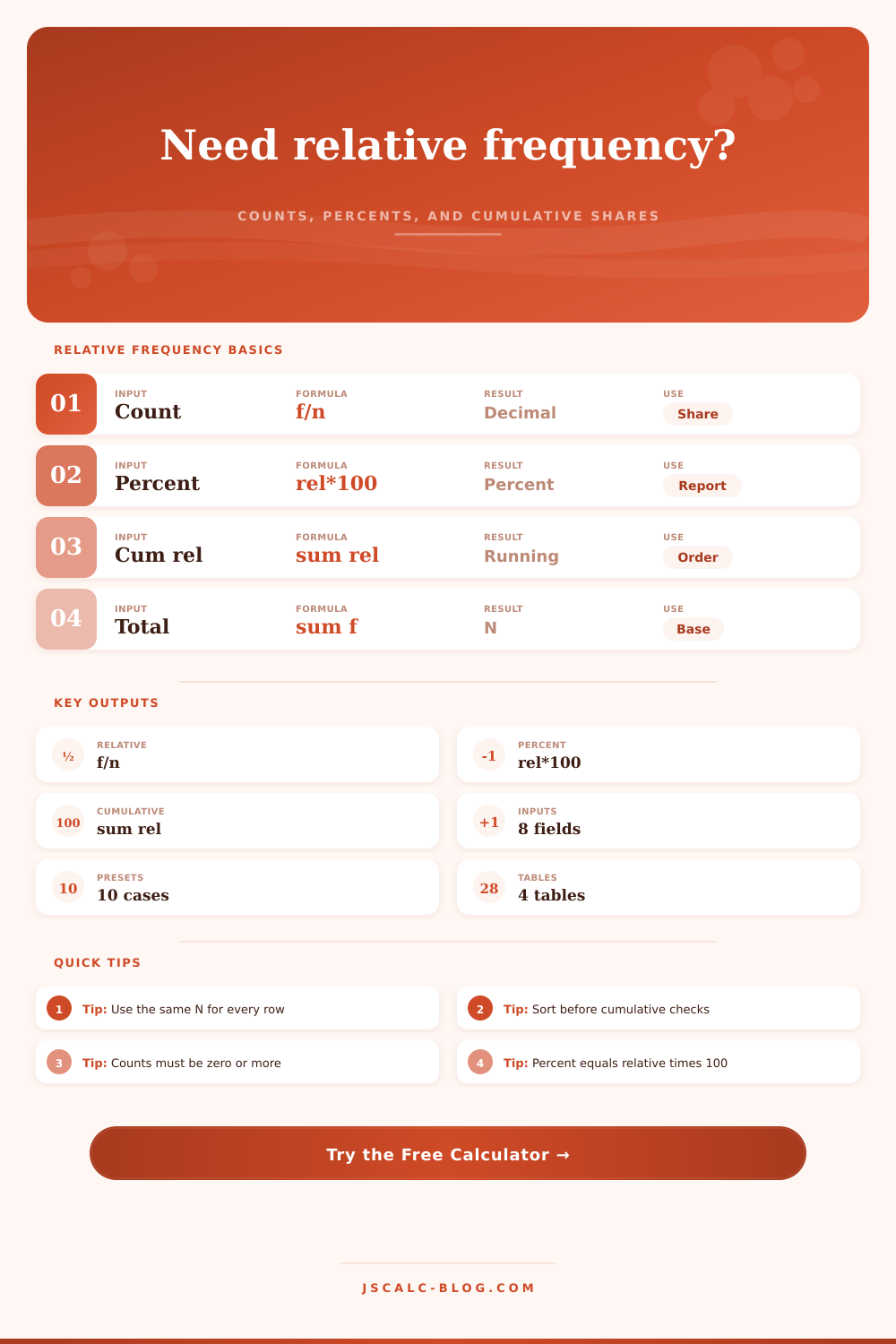
| Relative frequency | f / category total or f / n | Decimal share of the selected base | Report with enough decimals to avoid rounding to zero |
| Percent frequency | relative frequency x 100 | Percent share of the selected base | Percent totals may round to 99.9% or 100.1% |
| Cumulative relative frequency | running sum of relative frequencies | Share at or before each ordered category | Only meaningful after choosing a sensible order |
| Listed coverage | sum(f) / n | How much of custom n is represented by listed categories | Should equal 100% when all categories are included |
💡Tips
The first step is to take a raw count, except that a pile of surveys doesn’t really convey much information (unless you have some idea how big the group is). That’s where relative frequency comes in: by peeling away the raw number, it show you the share. It transforms a heap of survey answers into an image of proportions.
The dividers work behind the scenes in our calculator, leaving you free to think about what numbers should mean for your project. It’s just a ratio: A number of people divided by a different number. You have to choose which number goes where, though. Are you dividing by total number of people invited? Or the total number of people who responded? That make all the difference.
How to Turn Numbers into Shares
If you don’t know exactly what that decimal represents, between zero and one, then you don’t understand. Multiply it by 100 and you’ve got your percentage. But it still sounds simple; it is, in principle. With imperfect data, most peoples denominator is incorrect.
What if there are response categories for “non-response,” or “missing data” in your table? You have an option. You can remove those rows from the denominator. This way, you divide only by number of valid responses to show the distribution among those respondents. Or leave full sample size in the denominator (thus revealing the extent of the missing data issue).
You can switch between these modes with this tool. In one mode it will show you the percentage of total population, while in the other it will show you the percentage of valid answers. One reveals engagement; the other reveals preference.
That’s where it digs deeper: cumulative frequency. This take the relative frequencies and adds them, in some sort of order. Why? Well, if you’re looking for a threshold or a trend that jumps out at you, then cumulative frequency can help.
Let’s say you have a bunch of test scores and you want to identify number of people who scored below a particular grade on that test. You would take your categories (the grades), sort them from low-to-high and add their corresponding share. Now you have the running total. In other words, cumulative frequency tell you how far down the list you have to scroll to capture x percent of population.
Why does it work? You can visually see the weight of data accumulate. But it turns out that order makes a difference. You can change the sorting order on the fly… For example, if you sort from highest to lowest frequency, you highlight most common results right away.
That’s useful when analyzing defects, or doing some kind of quality control work; you want to tackle the largest issues first! But if you sort alphabetically, you’re getting a neutral view: no category is being privileged over another. With our calculator, you can flip the order around at will. You’ll notice how cumulative line adjusts as you do so. It also exposes patterns that are otherwise hidden in distribution.
The twist: It’s all about context. One answer could be common when its relative frequency is high, and that would make sense within a given survey. One type of defect on a manufacturing line might have such a high frequency as to point toward a broken machine part. And that too makes sense in its context.
The math is the same in each scenario. But meaning comes from the story behind the categorization. This isn’t simply a matter of numbers. It’s a matter of failure mode, or behavior.
Probability and frequency aren’t the same, but they are related. That’s a common misconception. Yes, frequency is linked to probability. But they aren’t synonyms. Probability is what might happen. Frequency is what already happened.
Your best estimate of future probability is how often something occur in the past. If, over the course of this year, a certain traffic source was responsible for 30% of all your visits, then you’d reasonably guess that it would account for something more comparable next month…unless something changes.
It comes with a handy reference table of most common setups. How each field defines its denominator. Quality engineers count defect types. Teachers count students. Web analysts count sessions. There’s a convention to each field. If you follow it, your colleagues will know what you’re talking about. If you don’t, then you’ll have to explain yourself.
This doesn’t require you to be a statistician. You just need to know your total. From there it’s arithmetic: add up your totals, and let the calculator do the rest.
Turn your raw counts into clean shares. Get a clear picture of landscape of your data. See what’s big and what’s small. See how the pieces fit together.
This is your base. Your counts. Run the numbers. The result is a map of your data.
You get a map of your data. Where does it show the weight? A pile of observations transforms into a story you can tell.
Actualy, you should of used this earlier. It makes everything so much more comfortabley.