Sturges Rule Bin Calculator
Calculate the Sturges histogram bin count, bin width, and a side-by-side comparison with square-root, Rice, Freedman-Diaconis, and Scott rules.
Sturges Rule Result
| Method | Formula Used | Bin Count | Bin Width | Best Use |
|---|---|---|---|---|
| Sturges | k = ceil(1 + log2 n) | 9 | 0.67 | Small, tidy samples |
| Square-root | k = ceil(sqrt n) | 14 | 0.43 | Quick visual screening |
| Rice | k = ceil(2 x n^(1/3)) | 12 | 0.50 | Simple large-sample check |
| Freedman-Diaconis | width = 2 x IQR / n^(1/3) | 6 | 1.05 | Skewed data and outliers |
| Scott | width = 3.5 x s / n^(1/3) | 7 | 0.87 | Roughly normal data |
| Sample Size n | 1 + log2(n) | Sturges k | Width if Range = 100 | Interpretation |
|---|---|---|---|---|
| 10 | 4.32 | 5 | 20.00 | Very compact |
| 25 | 5.64 | 6 | 16.67 | Small sample |
| 50 | 6.64 | 7 | 14.29 | Readable first chart |
| 100 | 7.64 | 8 | 12.50 | Common summary |
| 500 | 9.97 | 10 | 10.00 | Moderate detail |
| 1,000 | 10.97 | 11 | 9.09 | Still restrained |
| 10,000 | 14.29 | 15 | 6.67 | May be too smooth |
| Data Situation | Sturges Behavior | Rule to Compare | Reason to Compare |
|---|---|---|---|
| Small classroom scores | Usually readable | Square-root | Checks if more bins reveal clusters |
| Large event logs | Often very smooth | Rice | Grows faster as n increases |
| Skewed income data | Can hide tail detail | Freedman-Diaconis | Uses IQR instead of full spread |
| Normal measurements | Good starting chart | Scott | Uses standard deviation |
| Discrete ratings | May split categories | Domain bins | Natural categories can matter more |
| Many repeated values | May show empty bins | Square-root | Tests a more granular layout |
There are two thousand numbers on a spreadsheet. You want to make a chart so your boss can see what they look like; but it shouldn’t be cluttered. So you start Excel, and draw a histogram. Sometimes it end up being too scattered. Sometimes its too uniform. There is too many bins; the big picture isn’t obvious. There aren’t enough bin; you lose some fine detail.
A frequent challenge in visualization are deciding the width of each bin. That’s where Sturges rule comes in: it’s a mathematical way to get started. It doesn’t always work perfect, but it provides a reasonable guideline. The Sturges rule determine the number of bins.
How to Choose the Right Number of Bins
How does it do this? The calculator here do the math for you. You type in the number of samples, and it tell you the answer. No need to search through stats textbooks for formula. Sturges is simple.
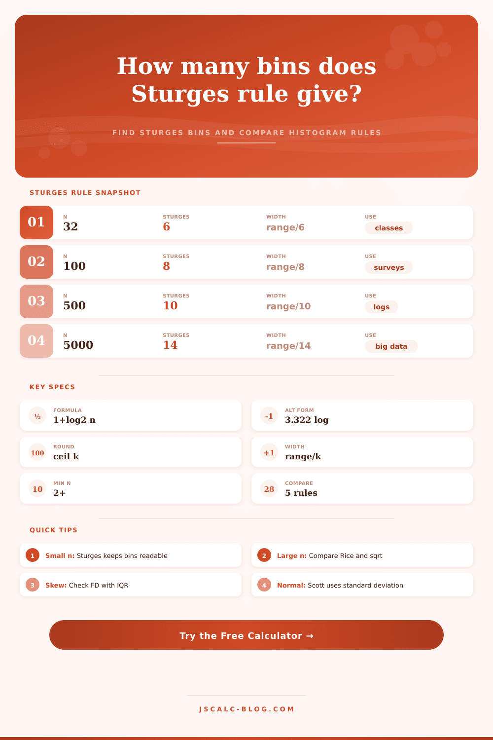
Sturges’ central concept are simplicity. Its idea is that your data will be distributed normaly. In other words, it will have a bell curve. From there, calculation for bins relies on following formula. The number of bins is log2(sample_size) + 1, rounded up to next integer.
The log part is base-two; thats because we are trying to split our data into halves as many times as possible. This rule is pretty good for smaller and medium-sized samples. What it do is generate an easily-readable chart that doesn’t get visually cluttered by too many bins.
But here’s the caveat. When dealing with very large sample, this rule tend to blur data too much. If you’re looking at millions of web click, for instance, Sturges may mask significant dips and spikes. So the tool also shows how Sturges stacks up against other binning rules such as Freedman-Diaconis or Rice, which let you achieve greater resolution where necessary.
It’s all in the inputs
This is what each input represents: The count: thats the number of observations you have. The min/max values are the range. It’s the difference between largest value and smallest value. So if we have a range from 0-100 on a test score, then the range is one hundred.
The bin width is the range divided by the number of bins. So if the bin width is five, then first bin will include values from 0, 5. Next will be values from 5-10. You’ll notice that when you update the numbers, you can watch the bin width calculation change accordingling.
To show why that matters, there are also preset buttons to demonstrate what happens for different situations. For example, a set of scores spanning three thousand would require fewer bins than a set of only thirty score. That means you need to interpret differently too. No single rule is always the best one to follow. There are tradeoffs in statistics.
Sturges favors smoothness and clarity. That make it suitable for presentation slides or quick summaries. The audience can pick up the overall trend immediately. However, Sturges may be unsuitable when your data have skew. Income levels, for instance, typically has extreme outliers on the high end. Sturges could of bundled all the middle values together.
When that happen, the Freedman-Diaconis rule is often better. It ignores the extreme tails and focuses in the interquartile range. As you’ll notice from the comparison table, Rice will suggest more bins then Sturges. This is an early warning sign: the shape of your data is sensitive to selection of bins. Try out both rules and see which show a sensible pattern.
In the end, though, a histogram is your call. How much noise do you want out of it? And how much detail do you want in? Sturges offers you a reasonable baseline. He doesn’t leave you guessing at a number. But it also doesn’t take away your responsibility: study the chart.
Is that the story you expect to see? Are there too many bins? Then smooth it out. Are there too few? Then add some more. The tool is the mechanism. Your job is the judgment. That’s how a plot becomes an insight. You have the formula on one side; you have the picture on the other.