Histogram Bin Width Calculator
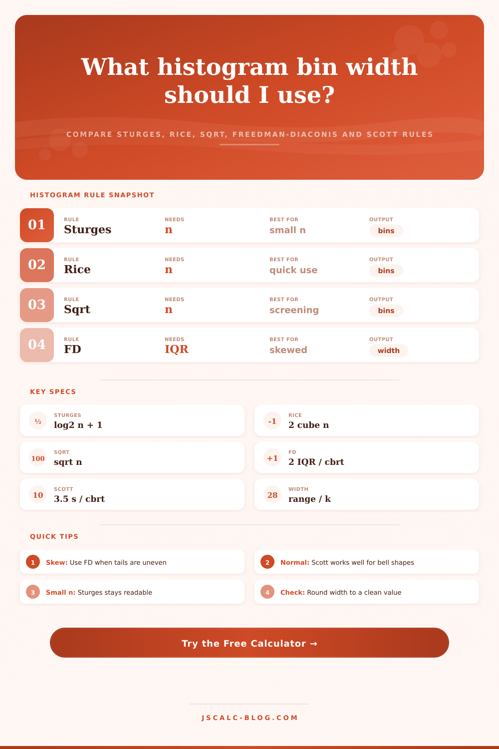
Compare Sturges, Rice, square-root, Freedman-Diaconis, and Scott rules from the same sample summary.
Recommended Histogram Setup
| Method | Formula Used | Bin Count | Bin Width | Best Use |
|---|---|---|---|---|
| Sturges | k = ceil(log2 n + 1) | 9 | 8.44 | Small or tidy samples |
| Rice | k = ceil(2 x n^(1/3)) | 12 | 6.33 | Fast general estimate |
| Square-root | k = ceil(sqrt n) | 14 | 5.43 | Quick screening |
| Freedman-Diaconis | width = 2 x IQR x n^(-1/3) | 8 | 10.26 | Skewed data or outliers |
| Scott | width = 3.5 x s x n^(-1/3) | 7 | 11.15 | Nearly normal data |
| Sample Size | Sturges k | Rice k | Sqrt k | Typical Starting Rule |
|---|---|---|---|---|
| 20 | 6 | 6 | 5 | Sturges or Rice |
| 50 | 7 | 8 | 8 | Sturges, then inspect |
| 100 | 8 | 10 | 10 | Rice or FD |
| 250 | 9 | 13 | 16 | FD if quartiles are known |
| 1,000 | 11 | 20 | 32 | FD or Scott |
| 10,000 | 15 | 44 | 100 | FD, Scott, or domain width |
Imagine that you have a list of 200 customer satisfaction scores and want to create an understandable chart out of them. The typical instinct is to pull up the histogram tool and let defaults apply. By default, the software split the data range into bins. Typically, this means dividing by some fixed number. Then, you get a set of bars that look OK at first glance, but maybe you don’t. Maybe the chart is not shaped as it should be. It could end up as a jagged mess of noise that hides outliers or it could be a smooth curve that misses those same outliers.
This is where a histogram bin width calculator come in. It forces you to make a choice about how to apply a rule suitable for nature of your data.
How to Choose the Right Bin Width for Histograms
Most people consider bin width to be just a matter of visual design. In fact, it’s a statistical question about how much detail you want to represent vs how much noise to smooth away. Too narrow a bin and you’ll point out random variation, you’ll find patterns that don’t realy exist. Too wide a bin, and you wash out the peaks, missing any detail that matter.
The calculator lets you try five different mathematical rules for choosing bin width. Compare them to see how much your bin width affect your distribution.
For example, Sturges rule is conservative. It assumes your data has approximately normal shape, and gradually adds more bins as your sample size gets bigger. Sturges rule is good if your dataset is fairly small and readable detail isn’t so important.
Rice rule is more aggressive. It makes more bins, which can be helpful when you’ve got a larger sample size and wish to discover some subtler cluster.
Some rules consider not only the amount of data but also its shape. The Freedman-Diaconis and Scott rules computes width based off measures of spread (e.g. Standard deviation, interquartile range). Why? Because skewed data matters.
Suppose that you’re looking at income level. A handful of people who earn lots of money will skew the maximum. With a basic range-type rule, your bins would has to be very wide because of those outliers. Everything else would get lumped into a single, useless bar. That’s why the calculator draws attention to the Freedman-Diaconis output: it focuses on middle half of your data, ignoring the crazy extremes at the tails. Most folks overlook this; they allow outliers to determine what the visual scale should of look like.
If you know the quartiles (or don’t) enter them along with your minimum value, maximum value, and your sample size. Click Go! And the calculator will do its thing immediately.
In this case, Scott tell you to use seven bins and Sturges says nine. They’re not incorrect, they’re answering different questions. Sturges tells you how many groups you need to represent your sample. Scott tells you what’s the optimal bandwidth of a normal distribution estimator. These tradeoffs is explained in the reference table within the calculator itself. Run it and make sure that the rule you selected is appropriate given your data size.
For example, when you have just twenty observations, you’d be wise to stick to Sturges. Freedman-Diaconis can be a bit unstable on small samples.
Don’t get hung up on the specific decimal point of the width you calculate. For viewing, 8 and 7.84 are almost identical widths. Use rounding to make it an easy-to-read-and-explain number in your chart. Your chart becomes more readable and you can convey meaning to those who don’t care about complicated math. It’s about being clear, not mathematically pure.
Click through the predefined examples in the tool. Notice what happens as you go from exam scores to API latency. Often latency-based data has a few slow requests that skew results. You’ll see how the Freedman-Diaconis robust width help eliminate that skew.
Pick a rule whose assumed shape seems closest to what you think your data might be. Freedman-Diaconis leans toward messiness (i.e. Skewed data) while Scott leans toward nice clean bell curves. Adjust the knobs. Examine the new histogram. Does it show the patterns you’d expect? Is it too spiky or too flat? If so, re-calculate using another rule.
There’s no such thing as “the” right bin width for a histogram. There’s only the width that lets the bars speak most truthfully about data.
You embarked on this journey to turn chaos into clarity.