Frequency Distribution Calculator
Build a standard grouped frequency table from raw data and class settings, including count per bin, relative frequency, cumulative frequency, class width, and midpoint.
Paste numbers separated by commas, spaces, semicolons, tabs, or new lines.
Manual mode gives the most reproducible class intervals.
Six to eight labels usually keep a table readable.
Manual and custom modes start the first bin here.
Width is upper boundary minus lower boundary.
The outer endpoint is included so the minimum and maximum are counted.
Used for boundaries, midpoint, and relative frequency.
Cumulative frequencies are still calculated from the lowest class upward.
Optional 6 to 8 comma-separated labels. Blank or missing labels use interval names.
Frequency distribution results
| Class | Lower | Upper | Midpoint | Frequency f | Relative f/n | Percent | Cumulative f | Cumulative % |
|---|---|---|---|---|---|---|---|---|
| Results load after calculation. | ||||||||
| Class | At or below upper boundary | Cumulative frequency | Cumulative relative | Cumulative percent | Remaining above |
|---|---|---|---|---|---|
| Results load after calculation. | |||||
| Check | Value | Formula or source | Interpretation | Action |
|---|---|---|---|---|
| Results load after calculation. | ||||
| Method | Class count k | Class width w | Best use | Watch item |
|---|---|---|---|---|
| Manual classes | Entered | Entered | Reports, classrooms, published bins | Check that min and max fit |
| Sturges rule | ceil(1 + log2 n) | range / k | Small to medium samples | Can under-bin large samples |
| Square-root rule | ceil(sqrt n) | range / k | Quick exploratory grouping | May create many bins |
| Rice rule | ceil(2 n^(1/3)) | range / k | General numeric samples | Still needs rounding review |
| Custom count | Selected | range / k | When table length is fixed | Width may be awkward |
| Integer-friendly | Selected | Rounded up | Scores, days, counts | Boundary choice changes labels |
All that raw data lives in spreadsheets somewhere. It is messy and it is unorganized. You might have hundreds of numbers; but how do you look at long list of commute times and know what’s really going on with traffic? Is it mostly 20 minute delays? Or is it a small handful of extreme values jacking up the average?
Grouping helps take chaos and create shape. Paste your values into the calculator I’ve made and it takes care of the math for you. But unless you know why bins work, you won’t be able to propery interpret the results.
Understanding Your Data Frequency Table
What number of classes should you choose? And why that matter? Choosing too few bins will flatten your distribution, hiding any spikes in the data. Choosing too many bins makes the data noisy; it appears as though there’s a pattern, when in fact its just random variation. For a normal report, rule of thumb is six to eight groups. That balance provides enough detail (so you can identify the most common group) without making table unreadable.
You’ll be able to explore various approaches, Rice rule? Sturges rule? (using the tool), seeing what happens as you change the setting.
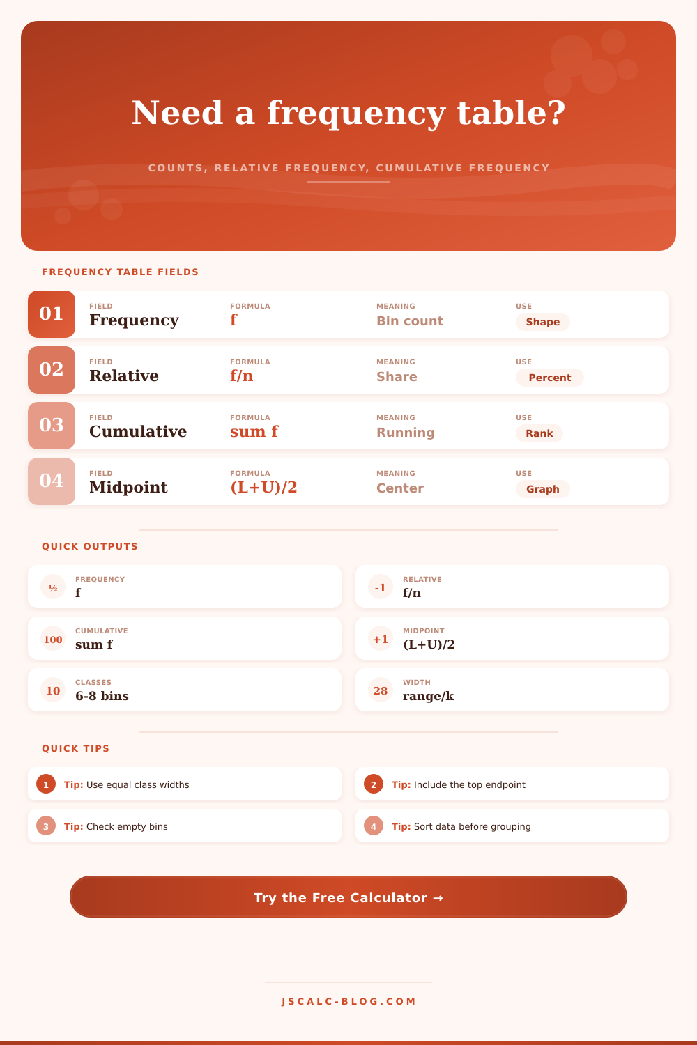
This is the relative frequency. The bottom row (frequency column) simply represents count, the number of observations per bin. It’s the core of the table. The count itself isn’t enough. If we have two tables with different sizes, counts aren’t going to give us much unless we know how big our dataset is. That’s where relative frequency comes in. It take the count and divides it by total number of observations. It balances this view over different size datasets so we can say ‘twenty percent of customers purchased something in that price range’, regardless of whether you’ve surveyed 5,000 or 50.
The cumulative frequency column adds another layer of understanding. Starting from the bottom up, it builds a running total. What does that tell you? Think of it like an exam: how many students performed at or below a specific score level? How many performed at or below a specific score level? That might help you determine what’s a cut-off point for getting into school.
Or maybe you want to know how much everyone scored around the middle? For that, you’ll use midpoint column, too. And if you want to draw a frequency polygon, you’ll need central value (the midpoint) from each bin. You will also need it if you want to estimate mean for your grouped data. We’re assuming that all values are equally distributed across the bin, but that’s generaly a pretty good assumption for most things we’d be doing with this sort of data.
A technicality in the closure rule trips people up: Do we include endpoint of our interval in the set? Yes or no? If yes, what about values that land exactly at that boundary? Most tools assume left-closed intervals, which implies including lower bound but not upper bound. Typicaly, the last bin includes the upper bound so we don’t exclude highest value. One easy check is to make sure that total frequency adds back up to the number of observations in the sample. If numbers don’t add up, chances are there’s an interval gap or overlap.
It’s like a kind of map of the terrain of your data: it shows the points where values congregate (the peaks), and where they become sparse (the valleys). It turns a list of numbers into something much clearer: how far apart things are, and how concentrated things are. It reveals outliers, symmetries, and skewness, all without having to run complicated algorithms. It isn’t just about putting your data in order; it’s about showing how your data is shaped. What you’re looking at when you glance down the table is shape of whatever it is you’re studying. And that shape is where the real insight starts.