Percentile Calculator
Paste any data set to find the percentile rank of a value, the value at a chosen percentile, and the full quartile summary using nearest-rank, linear interpolation, and exclusive methods.
📌Real Data-Set Presets
📝Data Set & Options
Non-numeric tokens can be ignored automatically or block the calculation using the toggle below.
The value whose percentile rank you want to score.
Example: 90 finds the value at the 90th percentile (P90).
🔢Data-Set Snapshot
📊Quartile & Decile Summary
| Statistic | Percentile | Value | Sorted Position | Notes |
|---|---|---|---|---|
| Enter a data set above to see the quartile and decile summary. | ||||
⚖Method Comparison
| Percentile | Nearest-Rank | Linear (R-7) | Exclusive (R-6) | Spread |
|---|---|---|---|---|
| The three methods are compared side by side after calculation. | ||||
🗂Five-Number Summary & Position
| Point | Percentile | Value | Position Index | Fraction | Cumulative % |
|---|---|---|---|---|---|
| The five-number summary with position math appears here. | |||||
⚙Percentile Formula Breakdown
📋Percentile Reference
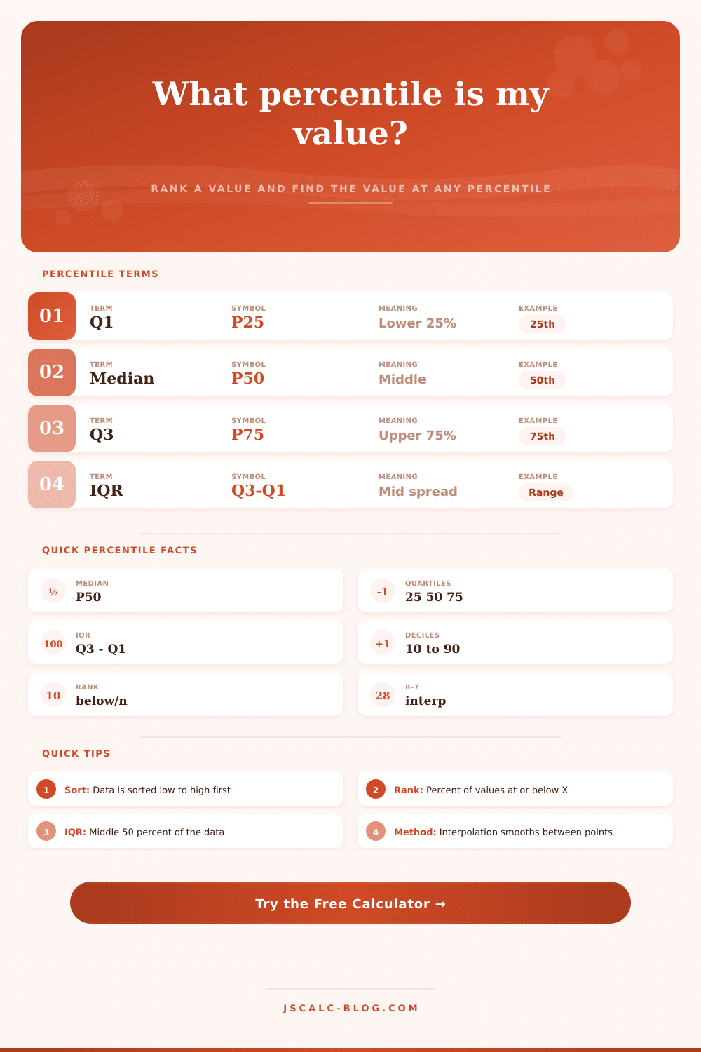
| Term | Symbol | Meaning | Common Use |
|---|---|---|---|
| First quartile | Q1 / P25 | 25% of values fall at or below | Lower boundary of the middle half |
| Median | P50 | Middle value of the sorted data | Typical value, resists outliers |
| Third quartile | Q3 / P75 | 75% of values fall at or below | Upper boundary of the middle half |
| Interquartile range | IQR | Q3 – Q1 | Spread of the central 50%, outlier fences |
| Ninetieth percentile | P90 | 90% of values at or below | Latency SLAs, top-tier cutoffs |
| Percentile rank | PR | Percent of data at or below a value | Scoring one value against the group |
💡Practical Percentile Tips
Ever been told you’re “in the top ten percent,” only to have no idea what that will do to your score? For some reason, percentiles is treated like a guessing game by most: they give you an arrow pointing to location of yourself amongst other numbers. This new tool removes the guessing and replaces it with some good ol’ fashioned math. Just give it your numbers and it’ll sort them out.
It will spit back answers to questions like “what’s the ninetieth percentile?” or “how does this number rank different than others?” It’s easy but it makes a difference if you ever find yourself trying to make sense of confusing data.
Understanding Percentiles Simply
The two are easily confused, because they’re asking two very different things: one is “what’s the rank of X?,” e.g., what percentile does my $50k offer fall into? The other is “what’s X at the Yth percentile?”, meaning what’s the cutoff score for the top 10% of applicants? Those are inverse operations: one asks for the rank of a known value and the other ask for the value at a known rank, and treating them as the same thing leads to mistakes. That’s how you make mistake when grading or hiring: you treat the two questions as equivalent.
This calculator nicely captures the difference: it allows you to toggle back and forth between modes so you can look at how the data works itself out going either way without having to do arithmetic by hand.
How they does this is important, too. A lot of folks don’t know that not every percentile are done in the same way. This can bite them when their output doesn’t match their colleague’s spreadsheet. There’s linear interpolation (a smoother estimate using an exact value where there is a gap) and then there’s nearest rank (which snaps directly to real world data). It can shift your cut off by several points, just enough to make someone get bumped up or down in the top tier.
This shows multiple approaches side by side to demonstrate how sensitive your dataset is to these adjustments. If your numbers vary wildly based off approach, chances are your sample set isn’t big enough to rely on any one answer.
The median value cuts the list right down the middle; the lower and upper quartiles defines what’s inside meaty middle (the 50% of your data). Because the average gets thrown off by outlying values at the high and low ends, it’s sometimes better to understand a spread: how wide is your interquartile range? It provides a clearer view of whether your data is stable or fickle, important for prices like houses and incomes.
How do we use all this in practice? We turn it into standards via percentiles. For example, imagine you’re building a traffic system. You want to ensure smooth usage for 90% of people, but you know the other 10% will push against the limit. In that case, you’d aim for the 90th percentile of traffic usage.
That’s a business choice hidden in statistics. It requires translating some abstraction (where do you draw the line?) into tangible figures so you can convince stakeholders why such a decision was made. That’s what the calculator does with the reference tables supplied with it, gives you the raw numbers to defend those choices.
You should of used them. Percentile isn’t an absolute statement of how good something is or how much it’s worth. You’re not “better” if you happen to be in the 90th percentile of shoe sizes; that only means that your shoe size is bigger then most people’s. But the calculator allows you to find where you fall within that distribution exactly, and that removes doubt from any comparison.
Now that you know exactly where a particular value falls relative to others like it, you can stop guessing and begin making decisions according to where the line actualy lies.