Linear Curve Calculator
Map a raw score onto a target grade line, clamp the result, compare the class average, and see every slope-intercept step.
📌Curve presets
📝Curve inputs
Percent mode reads raw values as 0 to 100. Points mode converts by max score.
Used for the letter and next-threshold cards.
Use the assignment total in points mode; leave 100 for percent mode.
Final curved grade is clamped between 0 and this cap.
🧮Formula summary
📊Curve behavior grid
📋Reference tables
| Curve setup | Common use | Raw anchors | Target anchors | What to watch |
|---|---|---|---|---|
| Top-and-floor curve | Hard exams | Low pass and best score | New pass and new top | Can lift middle scores strongly |
| Top-only gentle curve | Small adjustment | Bottom near unchanged | Top near 100% | Low scores may barely move |
| Compressed curve | Keep spread tight | Wide raw range | Narrow target range | Slope below 1 reduces gaps |
| Steep curve | Reward high scores | Narrow raw range | Wide target range | Slope above 1 expands gaps |
| Capped curve | Syllabus maximum | Any valid anchors | Often above cap | Top students may tie at cap |
| Points curve | Point-based exams | Raw points | Curved percent | Set max score correctly |
| Scale | A range | B range | C range | Best use |
|---|---|---|---|---|
| Standard letters | 90%+ | 80-89.99% | 70-79.99% | Simple school reports |
| Plus-minus letters | 90%+ | 80-89.99% | 70-79.99% | More precise cutoffs |
| College 4.0 plus-minus | 93%+ | 83-92.99% | 73-82.99% | Transcript planning |
| Mastery bands | Advanced 90%+ | Proficient 75-89.99% | Developing 60-74.99% | Standards-based classes |
💡Curve tips
It’s a particular sort of terror when you get your exam back, with class average listed as sixty-five percent. You’re not worried about being bad, exactly; you’re worried about someone making a random decision. Were you truly bad, or was this just a dumb exam?
Enter the linear curve and see its power to not only adjust a score but correct a narrative. Plug in your own raw scores into the linear curve calculator up top and it does all the math for you, sparing you from having to calculate intercept and slope on your own. It turns a black-and-white pass/fail answer into graduated scale of how well you did, based off what everyone else did.
How to Use a Linear Curve Calculator
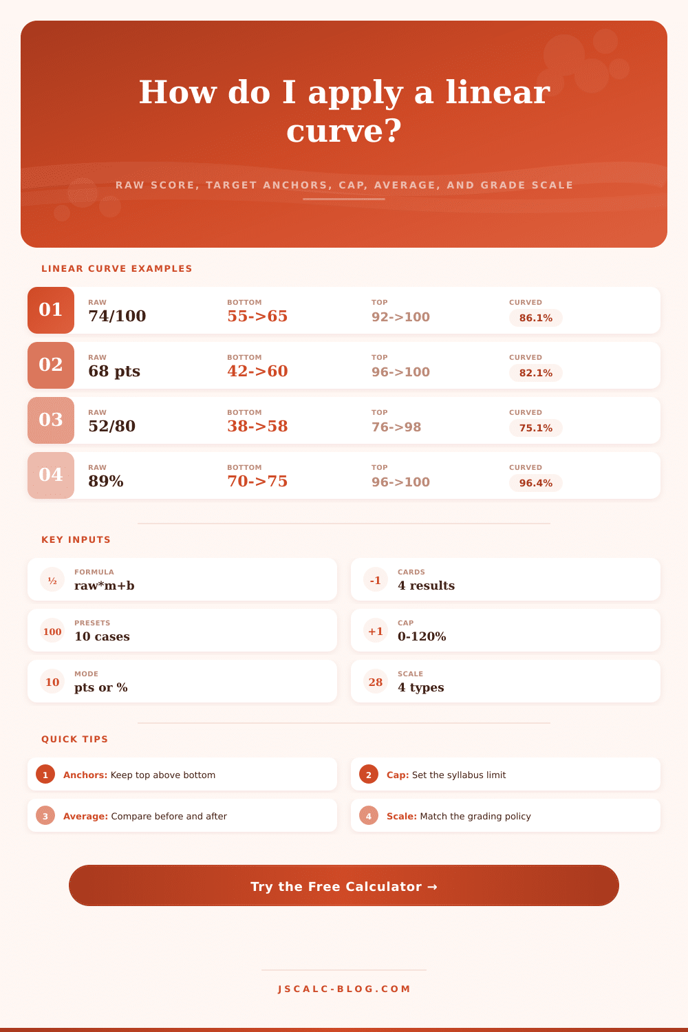
It’s more complicated than it sounds. It’s simply a line: Y=mx+b; Raw Score = X; Curved Grade = Y. M represent the slope of the curve. This represents how aggressive you want the curve to be, and b is the intercept. It is where the curve meets floor.
Educators instinctively know this, if the test is tough, you have to give students some slack. They struggle with quantifying it. Mostly it’s an exercise in understanding what are you anchoring yourself around? If you say the lowest raw anchor is 50% and you want them to get a minimum passing grade of 60%, then you are saying explicitly that half-hearted work should earns a passing grade. That’s a policy choice… Not just a math problem.
Now let’s consider the curve cap. That’s like putting a ceiling on your ambition; without it, an A would be worthless since scores could exceeds one-hundred-percent. With it, a soft curve can raise a score of ninety-eight to a one-hundred-and-two. It can still keep a score of zero different than a score of one-hundred. If there were no cap, then the value of a perfect score would of been diluted by such a curve. You can clamp the results with the calculator so that top performers don’t get credit for points that never existed in the first place. That’s critical to preserving the integrity of the grade scale.
The reference table on the page illustrates this clearly. You can see how different setups affects the spread of high and low scorers. But when you move your raw top anchor, what you’re doing is determining the percentage of points you want the very best student to get. Say the very best student got a score of ninety-two percent on the test and you set your raw top at one-hundred percent. You reward excellence by curving up. Or say you set your target top at just ninety-five percent. You’ll still be rewarding excellence but now you’ve compressed the range and narrowed the gap between student. That is useful if the students are tightly clustered in the middle. It lets you differentiate without creating huge differences. Now, rather than a skewed, lopsided spread, you flatten out the curve and make it more normal.
Another aspect of this I especially like is that it’s transparent. The “class average comparison” provides a macro view of the adjustment by showing how much the collective performance shifted after the curve was applied. So if the raw average was 68 and the class average shifts up by the curve to be an 80, that’s a 12-point jump for everyone. That gives you a broad view of what the curve did, which can help defend the decision to use one to students who may feel they recieve an arbitrary boost. The curve becomes more than a hunch that it made things fairer; it becomes data showing something was statistically normalized.
People often make mistake of applying a curve to every assessment. That’s fine… sometimes. However, if the line separating the easy and hard questions is clear, then using a linear curve are ideal. Otherwise, curving the test may mask holes in your instruction. Curving may reward laziness if the kids just didn’t study. Ultimately, you should curve if you want to accurately assess their knowledge; don’t curve to pad their grade for the sake of making them happy.
The educator provides the intent, while the tool provide the means. So in the end this comes down to communication. Grading on a curve shows how well a student did compared to other students and what class expects. If you use a fixed linear scale, you don’t have to guess. You can use logic that is reproducible. And whether you’re tweaking for a kind quiz or an awful midterm, it doesn’t matter. It’s still the same principle. You draw a line from work done to grades earned. And the final number should represent that and reflect what was realy done. Curve is just another way of looking at it. But if used properly, it is a tool to show you the result you want: what we really learned.