Bell Curve Grade Calculator
Calculate z-score, normal percentile, rank estimate, curve-adjusted score, and letter grade using class mean, standard deviation, class size, and custom cutoffs.
Enter the raw score before any curve adjustment.
Used to cap the curved score and show percent of max.
Use the class average for the same exam or assignment.
Use the sample standard deviation when available.
Rank is estimated from the normal percentile.
Choose the method that matches the class policy.
A simple shift adds target mean minus actual mean.
Controls displayed z-score, percentile, and score values.
At or above this z gets A.
At or above this z gets B.
At or above this z gets C.
Below this z gets F.
| Z band | Approx percentile | Default letter | Example meaning | Class rank cue |
|---|---|---|---|---|
| +1.50 and up | 93rd+ | A+ | well above class | top group |
| +1.00 to +1.49 | 84th-93rd | A | one SD high | top sixth |
| +0.25 to +0.99 | 60th-84th | B | above mean | upper half |
| -0.75 to +0.24 | 23rd-60th | C | near class center | middle band |
| -1.50 to -0.76 | 7th-22nd | D | below mean | lower band |
| below -1.50 | under 7th | F | far below class | bottom tail |
| Z-score | CDF percentile | Area above | Score example if mean 70, SD 10 | Curve note |
|---|---|---|---|---|
| -2.00 | 2.28% | 97.72% | 50 | very low tail |
| -1.50 | 6.68% | 93.32% | 55 | low cutoff |
| -1.00 | 15.87% | 84.13% | 60 | below average |
| -0.50 | 30.85% | 69.15% | 65 | slightly low |
| 0.00 | 50.00% | 50.00% | 70 | class mean |
| +0.50 | 69.15% | 30.85% | 75 | solid result |
| +1.00 | 84.13% | 15.87% | 80 | strong result |
| +1.50 | 93.32% | 6.68% | 85 | excellent tail |
| +2.00 | 97.72% | 2.28% | 90 | rare high score |
Now that you have your midterm grade in hand, what do you see? You see that number. It’s seemingly unchangeable. It’s not just some arbitrary figure; it’s a reflection of where you stands compared to your peers.
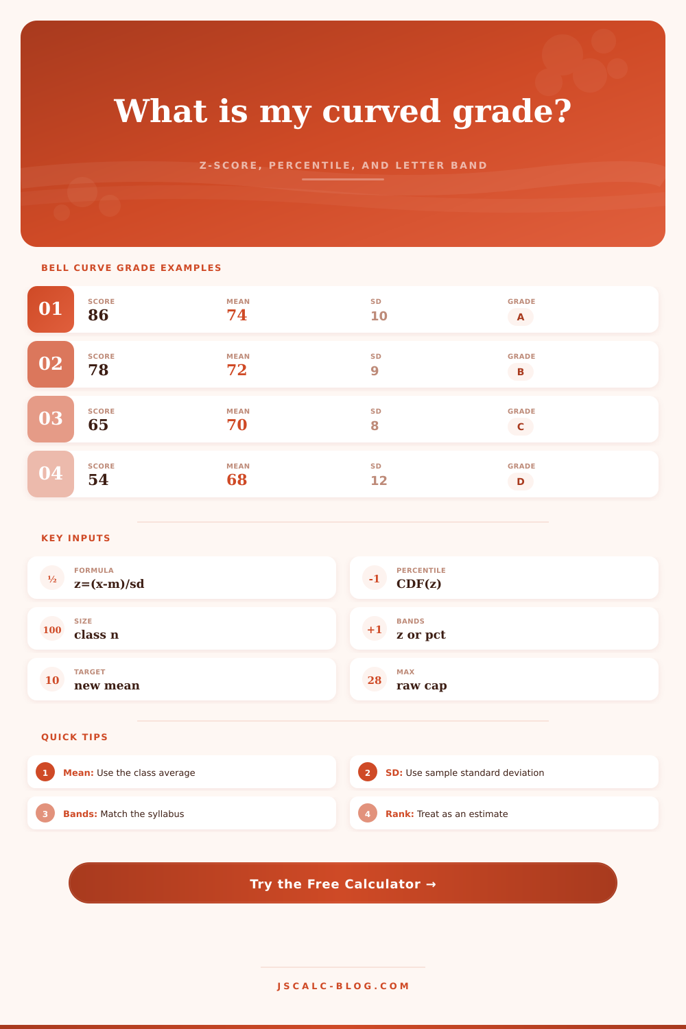
This is the bell curve. And knowing about the curve turns a static point into a place on scale. This distance are measured by the z-score. Your score represents so many standard deviations away from class average. A mean of 74 and a standard deviation of 10 means that a score of 86 lie one standard deviation above the norm.
Understanding Your Score on the Bell Curve
Because the bell shape is predictable, we can map the z-score back onto normal distribution. The percentage of scores that lie within one standard deviation of the mean? Approximately 68%. Within two? That’s another 95% right there.
Those percentages represents the grading system. Students tend to fixate only on last number. But it’s more about inputs. How wide is the curve? That is defined by standard deviation. If the standard deviation is small, then all the points is near the average and hence each point carries more weight. If the standard deviation are large, then the test was probably easy for some people and hard for other people. In this case, your raw score may appear as average but your z-score could indicates you scored higher then most of your classmates.
They see their 78 and say “that’s a B.” Then they fail to notice the mean was 60, with a small spread which would make that 78 high in comparison to the rest of the group.
This is all subject to class-size. If it’s a big class then the bell curve will be smooth. Your estimated rank from this tool will be fairly accurate. If it’s a small class, then it tend to have an uneven distribution. You’ll get a rank estimate from the tool based off the normal distribution. Take that with a grain of salt if it’s a small group. Small samples is more prone to individual effects. A bad test score for one student could impact the mean which alter everybody else’s percentile.
There are two main ways that instructors grade. The first is using strict z-score cutoffs. The second is shifting the mean to some target score (e.g., 80). The latter is easier but also less accurate. It bumps up everyone’s score by the same amount. The former is more accurate at rewarding relative performance.
If you have a professor who use percentile bands, then you’re in a quota system: A = top 10%, B = next 20%, etc. That’s competitive. Your score depends on your performance and the performance of other people.
The thing is these calculators makes sense of your numbers. They translate a jumbled up test score into something meaningful. How does knowing that you scored in the middle 40% or top 10% affect your studying? It makes you less anxious. Now that you know what the curve means, you stop worrying about one test and start thinking long-term. You begin to think about where you stand. It’s all relative