Grade Curve Calculator
Compare add-points, top-score scaling, linear anchors, and target-mean curves with caps, floors, shifted letter thresholds, and bulk score distribution on JSCalc-Blog.com.
Adds the same percentage-point bonus to each score.
Enter points earned, or enter a percent when possible points is 100.
Raw percent = raw score / possible points x 100.
Used directly for add-points; auto-computed for target mean.
For top-score scaling, the class top maps to the target top grade.
Set to 50 or 60 only if the course policy has a minimum grade floor.
Positive values lower thresholds. A shift of 3 makes A start at 87 instead of 90.
Use commas, spaces, or new lines. Values are interpreted in the same units as the raw score field.
| Student | Raw score | Raw percent | Curved percent | Change | Letter |
|---|---|---|---|---|---|
| Run calculator | -- | -- | -- | -- | -- |
| Method | Formula | Best use | Main risk | Policy check |
|---|---|---|---|---|
| Add points | curved = raw + bonus | Exam was uniformly too hard | High scores may exceed cap | Declare the bonus |
| Scale to top score | curved = raw x target / top | Highest score should set the ceiling | Low top score can overinflate | Use real top score |
| Linear anchors | curved = m x raw + b | Map two known raw grades to two curved grades | Bad anchors distort the middle | Keep upper anchor above lower |
| Target mean | curved = raw + target mean - mean | Move class average to a stated target | Does not change spread | Confirm mean source |
| Letter shift | threshold = original - shift | Keep scores but lower cutoffs | Percent and letter may tell different stories | Publish threshold table |
| Floor and cap | clamped = min(max(score, floor), cap) | Respect minimum and maximum policy | Can compress scores | Use syllabus limit |
| Band | A range | B range | C range | D or pass range | Below range |
|---|---|---|---|---|---|
| Current scale | 90+ | 80-89.99 | 70-79.99 | 60-69.99 | Below 60 |
| Preset | Curve method | Typical input | Default guardrail | Why it exists |
|---|---|---|---|---|
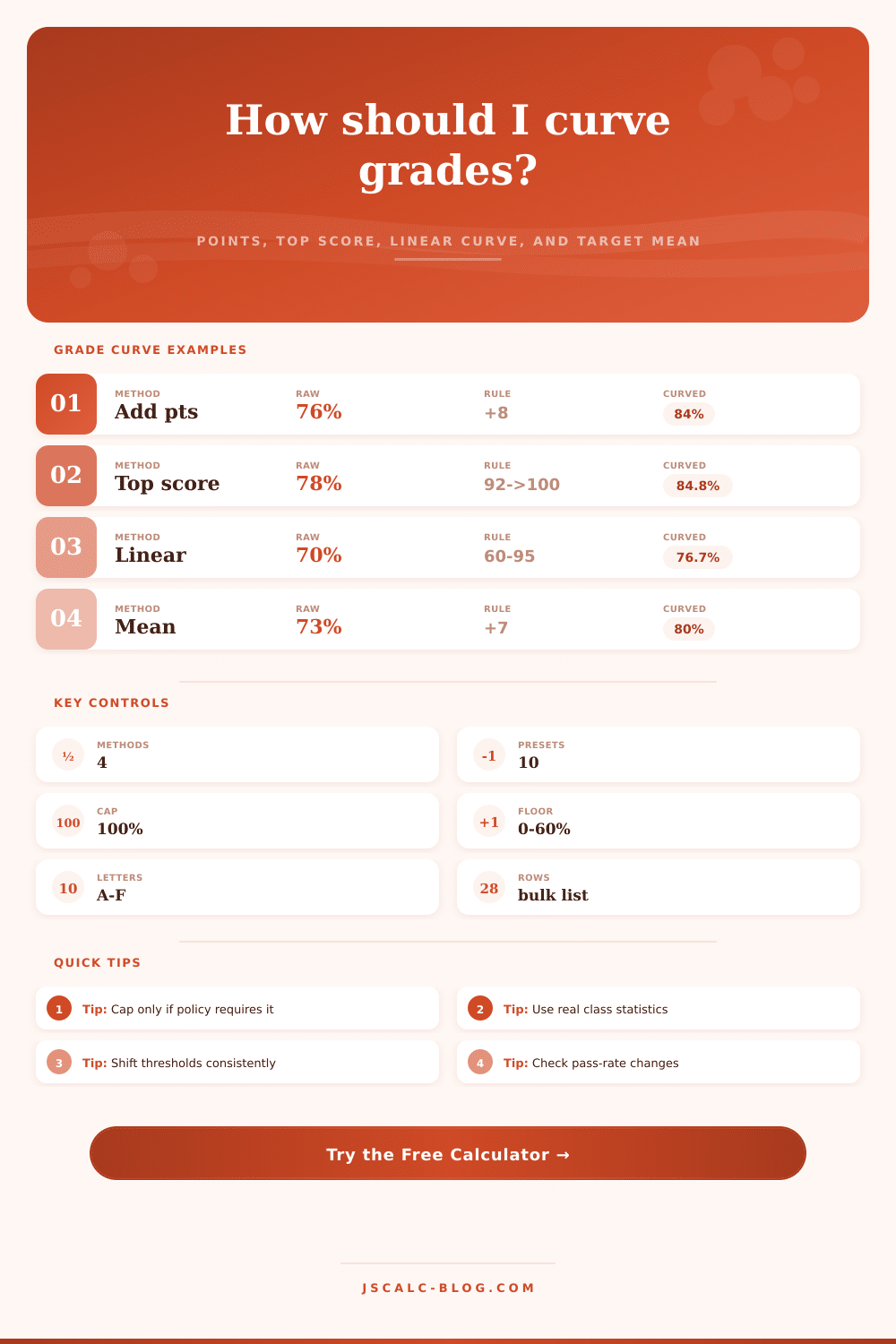
| Hard midterm +8 | Add points | 76 / 100 | Cap 100 | Simple class-wide correction |
| Top score to 100 | Scale top | Top 92 / 100 | Cap 100 | Rewards relative performance |
| Linear quiz anchors | Linear | 55->65 and 94->100 | Floor 0 | Maps pass and excellence points |
| Mean to 78 | Target mean | Mean 70 to 78 | Cap 100 | Centers the class average |
| Lab practical floor | Add points | Bonus 6, floor 50 | Floor 50 | Avoids extreme low outliers |
| Letter shift -3 | Add points | No score change | Threshold shift 3 | Curves only the letter cutoffs |
After, after all, you look at those scantron scores, and see that average of the class was something like 67, and one kid got an 82. And then you get emailed by kids who want to know if they are going to be graded on a curve. Well, it’s fair enough. But it’s also an exercise in numbers crunching, how do we do this fairly, given these numbers? That’s where the calculator comes into play: it’ll help you sort through the numbers and figure out which approach makes sense for you.
Grading curves aren’t realy about doing calculus. It’s about setting people’s expectations.
How to Grade Students Fairly
For example, they might simply tack some number of points onto each score. It seems pretty clear cut: a 76 becomes an 84. The simplicity make it seem clear. But that doesn’t account for effort level. It gives the same bump to a kid who put in hours of work as it does to a kid who didn’t even bother.
It also causes problems with ceilings. If your highest possible score is 95, then bumping up by eight will give you 103. What do you do? Do you just cut off the extra points and make everyone get a 100? That would mean kids would gets different amounts of extra points depending on how many points they already had. Kids wouldn’t know what to expect from their bonus.
Another common approach is scaling to the top score. Here you take the highest raw percentage (say a 95) and set that at 100. The rest are adjusted proportionally. That maintains the shape of the distribution of scores. Those who did better still beat out those who didn’t. But if high score isn’t very good, then this can get pretty brutal. Suppose best anyone did was 60. Then someone with 30 becomes a 50. The grade has been inflated but maybe that person hasn’t gotten much better. It’s a kind of relative competition more than an absolute measure. Some departments likes this for their competitive classes. Others find that it leaves students feeling unsatisfied because they don’t have a standard benchmark.
There’s a compromise called linear anchoring. You pick two points. Maybe you say that a raw score of 60 will anchor to a passing score of 70, but a raw score of 90 will remain an A at 90. The calculator connects those two anchors with a straight line. That softens the curve in the mid-range. It’s a method that feels defensible, because you’ve clearly defined the limits. Where is the floor? Where is the ceiling? Then everything else just falls into place automatically. Two choices up-front, yes, but they’re clearer choices different than a flat point bonus.
A statistical way to target mean curving would be to say, “Here’s what the average is in this class; I want the average to be here.” So if the average is 70 and you’d like it to be 78, you’ll give an additional eight points to every student. That’s simple and centers the distribution. But it doesn’t take into account how spread out the test results are. What if there were two different cluster of people who performed differently on the test? The mean shift won’t close that gap. It will just shift the whole distribution. The whole thing might end up being pretty fair. But kids could think the curve didn’t realy do anything for them, since shape of the distribution hasn’t changed.
The stealth curve shifts the letter thresholds. Leave the actual numbers untouched but push down the cut-off marks where an A starts or a C ends. Now, maybe it’s 87 instead of 90 for an A. So the raw numbers still sting; but your transcript is more flattering. This tends to be less contentious than changing the calculations, since you’re altering how they’re interpreted, not what they are. You’re signaling, “Sure, the bar was high, but we’re repositioning the ruler.” Be clear that you’re doing this. When the student sees that his number didn’t change, but he got a better letter on his report card, he knows something’s up.
Theory meets practice through bulk analysis. Analyzing one score gives no indication of the effect across the entire class. With this tool, you can paste in a list of scores and find out how many students pass/fail according to each method. While a curve may look good on paper, it could accidental cause half of the class to bump up a bracket. It might also not do enough for the struggling student you meant to help. Check total effect before you commit to a method.
There’s no perfect curve. There’s no free lunch for any method. Points are easy and blunt. Scaling is relative but also perhaps too harsh. Anchors are rigid but controllable. Moving the threshold is subtle but may seem unclear. We’re trying to get to a policy you can easily explain. Pick the tiniest change that solves the issue. Tell everyone how you’ll score. Make your method clear. Explain why the scores comes out as they do. Transparency matters more than the precise point value.
Pick a method then don’t move away from it. Consistency builds trust in class.