Household Income Percentile Calculator
See where a US household income ranks against the national distribution: your income percentile, top X% status, dollar gap versus the median, and the income class band, all estimated from published Census-style distribution data.
🎯Quick Income Presets
📝Household Details
Total pre-tax money income for the whole household.
Published distribution basis used for the ranking.
Family and nonfamily use a shifted reference curve.
Label only. Does not change the percentile math.
Used for the per-person income context line.
Optional. Scales income to national terms before ranking.
🔢Method Snapshot
📊US Household Income Percentile Reference
| Percentile | Approx. Income | Top X% Above | Meaning |
|---|---|---|---|
| Calculate to highlight your bracket in this reference table. | |||
🏷Income Class Bands
| Class Band | Rule Of Thumb | Approx. Range | Rough Percentiles |
|---|---|---|---|
| Calculate to highlight your income class band. | |||
🏆Top-X% Threshold Table
| Group | Percentile Cutoff | Income Threshold | Your Status |
|---|---|---|---|
| Calculate to see which top-X% thresholds you clear. | |||
🗂Percentile Interpretation & Comparison Grid
| Sample Income | Est. Percentile | Top X% | Vs Median | Class Band | Everyday Read |
|---|---|---|---|---|---|
| $25,000 | ~16th | Top 84% | –$50k | Poor | Well below median |
| $45,000 | ~31st | Top 69% | –$30k | Lower | Below middle |
| $62,000 | ~42nd | Top 58% | –$13k | Lower-middle | Approaching median |
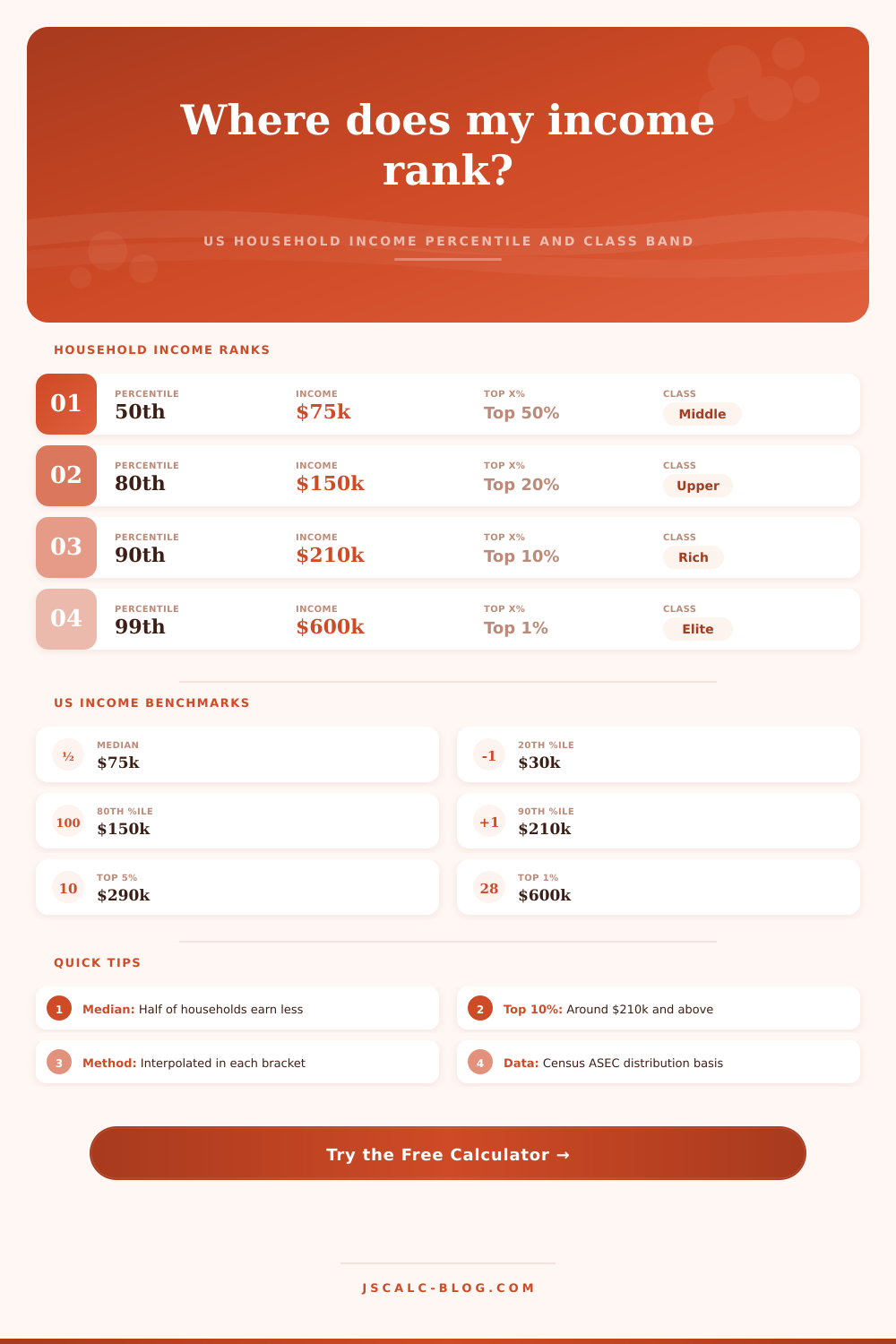
| $75,000 | ~50th | Top 50% | Median | Middle | Right at the median |
| $110,000 | ~66th | Top 34% | +$35k | Middle | Comfortably above |
| $150,000 | ~80th | Top 20% | +$75k | Upper-middle | Top fifth begins |
| $210,000 | ~90th | Top 10% | +$135k | Upper | Top tenth of all |
| $290,000 | ~95th | Top 5% | +$215k | Rich | Top twentieth |
| $600,000 | ~99th | Top 1% | +$525k | Elite | Top one percent |
⚙Formula & Method Breakdown
📋Reference Notes
| Term | Plain Meaning | In This Tool | Watch-Out |
|---|---|---|---|
| Percentile | Share earning below you | Interpolated in bracket | Not the same as top X% |
| Median | Exact middle household | 50th percentile point | Differs from mean income |
| Household | Everyone at an address | All money income summed | Not per-person income |
| Top 1% | Highest one percent | Near the 99th cutoff | Tail values vary by source |
| Class band | Relative-to-median group | Ratio to the median | No single official rule |
💡How To Read Your Result
Maybe you make $75k, and you’re confused as to why everyone says that’s the average or how you can be making so much but feel like you’re scraping by. Maybe you make $200k, and you don’t understand why people think you have money when you feel like you’re scraping by too. The confusion usually come down to not knowing where you actualy sit on the ladder. And income is both personal, it feels like it’s all about you, and it’s statistical.
When you find out what percentile you are in, focus shifts. It moves from talking about abstract numbers like dollars to talking about your relative standing. So go ahead: plug in your house’s stats, along with information about your family, and the calculator up top will do math for you. And it’ll not only provide your rank … but also put you into an income group (which is important, since raw dollars aren’t very meaningful on their own).
How to Know Your Real Income Level
If your annual salary is one-hundred grand, that sounds like a lot … unless you live in high-cost area such as New York or California (in which case, it could be squarely middle class). By providing a way to adjust for different cost of living, the tool take this into account, adjusting your income to national terms prior to the ranking.
People often misunderstand what a percentile means; if you’re at the 80th percentile, you are earning more then 80% of other households. That doesn’t mean you are wealthy in isolation. You just happen to be doing better than four-fifths of your peers. This is where it helps to look at reference table on the page, which explains clearly how hard it becomes to climb higher as you progress through each level of income.
That said, the median is typically where your eyes should of go. It hovers in range of seventy-five thousand dollars these days. Half of us make more than that. Half make less then that. The mean average is skewed upward by a few people with very high earnings; it pulls the overall total up so that we think the typical is something different than it actualy is. And that’s why the calculator calculates using percentiles instead of averages: Percentiles tells you who you are relative to your neighbor; averages lie about reality.
The other thing that can swing the game a lot is the makeup of your home. Sixty thousand bucks for a single earner is very different than a two-income household where both partners brings in $30k each. The calculator lets you flag yourself as single, retired or a member of some sort of extended-family unit. This isn’t going to alter the actual percentile calculation, but it will help show the background. Living off an income in the lower end of the class band while raising five kids is far different than livig alone with that check.
There’s yet another way to interpret classes: Bands. Instead of using arbitrary dollar thresholds, these groupings comes from how your income compares to the median. Earn half or less? You’re in the lower band. Double that and you’re much higher. That’s better than fixed numbers… This ratio-based system adapts as the economy change. Rather than having the definition of middle class drift away with inflation, it stays anchored to the general population.
First, keep in mind that this is all based off a snapshot of time. It’s built off of publicly available Census data. Understanding your percentile ranking help you understand the landscape of your financial position. Percentile scores don’t reflect your savings rate, your assets, your debt, or your spending habits. You can still be in the ninetieth percentile but be broke if you spend all of your money two times over. You can also be in the fiftieth percentile and be in great shape because you have no debt and you own your house outright.
The point isn’t to judge your location; rather, it’s to know what the lay of the land looks like. Much of our society hides those figures in political talk and slick lifestyle advertising. By getting the raw numbers, we can cut through that static. We turn anxious questions of how we’re “doing” into something real: Where do we stand? What’s the baseline? From there, how can we plan to get there?
That “there” might be the top five percent of earners, or it might just be establishing a solid spot near the middle. In the end, money is just one point along the much bigger graph of your happiness. Yet knowing that point lets you plot yourself better across this landscape. It allows you to see your own advancement rather than make comparisons to extremes. And it reveals the truth about where you sit within the grand scheme. It does this regardless of whether or not you like what those numbers say.