Correlation Coefficient Calculator
Enter paired X and Y values to compute the Pearson correlation coefficient r, covariance, and the coefficient of determination r-squared, then read the strength and direction of the linear relationship.
📈Real Data-Pair Presets
🔢Enter Your Paired Data
Separate with commas, spaces, or new lines.
Must have the same count as X values.
🧮Formula Snapshot
📊Computation Table
| # | x | y | x × y | x² | y² |
|---|---|---|---|---|---|
| Enter paired data above to build the computation table. | |||||
📏Correlation Strength Reference
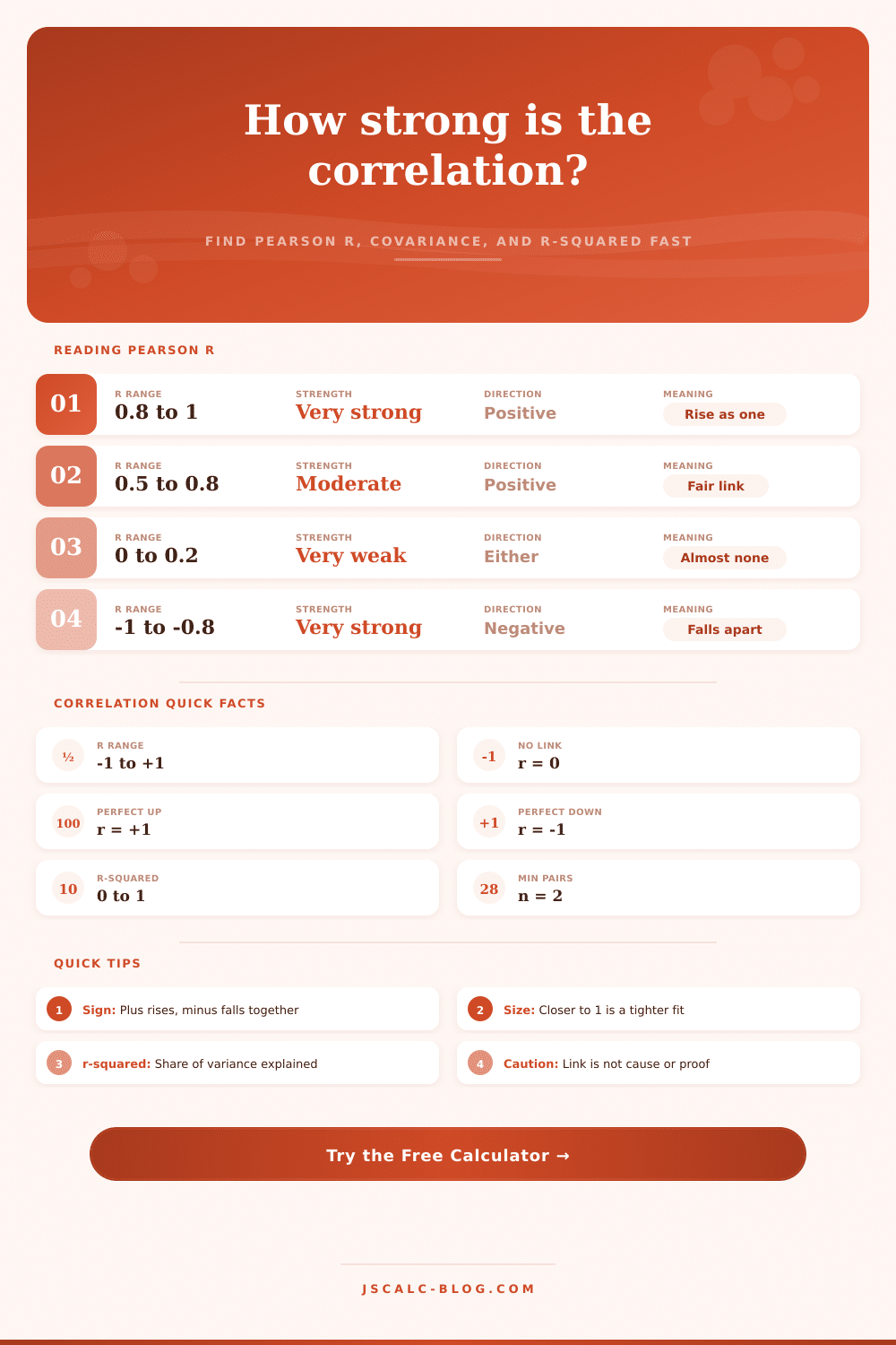
| Absolute r | Strength Label | Positive Meaning | Negative Meaning |
|---|---|---|---|
| 0.00 to 0.19 | Very weak | Barely rises together | Barely falls together |
| 0.20 to 0.39 | Weak | Slight upward link | Slight downward link |
| 0.40 to 0.59 | Moderate | Noticeable upward link | Noticeable downward link |
| 0.60 to 0.79 | Strong | Clear upward trend | Clear downward trend |
| 0.80 to 1.00 | Very strong | Tight positive fit | Tight negative fit |
📐r Versus r-squared Meaning
| Pearson r | r-squared | Variance Explained | Plain Reading |
|---|---|---|---|
| 1.00 | 1.00 | 100% | Every point on one line |
| 0.90 | 0.81 | 81% | Very strong shared movement |
| 0.70 | 0.49 | 49% | About half explained |
| 0.50 | 0.25 | 25% | Quarter explained |
| 0.30 | 0.09 | 9% | Little shared variance |
| 0.00 | 0.00 | 0% | No linear link |
🗂Covariance and Coefficient Comparison
| Scenario | Pattern | Typical r | Sign of Cov | r-squared | Takeaway |
|---|---|---|---|---|---|
| Study vs grade | Rises together | +0.98 | Positive | 0.96 | Very strong positive |
| Height vs weight | Rises together | +0.85 | Positive | 0.72 | Strong positive |
| Temp vs ice cream | Rises together | +0.92 | Positive | 0.85 | Strong positive |
| Price vs demand | Moves opposite | -0.94 | Negative | 0.88 | Strong negative |
| Age vs reaction | Moves opposite | -0.80 | Negative | 0.64 | Strong negative |
| Shoe size vs IQ | Scattered | 0.05 | Near zero | 0.00 | Essentially none |
⚙Full Formula Breakdown
📋Quick Interpretation Reference
| Value | What It Tells You | What It Does Not Tell You |
|---|---|---|
| Sign of r | Direction: plus rises together, minus moves opposite | Which variable causes the other |
| Size of |r| | How tightly points hug a straight line | The slope or steepness of that line |
| r-squared | Fraction of variance a line explains | Whether the true pattern is curved |
| Covariance | Direction plus scale in original units | A bounded, unit-free strength score |
💡Practical Correlation Tips
Suppose you’re looking at two lists of numbers. The first list represent hours studied for an exam; the second list contains your final grade on that exam. There’s a good chance that these variables relate to each other, but let me tell you: Intuition is not a very good statistician. It’ll guess correlations where there are none and miss ones that realy do exist.
That’s when Pearson’s r comes along and does all the heavy lifting. From those two messy columns of data, it squeezes out a single number between plus one and minus one. That number will tell you precisely how tightly your variables hugs a straight line together. And by stripping away the noise, we can more clearly see signal. You can use calculator above to do this for you.
Understanding Pearson’s r
But how do you interpret the answer? You have to look beyond decimal points. For starters, the sign on the number will tell you immediately which way to go. If there’s a plus sign, then the two variables tend to move together, study harder and your grade improves; hot weather leads to higher ice cream sales. Simple: when one moves so does the other.
A negative r-value, however, signals an inverse relationship between the two variables, such that when one goes up the other go down. Price and demand, perhaps? Or maybe something like age and reaction time in some physical task. The variables remains connected, but they move in opposite directions. That directional information can be even better than magnitude, since now you know whether to expect a boost or a penalty from increasing a variable.
Now here’s where you see how strong that link is: it’s the absolute value of r. The closer it gets to plus or minus one, the stronger association. When it hovers around zero, there is almost no linear relationship whatsoever. It would of been like guessing one variable based on the other. About as accurately as flipping a coin. Points will be scattered randomly.
When r is close to plus or minus one, however, those points will be clustered closely around an imaginary line. In most cases with real world data, it will fall somewhere in between (between.4 and.8). This means it’s moderately strong. It is strong enough to be predictive, yet not so strong that we aren’t thinking about other factors.
And r-squared helps us take that strength and put it in terms that might make more sense: How much of the variability in one does the other explain? If r =.7, then r-squared =.5, which tells us about half of the variability can be explained by its relationship with the other variable. The remainder is some kind of mysterious variation.
The danger of this leap is that people mistake correlation for causation. Two things moving together doesn’t imply that one causes the other. Shark attacks and ice cream sales both spike in the summer, but neither summons the predators by eating more gelato. Both are driven by a hidden third variable (in this case, heat). That hidden variable is what the calculator cannot see. All it knows how to report is the mechanical link between your provided columns, and it’s up to you to apply domain knowledge to explain why that link exists.
Before assuming cause, always ask if there’s a plausible mechanism connecting the variables. That said, outliers can be particularly misleading in skewing results. One weird data point might raise (or lower) r, giving an illusion of a strong correlation where there isn’t much or disguising one altogether. The assumption behind Pearson’s approach is that relationship is linear; if yours follows a curve instead, the coefficient could sink to close to zero despite having a perfect pattern. It measures straight lines alone. Examine a scatter plot first if you think your trend is non-linear.
So if you’re inputting your own data make sure that it’s lined up properly. Each row should contain a pair of x and y values where the x value corresponds with the y value in that same row. If they don’t match, then this will mess up the calculation and result in some pretty silly results.
There is also an option to specify whether the data is from a population (i.e., all cases) or sample (a select sub-set). Since we almost never collect data on all instances of any given occurrence, the sample setting is what you’ll want for most practical applications.
To conclude. The coefficient is not a prediction; it’s a snapshot of linear association. So don’t rely on it as evidence; let it inform your hypotheses. Be mindful of outliers, and keep an eye out for the shape of your data. Know that each number represents something in the real world, which the numbers alone can never show. Perhaps there truly is some relationship between those two variables; but perhaps it’s merely coincidental, disguised as causation. That’s where you come in.