Z-Score Comparison Calculator
Compare two raw scores from different distributions using z = (x - mean) / standard deviation, normal percentile estimates, z-rank, SD-unit gap, and equal-z target raw scores.
Enter two distributions to compare standardized standing.
Each raw score uses its own mean and standard deviation. The calculator ranks the scores by z, then translates each z-score into a normal percentile estimate.
| Output | Score A | Score B | Winner or Gap | Interpretation |
|---|
| Reference z | Percentile | Raw score A | Raw score B | Use Case |
|---|
| z-score | Percentile | Upper Tail | Standing Band | Plain Meaning |
|---|---|---|---|---|
| -2.00 | 2.28% | 97.72% | Very low | About two SD below mean. |
| -1.50 | 6.68% | 93.32% | Low | Clearly below typical range. |
| -1.00 | 15.87% | 84.13% | Below average | One SD below mean. |
| -0.50 | 30.85% | 69.15% | Low average | Half SD below mean. |
| 0.00 | 50.00% | 50.00% | Average | Equal to the distribution mean. |
| 0.50 | 69.15% | 30.85% | High average | Half SD above mean. |
| 1.00 | 84.13% | 15.87% | Above average | One SD above mean. |
| 1.50 | 93.32% | 6.68% | High | Clearly above typical range. |
| 2.00 | 97.72% | 2.28% | Very high | About two SD above mean. |
| Scenario | Score A Scale | Score B Scale | Why z Works | Caution |
|---|---|---|---|---|
| Course exam vs standardized test | 0 to 100 | 200 to 800 | Both become SD units. | Use the correct norm group for each test. |
| Two classes with different difficulty | Class A points | Class B points | Means and SDs absorb difficulty. | Small classes can make SD unstable. |
| GPA vs placement score | 0 to 4 | Scaled points | Relative standing becomes comparable. | GPA distributions may be skewed. |
| Regional sales quotas | Units sold | Revenue index | Different units become z-scores. | Seasonal groups should match. |
| Fitness time vs score | Seconds | Points | Direction selector handles lower-is-better. | Only flip rank, not the z formula. |
| Quality defects vs output | Error count | Yield score | Shows distance from each process mean. | Counts may not be normal. |
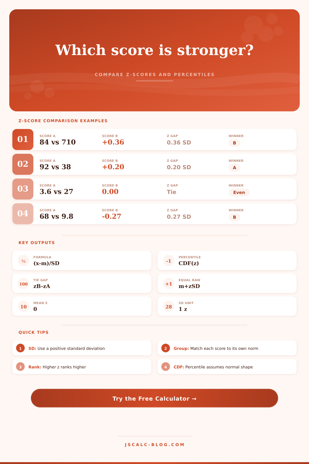
You have an 84 on a math exam and a 710 on a verbal section. One is big, the other is little. Which one indicates greater success compared with others? That’s what students, job applicants and analysts asks when they see raw scores that confuse them. An 84 may be an average score for one student in one class. An 84 may also be a low score for another student in a second class. A 710 may be a mediocre score for one student in one context. A 710 may be an elite score for a second student in a second context. Without knowing where those numbers falls within their respective groups, they don’t tell you anything at all.
Here standardization comes into play. Standardization takes away the noise that comes from different scales. What it does leave behind is signal of relative standing.
How to Compare Different Scores Fairly
To calculate a z-score, you take the difference between your score and the group average, then divide that number by the standard deviation. Your z-score shows how many steps away from the average you are. For example, if you’re one step above the mean, you’re better than roughly eighty-four percent of other people. One step below? You’re worse off then roughly eighty-four percent. The calculator (above) will do all this for you after you input the related means and spreads. No more guesswork required, just plug in your numbers and trust the results.
The first portion of that equation is what most folks understand. But then they fumble with the comparison. Because they notice a higher raw number, they think it’s superior. They ignore that spread also plays a role in these comparisons.
When a test is easy and has very little variance, your scores is close together. Everyone performs well and the standard deviation decreases. A relatively small distance away from the mean are therefore a significant relative accomplishment within this narrow range. On the other hand, when another test is really difficult, scores is distributed widely, and a big jump in raw terms may simply indicate a slight improvement over the mean. This is where the tool is useful. It shows you how far apart two score are in terms of standard deviation units. It converts their raw comparison to a shared language. Instead of comparing apples to oranges, you’re now looking at relative standing.
Another bit of nuance that trips up most people are directional. When we think of good things, we assume more is better. But in metrics like latency, error count or timing test, less is what matters. If you’re measuring number of seconds dropped, -2 on a z-score is great. There’s a toggle for that in the calculator. Without altering any math, it reverses the ranking. Why? Because the formula doesn’t know anything about quality. It knows nothing but how far away from the middle you are. It’s up to you to supply context. That’s where so many people miss the mark. They take a z-score as an absolute score. But it isn’t; it’s just a point in space.
Perhaps the most useful output is the equal-z target. That’s the one that answers the hypothetical: “If I were taking test B instead of test A, what score would I have to get to be at the same level?” It connects the dots between the two worlds. It takes the abstract world of percentiles and translates it back into concrete numbers. So if your class was in the ninety percentile for an exam, how many points did you need to score? What’s the number on the SAT that puts you in the same slice of the pie? It acts like a translator. When you’re trying to compare performance across metrics, this is helpful. How do we create benchmarks so our sales team performs just as well relative to their quota as our support team does relative to theirs? The target scores makes that comparison clear.
But watch out for which reference group(s) you select. A z-score is only as good as the data behind it. The data underlying the z-score will determine how accurate that z-score is. If you use the national average when dealing with a local issue, you may be off base. If the average came from a really small sample (e.g., the average in your small class), and you compare yourself to it, you may feel more accomplished than you actualy are.
And then there’s the whole normal curve thing. The real world is messy. Real data clumps up, it gets skewed, it gets stuck on ceilings. The percentages you get here assume that the world follows a perfect bell curve. They are meant to guide you; they’re not gospel. They provide you with a starting place: a ballpark of what you should expect.
All this isn’t an arithmetic exercise, but rather one of perspective in the end: you have to accept that value is defined by context. A 710 is neither better nor worse than an 84; it just depends on who else was around. And once you look at it that way, once you make that view standardized, then you see the hierarchy clearly. Now, instead of arguing over how big the number is, you’re arguing over the weight of the achievement. And that clarity makes the exercise worth it. Because now you have a fair measure of performance against which you respect the difficulty of what was done. And from there you are able to answer the question: whose score is stronger?