Standard Deviation and Variance Calculator
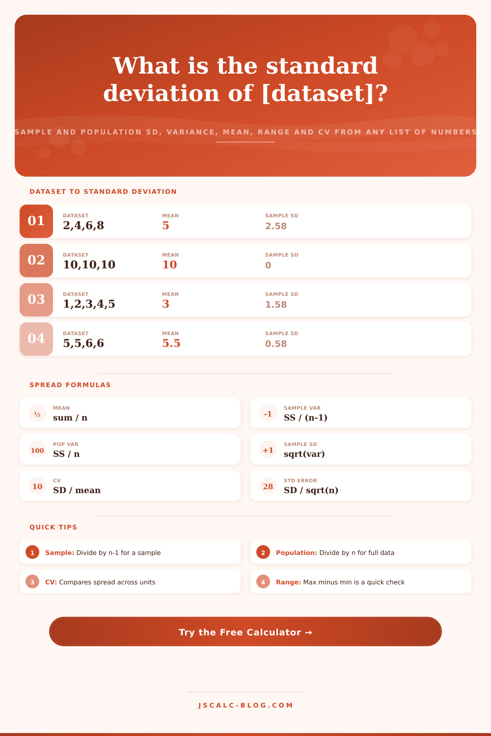
Paste any list of numbers and instantly see sample and population standard deviation and variance side by side, along with the mean, sum, count, range, coefficient of variation and standard error. A live step table shows every deviation from the mean so you can follow the math, not just trust it.
🎯Real Dataset Presets
📝Your Data and Options
Negative numbers and decimals are fine. Blank entries and stray text between numbers are ignored automatically.
Chooses whether the top result cards show the sample (n-1) or population (n) figures.
Rounds every card, breakdown line and step table cell to this many decimals.
Only reorders the parsed list and step table. It never changes the mean, variance or SD.
The live table lists each value, its distance from the mean, and that distance squared.
Marks any value whose z-score exceeds this many sample SDs from the mean in the step table.
CV rescales the spread against the mean so datasets in different units can be compared.
🔢Live Result Snapshot
📑Sample vs Population Formulas
| Quantity | Sample (n − 1) | Population (n) | Meaning |
|---|---|---|---|
| Mean | x̄ = Σx / n | μ = Σx / n | Same average either way |
| Sum of squares | SS = Σ(x − x̄)² | SS = Σ(x − μ)² | Total squared spread |
| Variance | s² = SS / (n − 1) | σ² = SS / n | Average squared deviation |
| Standard deviation | s = √s² | σ = √σ² | Spread in original units |
| Divisor | n − 1 (Bessel) | n | Correction for sampling |
| Use when | Data is a sample | You have every member | Drives which value to report |
🔬Step-by-Step Deviations
| # | Value x | Deviation x − mean | Squared (x − mean)² |
|---|---|---|---|
| Enter data above to build the deviation table. | |||
📈Spread Interpretation Guide
| Coefficient of Variation | Spread Verdict | What It Signals | Typical Example |
|---|---|---|---|
| Under 10% | Very low spread | Values cluster tightly on the mean | Calibrated lab instruments |
| 10% to 20% | Low spread | Consistent, modest variation | Adult heights in a class |
| 20% to 30% | Moderate spread | Noticeable but manageable variation | Daily store sales |
| 30% to 50% | High spread | Values vary widely around the mean | Monthly rainfall totals |
| Over 50% | Very high spread | Mean is a weak summary alone | Individual stock returns |
| Any level | Check outliers | A few extreme points inflate SD | Reaction time misfires |
📏Rules of Thumb for Standard Deviation
| Concept | Approximate Rule | Meaning | Note |
|---|---|---|---|
| Within 1 SD | About 68% of data | x̄ ± 1s covers most points | Bell-shaped data |
| Within 2 SD | About 95% of data | x̄ ± 2s is the common band | Outlier cutoff |
| Within 3 SD | About 99.7% of data | x̄ ± 3s covers nearly all | Empirical rule |
| Z-score | z = (x − x̄) / s | SDs a value sits from the mean | Compares to 2 or 3 |
| Standard error | SE = s / √n | Spread of the sample mean | Shrinks as n grows |
| Variance units | Original units squared | SD returns to original units | Take the square root |
📊Example Datasets Comparison Grid
| Dataset | n | Mean | Sample SD | Pop SD | Variance (Sample) |
|---|---|---|---|---|---|
| Exam scores | 8 | 86.63 | 6.63 | 6.20 | 43.98 |
| Daily sales $ | 8 | 1356.25 | 165.70 | 155.00 | 27455.36 |
| Heights cm | 8 | 169.38 | 2.67 | 2.50 | 7.13 |
| Temperatures F | 8 | 71.50 | 2.45 | 2.29 | 6.00 |
| Lab measurements | 8 | 2.31 | 0.02 | 0.02 | 0.001 |
| Stock returns % | 8 | 0.55 | 1.30 | 1.21 | 1.68 |
| Dice roll trials | 10 | 3.70 | 1.77 | 1.68 | 3.12 |
| Reaction times ms | 8 | 221.88 | 18.80 | 17.59 | 353.55 |
| Rainfall mm | 8 | 27.50 | 16.34 | 15.28 | 266.86 |
| Small sample n=5 | 5 | 13.20 | 7.40 | 6.62 | 54.70 |
⚙Formula Breakdown
💡Choosing the Right Formula
Or maybe it’s a list of numbers… Your daily sales figure at your store, or your exam scores from your last class. Averages are great; they’ll show you where center is, but two set of data can have the exact same average and still be completely different. For instance, one set may hug the center and stay there, whereas the other is spread out in all directions with crazy-highs and -lows pulling the average right back down to earth.
That’s what variance and standard deviation do: they measures how crazy-spread-out your data realy is (or isn’t). Once you’ve got the numbers pasted into text box (the calculator above does all the heavy lifting), you can copy and paste direct from your spreadsheet. The calculator will automaticly read new lines, spaces and commas. But what’s more important than how you enter your data is understanding what the results mean for your particular case.
How to Read Your Data Results
The variance are the average of the squared distances from the mean. It is an abstraction that is difficult to visualize because it is measured in squared version of your original units. That’s where standard deviation comes into play: It takes the square root, returning the measure back to whatever unit you were originally using. So if you use centimeters to measure height, the standard deviation will also be expressed in centimeters, allowing you to understand result without any extra work.
This is where there’s often a pitfall with these kinds of sample versus population calculations: most people assume they’re working with entire picture when what they actualy have is just a slice. In practice, you usually have some kind of subset, or sample, taken from a broader universe. That’s why you need to divide by n minus one (applying Bessel correction) rather than n (which you do if you has all members of the group you care about in your data). That adjustment is a bit more varied, but it does make up for the fact that your sample mean is probably going to be somewhat closer to your actual data points then a true population mean would be. So you can see the difference without having to guess, the tool show both side-by-side.
Standard deviation is unit bound. You can’t compare the spread of human height to the spread of stock returns directly, for example. But the coefficient of variation provide another useful way of comparing two unrelated set of data beyond its core deviation numbers. To achieve this, the coefficient of variation divides the standard deviation by the mean, producing a unitless ratio that makes apples and oranges comparable. A low percentage indicate tight clustering relative to average size, while a high percentage signals volatility. In other words: Regardless of scale, the coefficient of variation will tell us which of our two datasets is relatively more consistent.
Clicking through the tool’s table show all the steps used to arrive at each number (above). That’s the arithmetic going on behind the scenes: every single value plus the difference between each value and the mean, and the square of each of those differences. You should of checked this first. As the tool shows, one outlier adds a lot to the total sum of squares and drive up the variance. This is why they can skew results so much.
The tool allows you to flag values that lie outside of plus/minus two or three standard deviations from the mean. This is where checking your data for outliers comes into play. These flags shows you whether a value is a true signal or just noise to eliminate. These are numbers to interpret within context.
For example, in the world of manufacturing, a low standard deviation indicates reliable, uniform part. This reflects quality control at work. On Wall Street, though, low volatility can sound like safety, but it also implies lower potential returns (depending on the asset class), which means that there’s no such thing as a ‘good’ spread level. It all depends on what you’re expecting from your data and the range provides a quick check against your sanity by displaying the difference between high value and the low value. If the standard deviation is small but the range is huge, then something may be wrong either with your dataset itself or with your expectations of that dataset.
These tools turns the number-crunching back on itself to translate the raw numbers into understanding. By learning what the spread tells us, we no longer treat the average as the entire story. From business performance to scientific experiments, seeing the distribution behind the data means you can’t be fooled by central tendency. The math doesn’t change, but your power to wield it will.
Paste in your data, flag the deviations, and let the numbers show you how stable your world truly is.