ROC AUC Calculator
Enter ROC threshold points to calculate trapezoidal AUC sorted by false-positive rate, plus Gini, best Youden J, sensitivity, specificity, and threshold diagnostics.
🎯ROC Curve Presets
⚙Calculator Inputs
Percent and decimal rates are both accepted.
Names the class behind sensitivity / TPR.
Use 0.10 for 10%; values above 1 are read as percents.
One point per line. In sensitivity/specificity mode, FPR = 1 - specificity and TPR = sensitivity.
🧮ROC Diagnostic Grid
📊Sorted ROC Point Table
🏁Best Threshold Ranking
📐AUC Interpretation Table
| AUC Band | Gini Band | Model Separation | Common Read | Reporting Caution |
|---|---|---|---|---|
| 0.50 | 0.00 | No discrimination | Random ranking | Check labels, leakage, or threshold direction |
| 0.60 to 0.70 | 0.20 to 0.40 | Weak | Some ranking signal | May be useful only with low action cost |
| 0.70 to 0.80 | 0.40 to 0.60 | Acceptable | Practical ranking | Review subgroup performance and calibration |
| 0.80 to 0.90 | 0.60 to 0.80 | Strong | Clear separation | Still choose threshold by costs and capacity |
| 0.90 to 1.00 | 0.80 to 1.00 | Excellent | Very strong ordering | Validate on external or time-split data |
| Below 0.50 | Below 0.00 | Inverted signal | Scores rank backward | Reverse score direction and recompute |
🗂Preset Reference Table
| Preset | Use Case | Point Count | Expected Shape | Threshold Goal | Primary Check |
|---|---|---|---|---|---|
| Oncology biomarker | Diagnostic validation | 9 | High early TPR | Balanced rule-in/rule-out | External validation |
| Hospital triage | Urgent workflow | 9 | Sensitivity heavy | Low missed-case rate | Capacity at FPR |
| Fraud review score | Queue ranking | 9 | Steep at low FPR | Review precision | Alert volume |
| Imaging CAD model | Image classifier | 9 | Strong midrange | Radiologist assist | Dataset shift |
| Credit risk model | Risk ordering | 9 | Moderate lift | Rank stability | Calibration |
| Sepsis warning | Early warning | 9 | High recall region | Catch severe cases | False alarms |
| Spam filter sweep | Classifier tuning | 9 | Strong specificity | Protect inbox | User harm |
| Defect vision line | Quality inspection | 9 | High specificity | Limit scrap review | Defect misses |
| Veterinary herd test | Herd screening | 9 | Screening curve | Group decision | Prevalence shift |
| Noisy classifier | Weak model audit | 9 | Near diagonal | Baseline comparison | Score reversal |
⚖Full Formula Breakdown
💡ROC AUC Tips
Educational calculation only. For clinical, financial, or operational deployment, validate sampling, labels, threshold policy, and uncertainty with the intended population.
A binary classifier is like a gatekeeper. It’s on guard at the door to your workflow, it determines whether a patient receives an MRI, a transaction goes to fraud review, or an email gets directed to spam folder.
To see how well that gatekeeper separates the wheat from the chaff at all possible decision thresholds, we use something called the area under the receiver operating characteristic curve (commonly referred to as AUC). It’s a single number that captures the full spectrum of the tradeoff between false alarms versus catching what matters.
How to Use the AUC Calculator Tool
Most people start with accuracy. They shouldn’t. When classes is imbalanced, which they nearly always are in real world, accuracy falls flat on its face. You could have a model that predict “no fraud” for every transaction and be ninety-nine percent accurate, making it completely useless.
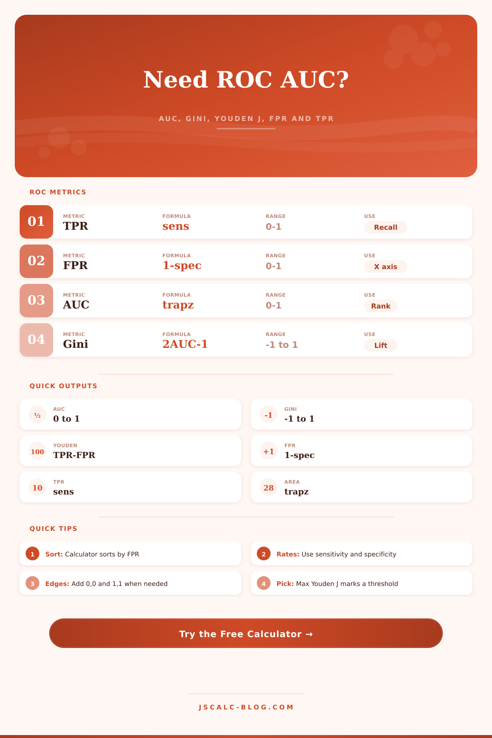
The ROC curve avoids this trap. It plots sensitivity against one minus specificity and allows you to see the performance landscape regardless of where you set the line. That’s where this curve gets an area calculation, using a trapezoid approximation, on this page. And the cool thing about that area: it’s not just a headline number, it’s a solid overview of your ranking quality.
It can dig further. For example, you’ll notice something called the Gini coefficient. That’s simply the AUC rescaled to start at zero. So if you get random guesses, your Gini is zero. If you have perfect separation, your Gini is one. Economists already use this measure to track economic inequality. It works well in this domain too.
Better yet, the tool provides the Youden J statistic, which measures best separating threshold (that is, the point that minimizes the gap between true positives and false positives). Mathematically speaking, that’s the sweet spot. Practically speaking, you don’t usually need balance. You’re trying to avoid missing too many diagnoses in oncology; your trying to reduce the number of nuisance alerts in cybersecurity.
To put this in context, we want to provide some guidance on what is too good or not good enough. There are also some neat reference tables that comes with the tool that demonstrate how various fields understands the same metrics differently. While 70 may be great for a biological assay that’s got lots of noise, it’s unforgivable for a credit risk model where money is involved.
That said, entering the data does take a little discipline. For each threshold point, you must input both its specificity and sensitivity values (and the false-positive rate will be calculated). Chances are good that the raw points were jumbled in whatever machine learning library you exported them from. To compute the area properly, they has to be sorted by false-positive rate, and luckily the calculator does this for you.
Alternatively, you may have missed the endpoints of one-one and zero-zero; simply forcing those endpoints closes the curve and allows for full integration. Duplicate false-positive rates are handled by taking the highest true-positive rate, because that represents the peak performance that’s possible with that amount of error. It is a small detail, but it helps prevent underestimating the area.
Another frequent error is mistaking a high AUC for good predictions. A high AUC doesn’t necessarily mean your probabilities are well-calibrated. You could have an AUC of 0.9, meaning your model ranks everything right, but it believes a ten percent chance is really a fifty percent chance. This is a whole other issue. Calibration isn’t assessed by the ROC curve. The ROC curve assesses rank ordering. For reliable probabilities, you must calibrate independently.
The tool calculates the TPR for a given target FPR by filling in the gaps linearly. This is invaluable for operational planning. You might be able to only review one percent of transactions. What should your recall rate be? The tool tells you this directly and it connects the dots between model performance and real-world limits.
Bottom line: the appropriate threshold is one that works within your budget. Where do you draw the line between false alarms and cases we miss? That’s how much it costs to have something miss a case vs. It is about how much it costs to have something trigger a false alarm. You should of looked at those costs first.
The Youden J point is a good starting neutral point, but ultimately your clinical guidelines (or business logic) should inform the decision. The tool provides the map, but you drive the car.
What distinguishes a data analyst from a data scientist is not only knowing the formula to spit out the number, but what exactly it means. It forces you to think about the implications of error. Whether you are predicting sepsis or filtering spam, choosing where to cut the curve defines what is at stake. Use the calculator above to let it do the math for you so you can spend more time thinking about the difficult part. What sort of error can you live with?