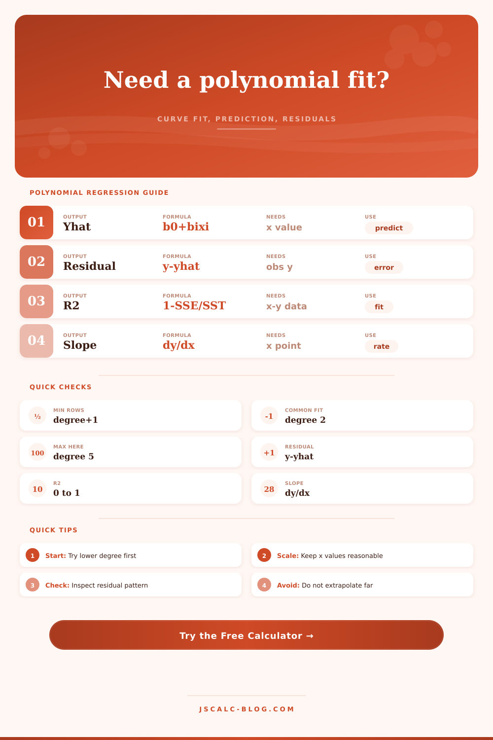
Polynomial Regression Calculator
Fit a least-squares polynomial curve from x-y data, then calculate predicted y, residuals, derivative slope, SSE, SST, R², adjusted R², and row-level fit diagnostics.
Use commas, spaces, tabs, or labels. The first two numbers on each valid line are treated as x and y.
Degree must be lower than the number of valid x-y rows.
The fitted curve is evaluated at this x using y = b0 + b1x + b2x² + ...
Enter a known outcome to calculate the prediction residual y - yhat.
Leave blank to use the prediction x for derivative slope.
Higher precision helps when coefficients are small.
Sorting changes the display table only, not the fitted curve.
Polynomial curves can bend sharply outside the observed x range.
| Term | Coefficient | Power at x | Contribution | Derivative part | Meaning |
|---|---|---|---|---|---|
| b0 | -- | 1 | -- | 0 | Intercept |
| Row | x | Observed y | Fitted yhat | Residual | Residual squared | Fit note |
|---|---|---|---|---|---|---|
| 1 | -- | -- | -- | -- | -- | Waiting for input |
| Degree | Model Shape | Minimum Rows | Common Use | Risk | First Check |
|---|---|---|---|---|---|
| 1 | Straight line | 2 | Nearly constant rate of change | Misses curvature | Residuals curve in one direction |
| 2 | One bend | 3 | Peaks, valleys, diminishing returns | Too smooth for S-shapes | Vertex location in data range |
| 3 | Two bends | 4 | Acceleration then slowdown | End behavior can swing | Compare against quadratic R² |
| 4 | Three bends | 5 | Complex calibration curves | Can chase noise | Residuals and sample size |
| 5 | Four bends | 6 | Dense smooth data exploration | High extrapolation risk | Use only with enough rows |
| Output | Formula | Good Sign | Warning Sign | How to Use | Report With |
|---|---|---|---|---|---|
| Predicted yhat | b0 + b1x + ... | Inside x range | Far outside x range | Use for interpolation and planned prediction | Prediction x value |
| Residual | y - yhat | Near zero | Large compared with RMSE | Checks one known outcome against the curve | Observed y and yhat |
| SSE | sum residual² | Lower than simpler model | Falls only by tiny amount | Compares models fit on the same data | Degree and row count |
| SST | sum y deviation² | Positive spread | All y values equal | Denominator for R² | Mean y |
| R² | 1 - SSE / SST | High with clean residuals | High but wavy residuals | Share of y variation explained by curve | Adjusted R² |
| Derivative slope | dy/dx | Matches expected direction | Sign flips unexpectedly | Reads local rate of change | x where slope is measured |
| Preset | Typical Degree | x Meaning | y Meaning | Pattern | Best Use |
|---|---|---|---|---|---|
| Retail demand curve | 2 | Price index | Units sold | Demand drops faster later | Short-range pricing analysis |
| Plant growth plateau | 3 | Week | Height | Fast growth then flattening | Growth-stage interpolation |
| Sensor calibration drift | 3 | Signal | Measured output | Small nonlinear drift | Instrument correction curve |
| Battery aging bend | 2 | Cycle count | Capacity | Gradual loss then steeper fall | Capacity trend checks |
| Crop nitrogen response | 2 | Nitrogen rate | Yield | Diminishing returns | Agronomy response curve |
| Material stress curve | 3 | Strain | Stress | Nonlinear stiffening | Lab curve fitting |
| Commute traffic peak | 4 | Hour index | Travel time | Morning peak and fade | Schedule interpolation |
| Dose response check | 3 | Dose | Response | Rising curve with taper | Screening assay summary |
| Seasonal load swing | 4 | Month index | Energy load | Winter and summer lift | Facility planning |
| Check | Preferred Range | Problem Signal | Why It Matters | Next Step | Calculator Cue |
|---|---|---|---|---|---|
| Rows per term | At least 3 to 5 | Degree nearly equals n - 1 | Curve may interpolate noise | Lower degree or add data | Rows used versus degree |
| x spread | Even coverage | Big gaps or clusters | Curve bends are poorly anchored | Add points in sparse zones | Residual table x order |
| Duplicate x | Allowed with repeats | Only a few unique x values | High degree can become singular | Average repeats or lower degree | Singular matrix warning |
| Extrapolation | Inside observed range | Prediction x far outside range | Polynomial tails can explode | Limit to interpolation | Status warning |
| Residual pattern | Random around zero | Long positive or negative runs | Model shape may be wrong | Compare another degree | Largest residual row |
| Scale of x | Small to moderate powers | Huge x values at high degree | Normal equations lose precision | Rescale x before entering | Coefficient size check |
Then there are numbers that don’t add up. The sensor readings drifts over time with increasing heat. These are sales volumes over a year. The relationship doesn’t form a straight line. It’s bent. It starts high, levels out, drops off sharply toward the tail-end.
Polynomial regression is your friend here. It doesn’t cram reality into a narrow corridor. It allows the data to create its own shape. You just need to provide enough breathing space and not too much rope to hang itself.
How to Use Polynomial Regression Simply
Least squares fitting is what this tool (above) does for you. What’s that? It calculate the curve that stays closest to all point you provide by looking at total distance.
Paste your pairings into text box. The system reads them. Select your degree. It returns a curve.
The trick isn’t in math. The trick is in selecting the proper degree. Two degrees will suffices at the beginning. That gives you a quadratic curve with one bend. It can absorbs up over peaks and down under valleys but not crazy.
Next, look at the residuals. Is there still some clear pattern? Is there a U in the U shape? Perhaps you want a cubic. Be cautious though: each additional term chase both signal and noise.
Check out R-squared value. This is telling you how much of the variation in your Y values the curve account for. The higher the better; it’s reassuring. It is also tempting. Fit a quintic curve to a few point, and you’ll have an R-squared of point nine nine. Your graph will appear perfectly fitted. And then it will predict that your battery has infinite capacity next week. That’s the polynomial curse.
They are eager to help. They’ll squirm around all those outliers and minimize sum of errors. Here’s where adjusted R-squared comes into play. It punishes you if you add terms which don’t earn their keep. If your adjusted score doesn’t increase when you increase the degree, stop there. In long run, simplicity prevails.
But you know what’s next? Restraint. To predict, you must restrain yourself. Where will this curve land if I feed it with X? Let me know. Put that X into calculator and watch. Did it land within range you provided? Then you’re interpolating. It is safe. There is data on either side of it holding that curve in place.
Did it land beyond the range you provided? Then you’re extrapolating. Ahead, there are no anchors for this curve. It simply continues along last path we saw. This often mean a straight up or down path that makes no sense. That’s why the warning bands exist in the tool, to prevent you from believing in numbers without any foundation. Don’t trust those.
Check the residuals. That’s where you compare what the model predicted with what you saw. And they should be random. No trends. There is no clusters. If you see three points in a row above the line, the degree is probably too low. Then the degree is probably to low. The math missed a bend. One point way out there? Maybe you typed it in wrong; its not a failure of the math.
Nice touch: the derivative slope output will show you the steepness (rate of change) of the curve at any given moment. On demand curve, that means how much sales change when price changes right now.
Make sure your x-values aren’t too big. If you’re raising them to third or fourth power. As in years, timestamps and big ID numbers… Then you need to rescale them. The math will be unstabel. Reduce their range. Make the numbers manageable.
Don’t let the curve get so precise you become confused about what it’s trying to say. Aim for a model which describes the world you’ve got, not one that makes you feel like you’ve been duped by its precision. Low degree is good. Pay attention to the residuals. Stick within the fence. You’ll get more mileage out of the curve.