Point-Biserial Correlation Calculator
Calculate rpb from a binary group and a numeric outcome, then convert the correlation to t, df, p-value, shared variance, and reporting details.
Use commas, spaces, or line breaks. Values are paired in order with the binary codes below.
Use 0 and 1 codes. The sign of rpb depends on which group is coded 1.
| Use case | Binary variable | Numeric outcome | Common direction | Watch point |
|---|---|---|---|---|
| Education | Pass vs fail | Exam score | Pass group higher | Outcome may partly define the group |
| Clinical | Treated vs control | Symptom score | Depends on scale | Lower scores can mean improvement |
| Product | Churned vs retained | Usage minutes | Churn group lower | Code churn as 1 to read sign clearly |
| Marketing | Clicked vs not clicked | Dwell time | Clicked group higher | Outliers can dominate time data |
| Quality | Defect vs no defect | Strength test | Defect group lower | Reverse coding flips the sign |
| Workforce | Certified vs not | Productivity | Certified higher | Selection effects may remain |
| Absolute rpb | Rule of thumb | Shared variance | Typical wording | Caution |
|---|---|---|---|---|
| 0.00 to 0.09 | Negligible | Below 1% | Little linear separation | May still matter in large samples |
| 0.10 to 0.29 | Small | 1% to 8% | Small group separation | Context beats labels |
| 0.30 to 0.49 | Moderate | 9% to 24% | Noticeable separation | Check group imbalance |
| 0.50 to 0.69 | Large | 25% to 48% | Strong separation | Inspect distributions |
| 0.70 to 1.00 | Very large | 49% to 100% | Very strong split | Look for coding or design links |
| Quantity | Definition | Formula | From summary data | Interpretation |
|---|---|---|---|---|
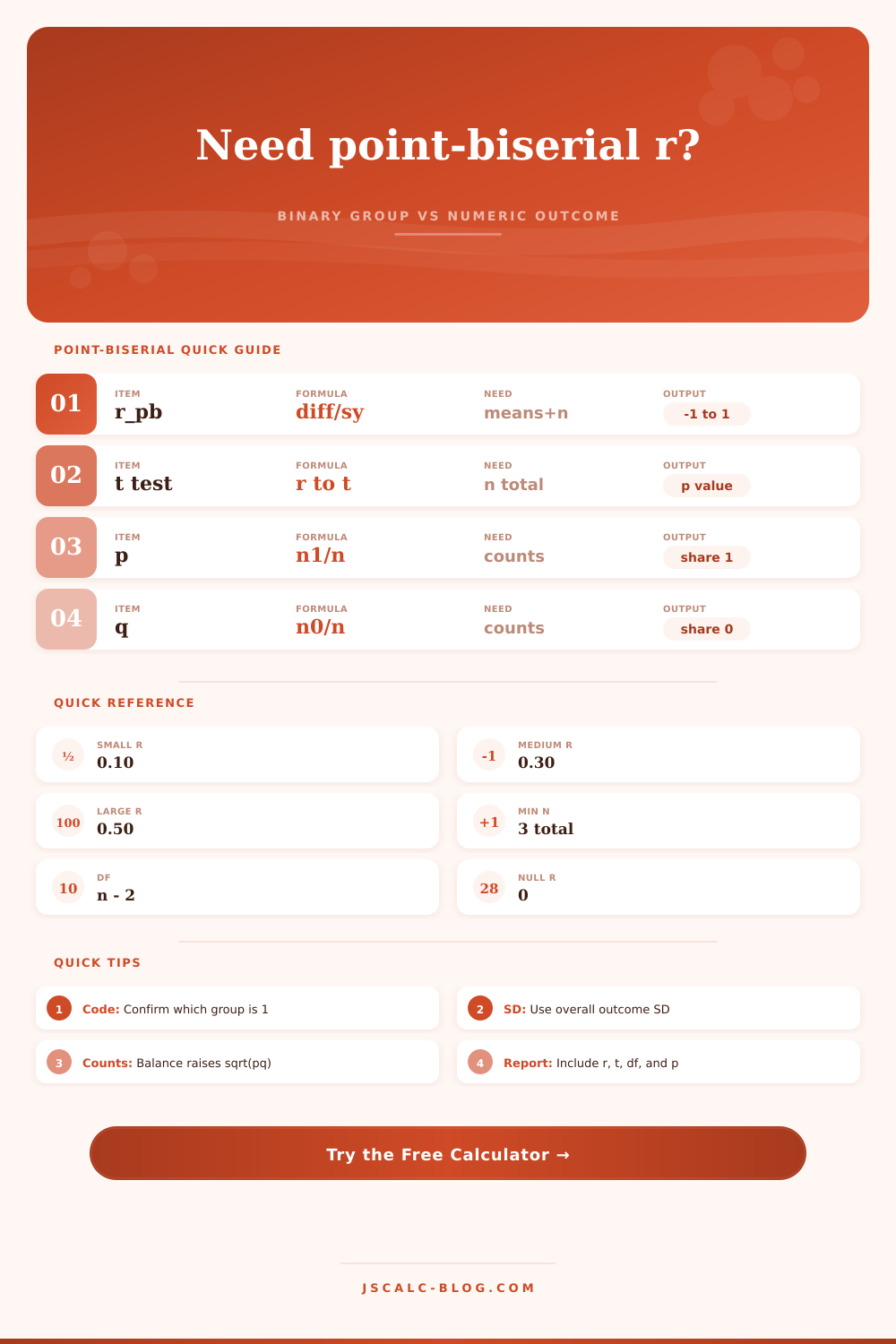
| p | Share in group 1 | n1 / n | Yes | Binary balance term |
| q | Share in group 0 | n0 / n | Yes | Equals 1 - p |
| sy | Overall sample SD | sqrt(SS / (n - 1)) | Computed from group stats | Outcome spread across all cases |
| rpb | Correlation | (M1 - M0) / sy * sqrt(pq) | Yes | Signed group-outcome relation |
| t | Significance statistic | r * sqrt((n - 2) / (1 - r2)) | Yes | Tests H0: r = 0 |
| df | Degrees of freedom | n - 2 | Yes | Used for p-value |
| Report item | Include | Example | Reason | Common mistake |
|---|---|---|---|---|
| Coding | Which group is 1 | 1 = completed | Explains sign | Reporting positive r without labels |
| Descriptives | n, means, SDs | n1 = 42, M1 = 84.2 | Makes result reproducible | Using SE instead of SD |
| Correlation | rpb and r2 | rpb = 0.46 | Shows magnitude | Ignoring direction after recoding |
| Test | t, df, p | t(78) = 4.58, p < .001 | Shows significance | Treating p as effect size |
| Assumptions | Distribution check | Outliers reviewed | Protects interpretation | Skipping plots for skewed outcomes |
It’s a mix of continuous and categorical. For example, a student might pass an exam and also get specific grade. Similarly, a doctor might prescribe treatment and also rate how severe a patient’s symptoms were.
Standard t-tests will just reveal whether the groups differs but won’t indicate strength of relationship; similarly, standard correlation requires a smooth flow off both variables. That’s where the point-biserial correlation comes into play.
What Is Point-Biserial Correlation?
By coding the categorical variable as 0/1 to treat it like a numerical variable, you can compute one coefficient that shows both direction and strength of relationship between the split and the outcome variable. If you know the means, standard deviations, and number of people in each group, the calculator above takes care of all the math for you so you don’t need to tediously piece back together the total variance.
So what is the key metric here? It is the r subscript pb. Like Pearson’s r, it can vary between -1 and +1. But in this case, it has a particular story to tell about separation between the two group.
A positive value mean the group labeled one tends to score higher on the numerical outcome, while a negative value means opposite. And the size of the number tells you how clean the separation is between these groups.
If it is close to zero, then the groups are essentially overlapping so that knowing whether somebody is in one or the other tells us little about how they might scores. Large values mean the group are distinct, and being able to label somebody into one of them provides strong predictive information about their score.
The mistake people make here tends to be about understanding what goes into calculation, specifically the standard deviation. No, averaging the standard deviation of each group does not produce the denominator for this equation. For that, we need the standard deviation of whole combined pool (with respect to all the data points).
That is: how much the groups’ scores spread out and how far apart their means are. And also: how much do the means differs from each other? That’s why the tool requests information not only about the variance/standard deviation but also about group size. These allows it to weight each contribution properly.
In a study with unequal numbers of participants, failing to account for the sample sizes will lead you to over-estimate correlation. A diagnostic grid on the page shows you overall sample SD that it calculated. This lets you check that basis for your answer makes sense.
There are no hard and fast rules of thumb to know how large to consider a correlation. It depends on context. Zero point three may not sound like much, but it’s actualy quite a strong split in social sciences. That same zero point three could be an unimportant bit of noise in quality control or engineering.
The best thing to pay attention to is the common variance (a.k.a., the correlation squared). If you have r equal to zero point five, then this tells you that there is a 25% shared variance. This implies that given the two groups, one can statistically explain 50% of the score differences. This is pretty considerable explanatory power from only one yes or no variable.
That’s where the statistical significance comes in. It tells you how confident you can be that pattern you saw isn’t random chance. If the null hypothesis holds (i.e., if there is no causal relationship), then correlation value will fall within a known distribution. That way, we can calculate an exact p-value.
So what? A small p-value doesn’t imply that effect size matters. Even a tiny correlation will become statistically significant given a large enough sample size. So don’t mistake precision for importance. You want a big enough sample to find out about a meaningful effect; you don’t want a big enough sample to merely confirm that there’s some kind of difference.
But what does it mean in practice? How do you code the binary variable? The intuitive way is to code treatment group as a 1 and the control as a 0. In this case, a positive r indicates that the treatment was associated with higher scores.
You could also flip the coding (the treatment group would then be 0). Now magnitude remains the same, but the sign flips. It’s a simple bookkeeping detail but will change how you interpret the results. Make sure you always indicate which group you coded as a 1 so that others know how to replicate the analysis.
The calculator includes reference tables that give you quick benchmarks for where effect sizes falls into different categories. However, you should always interpret them in terms of the particular area in which they were measured.
The numeric variable itself has outliers that could skew the number and make the correlation either lower or higher than it should of been. The point-biserial uses means and variances. Extreme points will pull the means of each group and stretch the standard deviation. That may hide actual relationships or lead you to believe there are none when they does exist.
It’s a good idea to look at how your data distributes before taking the coefficient as gospel. And if your outcome variable is highly skewed, the correlation may not reflect the nature of relationship completely. In these instances, non-parametric alternatives may be more robust.
To conclude. The point-biserial correlation offers you a standardized measure of effects from one study to another. It allows you to compare how much a product strength defect affects product strength with how much a training program affects test scores. It provides a clean measure of association that is easily interpreted and communicated.
Pull out the tool and get the numbers; rely on your experience to determine if those numbers should matter. The math shows there’s a relationship… Your expertise explains why.