Scatter Plot Correlation Coefficient Calculator
Paste your paired X and Y measurements to get the Pearson correlation coefficient r, the coefficient of determination r², the least-squares regression line, plus means, covariance, and a strength label.
📌Real Data Presets
📝Paired Data Input
Separate values by comma, space, or new line.
Must have the same count of numbers as X.
Type one X and one Y, then click Add Point to append them and recalculate.
🔢Formula Symbols
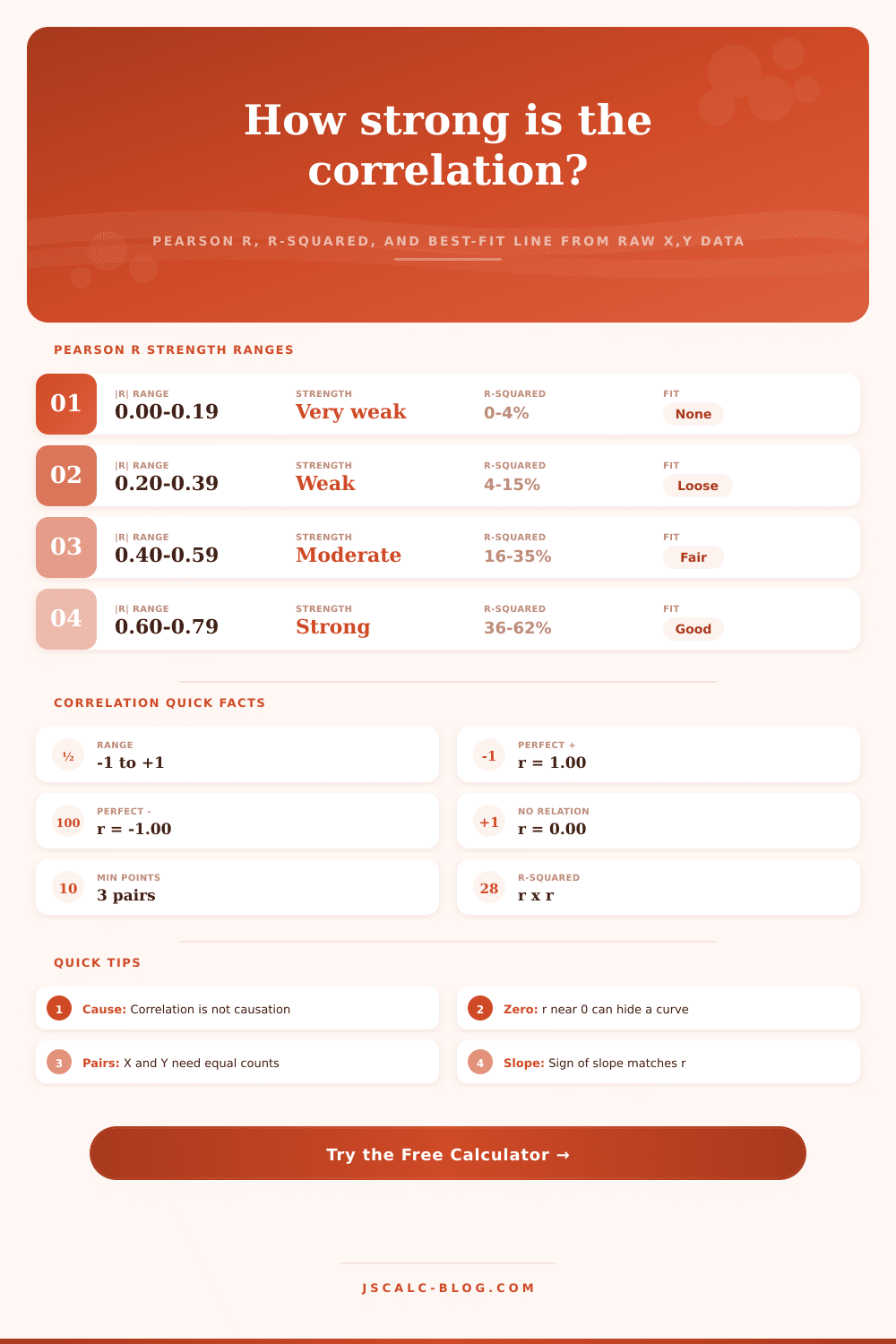
📏Pearson r Strength Ranges
| Absolute |r| | Strength Label | r² Explained | What It Means |
|---|---|---|---|
| 0.00 – 0.19 | Very weak | 0% – 4% | Almost no linear link |
| 0.20 – 0.39 | Weak | 4% – 15% | Slight linear trend |
| 0.40 – 0.59 | Moderate | 16% – 35% | Clear but scattered |
| 0.60 – 0.79 | Strong | 36% – 62% | Tight, predictable |
| 0.80 – 1.00 | Very strong | 64% – 100% | Nearly a straight line |
🧮Worked Sums Example
| Point | X | Y | X × Y | X² | Y² |
|---|---|---|---|---|---|
| 1 | 1 | 2 | 2 | 1 | 4 |
| 2 | 2 | 4 | 8 | 4 | 16 |
| 3 | 3 | 5 | 15 | 9 | 25 |
| 4 | 4 | 4 | 16 | 16 | 16 |
| 5 | 5 | 5 | 25 | 25 | 25 |
| Σ | 15 | 20 | 66 | 55 | 86 |
🗂Dataset Comparison Grid
| Dataset | n | r | r² | Slope | Strength |
|---|---|---|---|---|---|
| Study Hours vs Score | 10 | +0.94 | 0.88 | +5.79 | Very strong |
| Height vs Weight | 10 | +0.87 | 0.76 | +4.44 | Very strong |
| Temp vs Ice Cream | 10 | +0.96 | 0.92 | +10.47 | Very strong |
| Ad Spend vs Sales | 8 | +0.95 | 0.89 | +3.33 | Very strong |
| Age vs Reaction Time | 10 | +0.94 | 0.89 | +2.99 | Very strong |
| Sleep vs Mood | 10 | +0.83 | 0.68 | +0.96 | Very strong |
| Perfect Positive | 6 | +1.00 | 1.00 | +2.00 | Very strong |
| Perfect Negative | 6 | −1.00 | 1.00 | −3.00 | Very strong |
| No Correlation | 8 | +0.14 | 0.02 | +0.12 | Very weak |
| Textbook Set | 5 | +0.77 | 0.60 | +0.60 | Strong |
⚙Full Formula Breakdown
📋r versus r² Interpretation
| Pearson r | r² | Variance Explained | Plain Reading |
|---|---|---|---|
| ±0.30 | 0.09 | 9% | Weak, mostly scatter |
| ±0.50 | 0.25 | 25% | Moderate signal |
| ±0.70 | 0.49 | 49% | Strong, half explained |
| ±0.775 | 0.60 | 60% | Strong textbook fit |
| ±0.90 | 0.81 | 81% | Very strong link |
| ±1.00 | 1.00 | 100% | Points on one line |
⚠Correlation vs Causation Notes
| Situation | Why r Misleads | Better Check |
|---|---|---|
| Lurking variable | A third factor drives both X and Y | Control or hold it constant |
| Reverse cause | Y may actually drive X | Test direction with a design |
| Curved pattern | r near 0 hides a U or arc shape | Always view the scatter plot |
| Outlier pull | One extreme point inflates r | Re-run without the outlier |
| Small sample | Few pairs give unstable r | Gather more paired data |
💡Reading Your Result
Do you have some sort of data? You has two columns of numbers that you suspect is related somehow, but when you look at them, you see just rows of number and wonder if there’s anything to connect them. Maybe you recorded how many hours people studied for an exam and their resulting score. Or perhaps you recorded your ad spend and daily sales.
These numbers seem random. You go across one column and down another, but you don’t quite see the connection. Pearson’s r makes it visible. It turns visual noise into a simple number, ranging from -1 to 1. If it’s 0, then there’s no linear relationship here. If it’s 1, then there is a perfectly upwards sloping relationship. If it’s -1, then there’s a perfect downwards sloping relationship.
How to Use a Pearson’s r Calculator
The calculator does all of this math for you. It gives you the variance explained, the regression line and the coefficient itself. No need for you to do any work with square roots or summations. So what does Pearson’s r measure? Simply put, it measures degree to which your points fall on or close to a straight line.
If increasing X always lead to double Y, then there is a strong positive correlation between them. If higher X equals lower Y, then there is a strong negative correlation. If increasing X results in completely random increases/decreases in Y, then the r will be very close to zero. That’s where a lot of people gets confused. A score of zero doesn’t imply no relation at all between variables. It merely indicates there isn’t a linear relationship between them. There could be a U-shaped pattern that results in an r of zero (because the up-and-down motion cancel itself out).
First, you should of plot your points. This look allows you to avoid overlooking a curvy relationship that formula won’t account for. For instance, r-squared gives you a more useful picture. That’s because it is simply the square of the r value. (Note: The r value represent the percentage of the variance in Y that can be explained by the change in X.) So if I say my r is 0.8, that sounds realy good. But if I square it, I get.64. That means that only sixty-four percent of the variation are explained. That leaves thirty-six percent unexplained by your model.
Do you wish to understand degree of control you have on an outcome? If r-squared is low, then something else must be driving the results. The reference table on the page converts those decimals into words such as “very strong” or “weak.” It anchors numbers in reality so you can decide whether the trend is meaningful.
Outliers are dangerous: One rogue data point will boost or bust your correlation. Suppose you’re taking reaction times for 10 individual. One person has a seizure and logs an unreeslistic score. This will skew all your data. It’ll warp the best-fit line, the true relationship will get pulled towards that outlying value. Before crunching the numbers, check your input values for mistakes.
And remember: correlation doesn’t imply causation. In July, drowning rates goes up and so do ice cream sales. But ice cream isn’t causing anyone to drown. It’s just the heat. There are hidden variables everywhere. Use your background knowledge to understand why two things connect. Don’t just assume it’s because one causes the other.
Paste (or type) your X and Y values in the boxes. You may enter them on separate lines or separated by commas. That way, you can copy-and-paste from a spreadsheet. If you’re collecting data over time, simply paste each point individually. The graph will update immediately with the slope and y-intercept of the least-squares line.
From there, you’ll be able to predict what will happen next, at least within the range that you’ve observed. Beyond that, predictions are just wild guesses. You’d better stay within your range where the data backs up the prediction. For business metrics or scientific measurements, this gives a stark picture of linear association. Where there was only random dots, now there’s a story, of how strong and which direction things is headed.
But remember: your data tells the tale. Garbage in, garbage out. Clean up your data first; then let the math do its magic.