Probability in Normal Distribution Calculator
Enter the mean and standard deviation of a normal distribution, choose a probability type, and get the answer as a decimal, a percentage and a percentile. Values are converted to z-scores with z = (x - mu) / sigma, then the standard normal CDF is evaluated with a high-accuracy erf approximation for P(X below x), P(X above x), P(a to b) and the outside-the-range tail.
📊Choose a Probability Type
🎯Real Normal Distribution Presets
📝Distribution Inputs
Center of the bell curve, the population average.
Spread of the curve, must be greater than zero.
Used for below and above probability types.
Left edge of the range for between and outside.
Right edge of the range for between and outside.
Continuous curves give identical area either way.
Controls the decimal probability display.
🔢Formula Snapshot
📋Z-Score to Area and Percentile
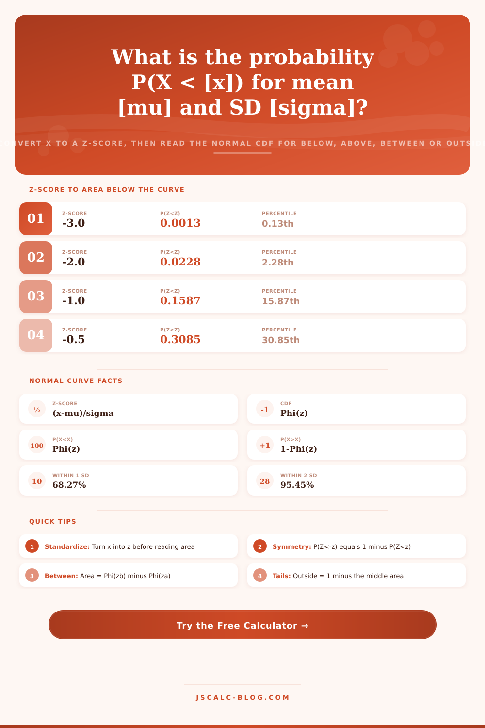
| Z-Score | Area Below P(Z<z) | Area Above P(Z>z) | Percentile |
|---|---|---|---|
| -3.0 | 0.0013 | 0.9987 | 0.13th |
| -2.0 | 0.0228 | 0.9772 | 2.28th |
| -1.0 | 0.1587 | 0.8413 | 15.87th |
| -0.5 | 0.3085 | 0.6915 | 30.85th |
| 0.0 | 0.5000 | 0.5000 | 50th |
| 0.5 | 0.6915 | 0.3085 | 69.15th |
| 1.0 | 0.8413 | 0.1587 | 84.13th |
| 2.0 | 0.9772 | 0.0228 | 97.72th |
| 3.0 | 0.9987 | 0.0013 | 99.87th |
📏Empirical Rule (68-95-99.7)
| Range Around Mean | Z Bounds | Area Inside | Area in Tails | Common Use |
|---|---|---|---|---|
| mu ± 1 sigma | -1 to +1 | 68.27% | 31.73% | Typical values |
| mu ± 1.645 sigma | -1.645 to +1.645 | 90.00% | 10.00% | 90% interval |
| mu ± 1.96 sigma | -1.96 to +1.96 | 95.00% | 5.00% | 95% interval |
| mu ± 2 sigma | -2 to +2 | 95.45% | 4.55% | Empirical rule |
| mu ± 2.576 sigma | -2.576 to +2.576 | 99.00% | 1.00% | 99% interval |
| mu ± 3 sigma | -3 to +3 | 99.73% | 0.27% | Almost all data |
📑Critical Z-Values for Confidence
| Confidence Level | Two-Tailed z | One-Tailed z | Alpha |
|---|---|---|---|
| 80% | 1.282 | 0.842 | 0.20 |
| 85% | 1.440 | 1.036 | 0.15 |
| 90% | 1.645 | 1.282 | 0.10 |
| 95% | 1.960 | 1.645 | 0.05 |
| 98% | 2.326 | 2.054 | 0.02 |
| 99% | 2.576 | 2.326 | 0.01 |
| 99.9% | 3.291 | 3.090 | 0.001 |
🗃Full Z-Score Area Comparison Grid
| Z-Score | Left Area P(Z<z) | Right Area P(Z>z) | Between ±z | Outside ±z | Percentile |
|---|---|---|---|---|---|
| -3.0 | 0.00135 | 0.99865 | 0.99730 | 0.00270 | 0.13th |
| -2.0 | 0.02275 | 0.97725 | 0.95450 | 0.04550 | 2.28th |
| -1.5 | 0.06681 | 0.93319 | 0.86639 | 0.13361 | 6.68th |
| -1.0 | 0.15866 | 0.84134 | 0.68269 | 0.31731 | 15.87th |
| -0.5 | 0.30854 | 0.69146 | 0.38292 | 0.61708 | 30.85th |
| 0.0 | 0.50000 | 0.50000 | 0.00000 | 1.00000 | 50th |
| 0.5 | 0.69146 | 0.30854 | 0.38292 | 0.61708 | 69.15th |
| 1.0 | 0.84134 | 0.15866 | 0.68269 | 0.31731 | 84.13th |
| 1.96 | 0.97500 | 0.02500 | 0.95000 | 0.05000 | 97.5th |
| 2.0 | 0.97725 | 0.02275 | 0.95450 | 0.04550 | 97.72th |
| 3.0 | 0.99865 | 0.00135 | 0.99730 | 0.00270 | 99.87th |
⚙Formula Breakdown
💡Normal Probability Tips
Most quality- and risk-related decisions is driven by the quiet engine of the normal distribution. Your commuting time follow a normal distribution. Your test scores bunch around the average like they do. The number of defects on your manufacturing line follow a known curve.
After you feed in a few numbers (the mean and the standard deviation), the calculator do all the hard work for you, changing abstract bells into real-world probabilities. Without any need for interpolation errors or flipping through a printed table, you recieve your answer back in percentiles, decimals and percentages. Fast. Precise. Guess-free.
How to Use This Tool
But the core of the calculator are standardization. Raw scores becomes z-scores. And all normal curves of any width or narrowness fits onto one single curve. It’s not hard math: you subtract the mean from your number, then divide by the standard deviation. So you know how many steps away from the middle your point is located.
If the z-score is zero, then you’re smack dab in the middle (average). If your z-score is two, then you’re two standard deviations above the norm. That’s where people go astray. They think about raw number, such as “six feet” or “IQ of 130.” They forget that the distribution around the number are equally important. The spread itself is what matters.
The calculator converts all these for you at the touch of a button, allowing you to compare apples to oranges. The tool calculate the area under the curve by applying the cumulative distribution function once the parameters has been standardized. That’s not some abstract mathematical concept; it’s real-world probability. For instance, if you’re testing products on a production line for defects, that area is the number of units that will fail quality control.
Printed tables often round to four decimal places, but this interface employ a high-accuracy approximation of error function. When dealing with very low-tail probabilities, small differences compound quickly and those additional digits becomes meaningful. Yes, it’s a small thing, but when you’re setting tight confidence intervals or auditing safety margins, it matters.
We all have four types of questions about these kinds of curves. We may be interested in the lower tail, like what is the probability that I score under a given GPA? Or maybe we’re more concerned with the upper tail, like how likely are extreme heat waves? Range queries is another common use case. What’s the probability I’m somewhere in-between a pair of bounds, say the tolerance around some design? Finally, we get the complement. This is the probability I am nowhere in those bounds at all, which means it is something extremely rare or an outlier.
Each mode show just enough inputs to answer your question while keeping things clean and focused on your specific problem. Presets based off real world conditions make it easier to relate numbers to actual situations. For example, if you click “IQ less than 115,” all the fields fills in with the typical values: 100 (the mean) and 15 (the deviation). And right away, you notice that that’s below the average for nearly 84 percent of population. Switch it to the blood pressure limits or the range of human temperatures and watch what happens when you apply it to other groups.
The charts on the page reinforce the message by explaining the empirical rule. The chart shows you that approximately 68 percent of any group’s data is going to be within one standard deviation; 95 percent is going to fit into two. That’s a decent sanity check as you’re comparing different than your own findings.
Normal distribution isn’t as much about knowing formulae as it is about seeing spread. The mean anchors you. But the standard deviation tell the story of spread. Is it tight? Most values will be tightly bunched around the average. Is it fat? Extreme values are more common and the tails get fatter too. Using this tool amounts to learning how to read the spread: deciding whether a given outcome represents normal noise or a signal worth investigating.
The numbers comes from the calculator. Your intuition fuels the question. You should of begin with a rough estimate of what feels right, plug in the parameters, and let the math confirm/correct your hunch. Confusion about statistics turns into clear, useful insight.