Mean Absolute Percentage Error Calculator
Compare actual and forecast values with MAPE, sMAPE, WAPE, row-level percentage errors, zero-actual checks, and transparent formula steps.
Rows at or above this APE are highlighted in the diagnostics table.
Used only when epsilon zero handling is selected.
Enter one row per line as label, actual, forecast. Labels are optional, so rows like 420, 405 also work.
Forecast Error Summary
| Row | Actual | Forecast | Error | APE |
|---|---|---|---|---|
| Run the calculator to fill row diagnostics. | ||||
| Metric | Formula | Best For | Watch Out |
|---|---|---|---|
| Run the calculator to fill summary comparisons. | |||
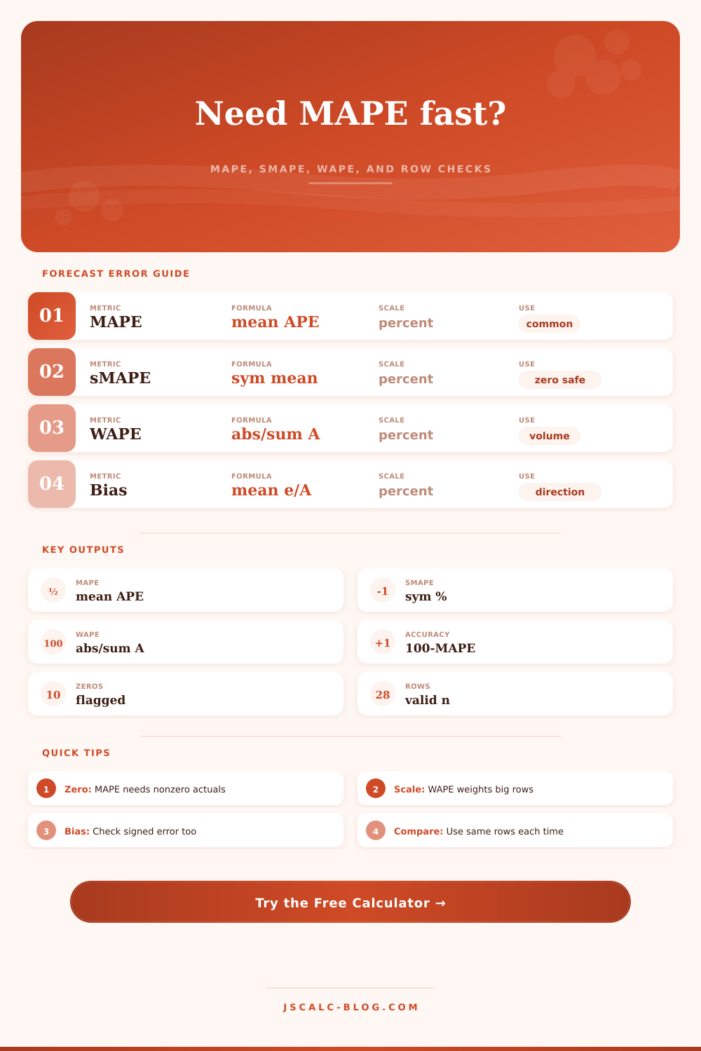
MAPE = (100 / n) x sum |actual - forecast| / |actual|. Rows with actual = 0 need a stated rule because the standard denominator is zero.
sMAPE = 100 / n x sum 2|F - A| / (|A| + |F|). This symmetric form is less dominated by very small actual values.
WAPE = sum |error| / sum actual. The calculator reports it as a percent and expects the total actual value to be positive.
Percent bias = 100 x sum(forecast - actual) / sum actual. Positive bias means the forecast is high in aggregate.
| Forecast Situation | Preferred Metric | Reason | Reporting Note |
|---|---|---|---|
| Stable positive actuals | MAPE | Easy percent interpretation | Use same horizon each time |
| Very small actuals | sMAPE | Reduces tiny-denominator blowups | Still inspect row outliers |
| Mixed item volumes | WAPE | Weights by aggregate demand | Large rows drive the score |
| Executive dashboard | MAPE plus WAPE | Shows typical row and volume error | Name the zero handling rule |
| Launch or intermittent demand | sMAPE plus row table | Zeros make standard MAPE fragile | Separate no-activity rows |
| Forecast calibration review | Bias percent | Shows over or under forecasting | Pair with absolute metrics |
Standard MAPE cannot divide by zero, so keep a count of excluded rows beside the final percent.
A small item and a large item should not always count equally when staffing, inventory, or energy capacity is the decision.
MAPE shows average absolute miss, while bias shows whether forecasts are consistently high or low.
Daily, weekly, and monthly MAPE can tell different stories because aggregation changes percentage error behavior.
Because raw numbers don’t necessarily align with real world accuracy, it’s common for your warehouse floor to appear chaotic while your spreadsheet prediction appears perfect. You want to know how closely your predictions match reality, but this is where it often go wrong. How do you pick the right metric to assess how close they’re aligned?
Well, if you input your prediction and actuals into calculator above, we’ll handle the math. It spits out mean absolute percentage error (plus a couple others of equal importance depending on industry).
How to Check Your Prediction Accuracy
Everyone knows what a percent is, so MAPE (the standard) makes sense (and it’s intuitive). If you have a MAPE of ten percent, then your prediction error is one-tenth of the true value. It all seems straightforward, except for a small problem hidden underneath.
The actual value is used as denominator in the formula, which causes small actual values to be blown out of proportion. When your prediction are off by five units and the actual value is only one unit, then in absolute terms you are way off, but your percent error will be four hundred percent. That will throw off the entire data set, a good model will appear bad if one row like this skews it.
And many do, because that is where most people go wrong: they focus on the overall number and not the distribution of their errors. That’s why the tool also contains symmetric MAPE, or sMAPE. Why? Because it averages the prediction and actual in the denominator, making it stable with zeroes and small numbers in the actuals. Those little denominators can’t dominate the score.
When you’re predicting intermittent demand. Like spare parts for some rare machine; sMAPE tends to be a more accurate picture of how well your model is doing. The individual outlier rows may still bear inspection, but at least the overall score isn’t going to mislead you on just how big a miss there was.
Table of references on the page explains when each one applies.
Another measure is called WAPE, or weighted absolute percentage error. It weights error relative to the volume of the actuals. For example, if you’re off by ten units for a product that sells ten thousand units a month, that’s less harmful than being off by ten units for a product that sells fifty units a month. WAPE understands that and tells you your error rate as a function of the entire volume, rather then just the average of each individual row. Combining both MAPE and WAPE on an executive dashboard provide a full picture. One represents the average row accuracy, while the other represents its impact on bottom line.
Another key decision you must make is how to handle zeros. Because standard MAPE divides by zero, which won’t work, you need some way of dealing with zero rows (no sales). One option is to exclude them, but then that’s changing your sample size. Another option is to include an epsilon value, a small placeholder number, and keep the row in calculation, while not messing up the math.
It’s a philosophical question. Do you assume if there was zero, it was a true zero? Or you might assume your model predicted nothing, meaning that by excluding it, you are assuming it doesn’t matter.
Lastly, consider the bias. Because MAPE is an absolute metric, it masks direction. If your errors is all small in size but consistent. Either always over-forecasting or under-forecasting (then you will get a low MAPE), even though your forecast is off kilter. The bias exposes this drift.
Is your prediction aggregated too high? This would indicate bias to the positive, i.e., you’re carrying excess inventory. Are you leaving money on the table? That’s a negative bias. Check both the absolute error and the signed error. It’s a small habit with the potential to save you from expensive planning mistakes.
“Know what metric you’re listening to, because the numbers are telling a story. Handle your zeros with purpose. Pick the tool that fits your volume profile. Always be aware of directional drift. It’s not a prediction based off the past; it’s a promise about the future. Hold them to that promise. Tighten it up.”