Grade Distribution Calculator
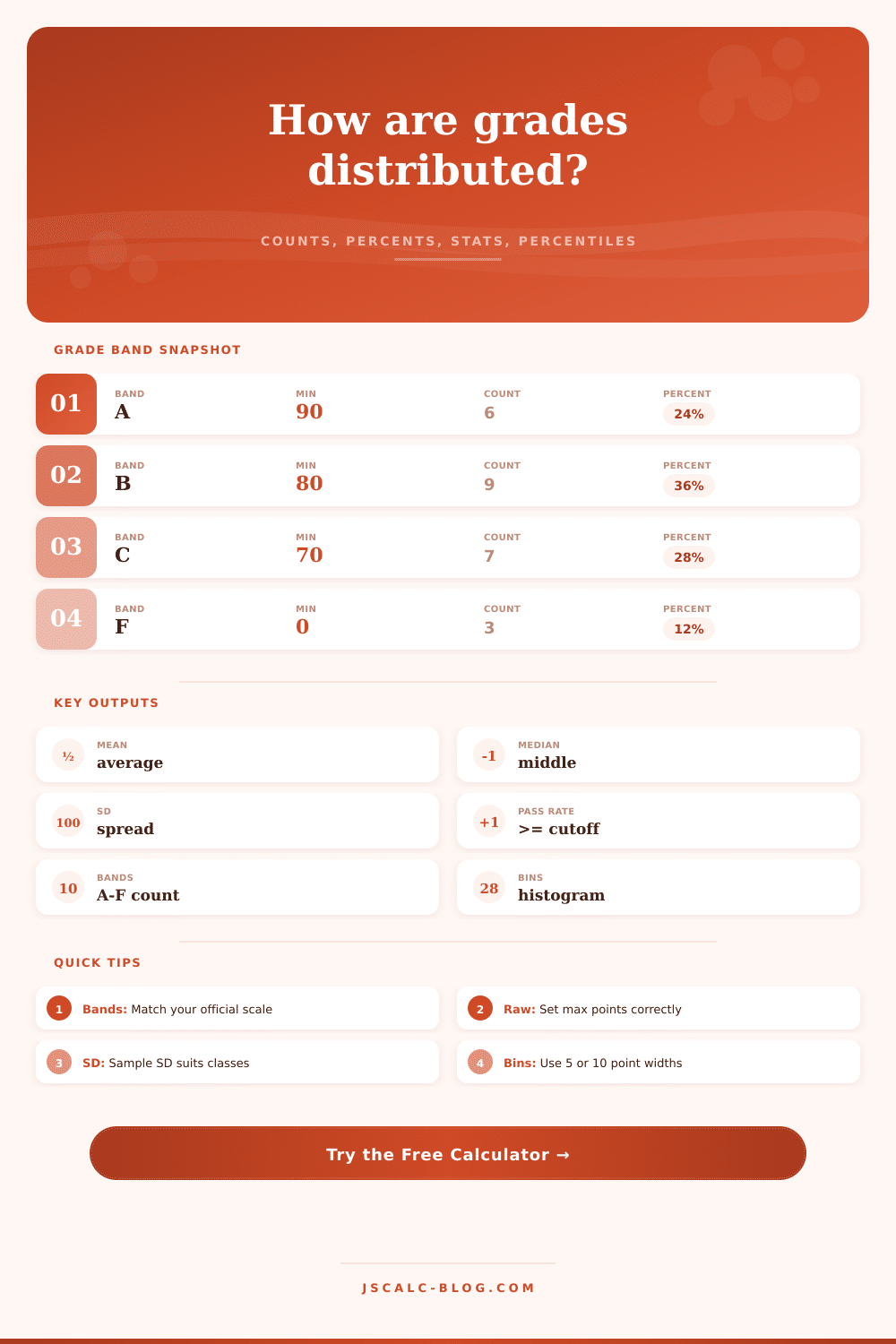
Convert a class score list into grade-band frequency, percent distribution, histogram counts, pass rate, descriptive statistics, and percentile checkpoints from JSCalc-Blog.com.
📌Fast Presets
⚙Score Inputs
Enter scores to calculate the distribution.
📊Distribution Snapshot
📋Grade Band Frequency Table
| Grade Band | Minimum | Upper Range | Count | Percent | Cumulative | Distribution Bar |
|---|---|---|---|---|---|---|
| Results will appear after calculation. | ||||||
📈Histogram Counts
| Score Bin | Lower | Upper | Count | Percent | Histogram |
|---|---|---|---|---|---|
| Choose a bin width and calculate. | |||||
🎯Percentile Bands
| Percentile | Score | Grade Band | Z-Score | Share At Or Below | Interpretation |
|---|---|---|---|---|---|
| Percentile checkpoints will appear here. | |||||
🧮Statistics Breakdown Table
| Metric | Value | Formula Used | What It Means |
|---|---|---|---|
| Summary statistics will appear here. | |||
🗂Grade Scale Reference Grid
ℹFormula Reference
| Calculation | Formula | Input Needed | Use In This Calculator |
|---|---|---|---|
| Grade-band frequency | count scores where score >= band minimum | Score list and band cutoffs | Builds the A-F or custom distribution table. |
| Grade-band percent | band count / valid scores x 100 | Band count and n | Shows each grade share of the class. |
| Mean | sum of scores / n | Every valid percentage score | Reports the class average. |
| Median | middle sorted score, or average of two middle scores | Sorted percentage scores | Shows the central score when outliers exist. |
| Sample SD | sqrt(sum((x - mean)^2) / (n - 1)) | Scores, mean, class size | Best default when the class is a sample. |
| Pass rate | passing scores / valid scores x 100 | Pass threshold | Counts everyone at or above the cutoff. |
💡Practical Tips
The problem is that you usually don’t get to see what actual grade distribution is until it’s too late. Maybe you have a gut feeling that the test was just right or too hard, but when you’re stressed out about grading your memory can be pretty unreliable with gut feelings.
Often times the difference between a harsh-feeling curve and a fair-feeling curve are just a couple of points in the middle. When we have a calculator that plots out how many students got each grade band, that vague anxiety become a concrete visual map. It shows you exactly where the body of the class lie, which is much more useful than just an average score.
Why You Should Look at All the Grade Data
And then there’s that one number we all know (the one we all get wrong: the mean). Maybe you had a couple of kids ace this test and a couple of kids bomb it, so the mean end up right on a C when no one realy got a C. That is why it is important to consider both the mean and the median. The median show you the middle kid, the one whose grade pulls less hard from extreme ends of the spectrum. So if the mean is 72 but the median is 78, you know the few super bad scores pull down the mean. That’s important information when you’re determining whether you should curve the scores, or if you simply ought to contact struggling students.
There’s another silent force at work: standard deviation. This number represent how spread out the scores are. If there’s a small standard deviation, then people did pretty much the same thing, it’s tough to tell who mastered something and who just got by. A large standard deviation indicate that the test was either way above or below average for people (in which case maybe you need to adjust difficulty), or that the students as a whole has different levels of preparation. Most instructors would prefer a medium standard deviation. That give you enough variation in grade to indicate difference without leaving huge chasms open.
You don’t even have to check the math on this one; the tool figures out if you’re using population or sample standard deviation depending on what numbers you put in, and you get to look at the shape of the bell curve instead!
Many teachers gets hung up on setting their grade bands properly. You can select your grading scale, such as strict honors tracks versus standard US scales. You can even choose the country, because UK degree classifications is different than the US. That’s important, because what counts as a ‘pass’ at one school could fail at another. For example, a 70 is a ‘C’ in some systems but a failure in others. When creating a custom scale, make sure you’re specific about your minimums. Raising that cutoff by one point can push a few student from a C to a D, dramatically altering your pass rate. Remember: this isn’t just a mathematical tweak, it impacts students’ morale and whether they graduate or not.
The visuals back up what you are seeing in the data with histograms. When you group the score into bins and plot them out, do they resemble a normal bell curve? Are they skewed far to the left or right? Do you have two distinct peaks (two clear bumps on the graph)? If so, there’s likely something wrong with how you built the test, whether it was loaded with biased questions or wasn’t explained well enough that half the class understood it while the rest was totally lost. Those two humps on the histogram? Red flag! Time for you to go look at what exactly was on that exam instead of just tweak their grades.
Percentile checkpoints provide another level of clarity. For example, it can be far more helpful for me to know my student is at the 80th percentile rather than having recieved a “B.” It puts their results in context. Who’s above them? Who’s below? This is particularly useful in large seminar where individual feedback is limited. The percentile information highlight who is doing well or not so much, without altering the letter grade.
Raw numbers becomes story-telling data about how students are improving. In the end, it’s all about making judgments with data backing up those judgments. There is no escaping the fact that grades are a human judgment process, and you shouldn’t try to escape it either. But there is a way to make this judgment process based off precision rather than guessing. When you see the entire distribution of grades, including the median grade, as well as each student’s percentile ranking relative to his or her classmates, you gets a sense of how the class did overall. This makes for transparent, fair, and defendable grading practices. It isn’t enough to give out letters; we should also know what these letters signify for our students. To do so begins with seeing the big picture, not simply the average.
You should of seen it earlier.