Gini Coefficient Calculator
Calculate inequality from raw values or weighted grouped data using the standard sorted-value Gini formula and the Lorenz curve area method.
Weighted mode treats each value as repeated by its weight.
This changes the interpretation label, not the formula.
Enter nonnegative values separated by commas, spaces, semicolons, pipes, or new lines.
Use counts, population shares, or group frequencies. Ignored in unweighted mode.
The standard income Gini assumes nonnegative values.
The third card reports this group share of total value.
Controls Gini, shares, and table values.
Used only in table headings and the breakdown text.
Gini coefficient results
| Rank | Value | Weight | Weighted value | Cum population | Cum value share | Lorenz strip area |
|---|---|---|---|---|---|---|
| Results load after calculation. | ||||||
| Point | Population share | Value share | Equal-line share | Gap from equality |
|---|---|---|---|---|
| Results load after calculation. | ||||
| Gini range | Inequality reading | Lorenz shape | Useful check | Typical caution |
|---|---|---|---|---|
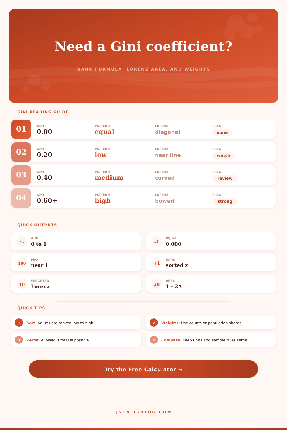
| 0.000 | Perfect equality | On the diagonal | All values equal | Rare outside toy examples |
| 0.001 to 0.199 | Very even | Slight bow | Median close to mean | Small sample noise can dominate |
| 0.200 to 0.349 | Low to moderate | Noticeable curve | Top share modest | Compare only like samples |
| 0.350 to 0.499 | Substantial | Clear bow | Review top and bottom shares | Grouped data may smooth extremes |
| 0.500 to 0.649 | High | Strong bow | Inspect concentration drivers | Outliers can move the result |
| 0.650 to 1.000 | Very high | Deep bow | Check top-heavy rows | Verify zeros and weights carefully |
| Input structure | Use this mode | Weights mean | Best for | Watch item |
|---|---|---|---|---|
| Every person or item listed once | Unweighted | Ignored | Microdata, raw observations | Duplicate rows only if real |
| Grouped by bracket midpoint | Weighted | Group count | Income brackets, frequency tables | Midpoints hide within-group spread |
| Regions with populations | Weighted | Population | Per-capita regional metrics | Do not weight by the metric itself |
| Customer or account segments | Weighted | Segment count | Spend concentration | Separate active from inactive accounts |
| Shares instead of counts | Weighted | Population share | Published decile or quintile tables | Shares should use one scale |
| Negative balances included | Custom | Depends on design | Net worth edge cases | Standard Gini needs care |
The Gini Coefficient measure how equally or unequally a value is divided in a group. Think about a pizza divide among 10 people. On one side of the spectrum, we have a perfectly even distribution where each person get one slice and the Gini coefficient equal zero. On the other end, one person consumes the whole pizza, the remaining nine gets nothing, and the Gini coefficient equals one, an absolute inequality. Values between zero and one represent how much resource flows throughout the group.
It doesn’t take into account the overall quantity of the resource; it only accounts for the shape of its distribution. Whether a countrys total wealth is concentrated at the top or spread through the middle, you don’t need to know the overall wealth to know the distribution. The ratio do that for you. Once the data is entered, the calculator will do all the work for you: integrating and sorting it into something you can understand.
How to Understand the Gini Coefficient
If you’re looking at research citations, customer spending, or household income, it doesn’t matter, they use the same type of calculations under the hood. You can enter your observations either in a raw format (where each entry is considered its own unique observation) or in a weighted format (where each entry is representative of number of other entries). When you input the former, the calculator use the actual count of entries; when you enter the latter, it modifies calculation accordingly to account for how many people are represented by any given entry.
Different kinds of data is tricky to compare. Don’t compare the Gini coefficient of your annual wealth to the Gini coefficient of your monthly income. Those are apples and oranges (time frame and unit). In one area, the Gini might be very high but it might look low in another area just because the baseline is different.
Generally, income distribution is moderate. The distribution of wealth, on the other hand, tends to be much more skewed. Money compounds and builds up over time, creating a gap that salaries alone can not create.
Be sure to keep an eye on top share focus when you input your data. Often times, looking at what the top ten percent holds will tell you more about concentration then the Gini number itself. This gives you a concrete picture. That’s where the sanity check comes in: The interpretation bands show you how much equality or inequality exist. For instance, if the band is marked 0.2 that means there is fairly even distribution. If it’s marked 0.5 then there is a lot of disparity.
But just looking at the number doesn’t give complete picture. Is this an issue of a couple of outliers pulling up the average? Or is this something about the structure of the system?
One thing to watch out for is the Palma ratio, which the calculator will also provide. That’s the ratio between top ten percent and the bottom forty percent. Because it doesn’t include middle class, it can be less volatile than the Gini coefficient. So if the bottom group is flat but the top group get richer, the Palma ratio will go up. It signals pressure on the lower part of the distribution.
The typical calculation model break down with negative numbers. For example, income and number of visits aren’t things that can sensibly be negative; these are nonnegative quantities. The Gini coefficient assume nonnegative quantities. What do you do if your dataset contains deficits? Shift the values or adjust the scale. There’s a setting in the tool to make such an adjustment.
But is it really shifting data so as not to distort what you’re trying to measure? In some cases, it might of been best to simply drop negative values or treat them separately. After all, we want to measure who has what (i.e., measure the inequality of possession), not loss.
But in the end, the Gini coefficient doesn’t pass judgement. Instead, it acts as a way to see the distribution. It is a lens on where the weight is and it doesn’t say whether that weight should be there or not. Whether that distribution is fair or unfair. That is an ethical or political judgement.
What the tool provides is a sense of how the distribution looks. How much area does it cover? How much weight sits at each point on the curve? You don’t need to guess anymore. You have removed the guesswork from the calculation and the sorting, now you have a simple number representing the difference between the haves and the have-nots.
Apply this principle when you look at GDP by region. Apply it when you audit your companys sales accounts. In both cases, you’re drawing the map of the value. The slope you see, you get to decide what to do with it. You’re finally able to see who got the biggest slice.