Correlation Matrix Calculator
Paste 3 to 5 numeric variables with equal row counts and get the full pairwise Pearson r matrix, color-coded by strength, plus the strongest and weakest correlated pairs at a glance.
📌Real Data Presets
🔢Variables & Data
Enter one number per row in each box. Use commas, spaces, or new lines. Every variable must have the same number of rows – extra or blank rows are trimmed to the shortest column.
Pearson r Correlation Matrix
🧮Pearson r Formula
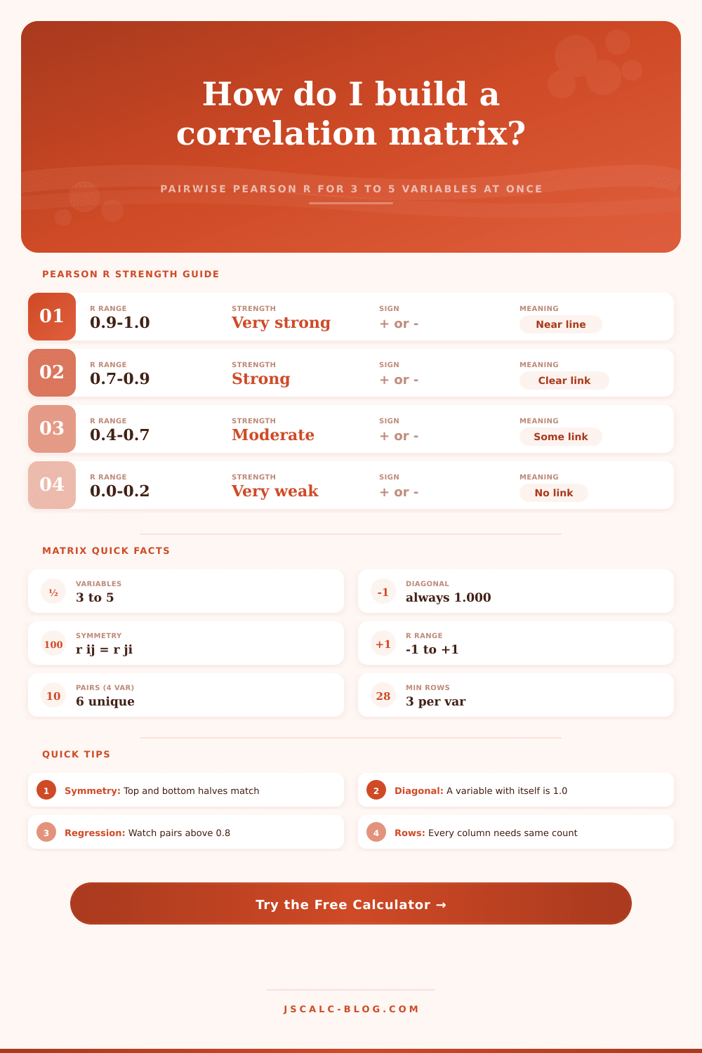
📐r Strength Ranges
| Absolute r | Strength | Positive Meaning | Negative Meaning |
|---|---|---|---|
| 0.90 to 1.00 | Very strong | Move up almost together | Move opposite almost exactly |
| 0.70 to 0.89 | Strong | Clear upward link | Clear downward link |
| 0.40 to 0.69 | Moderate | Noticeable rise together | Noticeable inverse trend |
| 0.20 to 0.39 | Weak | Slight positive tendency | Slight negative tendency |
| 0.00 to 0.19 | Very weak / none | Little to no pattern | Little to no pattern |
🗺Matrix Interpretation Guide
| Cell | What It Shows | Read It As | Watch For |
|---|---|---|---|
| Diagonal | r of a variable with itself | Always exactly 1.000 | If not 1, data is misaligned |
| Off-diagonal | Pairwise Pearson r | Sign gives direction | Sign flips change meaning |
| Upper triangle | Same values as lower | Mirror of bottom half | Matrix is symmetric |
| Near ±1 cell | Very tight linear link | Strong association | Possible multicollinearity |
| Near 0 cell | No linear association | Effectively unrelated | May still be curved link |
📊Example 3×3 Matrix
| Study Hrs | Sleep Hrs | Exam Score | |
|---|---|---|---|
| Study Hrs | 1.000 | 0.214 | 0.905 |
| Sleep Hrs | 0.214 | 1.000 | 0.481 |
| Exam Score | 0.905 | 0.481 | 1.000 |
⚙How Each r Is Computed
⚠Correlation Cautions
| Caution | Why It Matters | Practical Check |
|---|---|---|
| Not causation | A high r does not prove one causes the other | Look for a lurking third factor |
| Linear only | Pearson misses curved U-shaped links | Plot the pair before trusting r |
| Outlier pull | One extreme point can inflate or hide r | Inspect min and max rows |
| Small n | Few rows make r unstable | Prefer 10 or more paired rows |
| Multicollinearity | Pairs above 0.8 distort regression | Drop or combine one variable |
💡Matrix Reading Tips
Start with a few (three or five) variables whose relationships you suspect but don’t see directly. Your intuition is shown as a matrix of numbers called a correlation matrix; each number measure how much two variable move together. The calculator calculates all the pairwise relationships at once, helping you find patterns instantly.
Finding links is just half the job; it’s knowing what links is strong enough to trust and which are noise. Pearson’s r is a measure of linear association, it will only reflect straight line relationships between two variables, such that when one increases (or decreases), so too does the other. It returns a number between -1 and +1; the closer to +/- 1, the more strong tied they are, while anything nearer zero mean there is essentially no linear connection whatsoever.
Understanding Correlation Matrices
To calculate this, Pearson adjusts the inputs by chopping them down to their lowest common denominator: rows with fewer entries than others gets trimmed. Only the pairings matter to the math, so even though your initial samples may be unequal in size, they must be paired observations. That is to say, if one column contain six entries and another column contains ten, then only the first six pairs will be accounted for in the calculation.
All correlation matrices has a diagonal that’s always equal to 1. Each variable have perfect correlation with itself (it’s a mathematically guaranteed anchor point). It’s the rest of the off-diagonal cells that describe the actualy nature of the variables in your dataset. Because the matrix is symmetric (the bottom left mirror image of the top right), you only really have to read through one triangle to grasp all the pairwise interaction. An example of how the calculator visualizes this help you quickly scan for dominant relationships and outliers without getting bogged down in redundant information.
The grid do reveal one quick pitfall of multicollinearity, two variables can be very highly correlated with one another. This muddies the estimation process. It inflates the standard errors and offers redundant information to a regression model. A practical starting point would of been to look at cells beyond plus or minus 0.8. High correlations mean that you may wish to combine these variables into an index or drop one altogether. It’s better to have fewer unique predictors different than a lot which say the same thing.
These coefficients is easily influenced by outliers. One outlier can change results massively, such as hiding a true trend completely or making us think there is a strong relationship when there isn’t. You can look at your raw data before running the calculator to make sure there aren’t any obvious outliers, if your ad spend spikes but your sales don’t then that point will drag the correlation closer to zero because it distorts the data. It’s important to know what individual points mean so we can understand the story that lies behind the rows. It’s all too easy to believe the number and forget the story.
To that end, they also break out strength categories to give people an expectation of how linear these things are (very strong = almost linear; moderate = has a noticeable tendency but a lot of variance; weak = subtle effect, maybe just statistics noise or drowned out by other factors); the table on page breaks it out well there too. Red is generally negative alignment, green generally positive, and darker means more intense, since that’s a quick visual indicator that helps speed up the analysis pretty substantialy.
This brings me back to the most cited statistic in the room: correlation doesn’t equal causation. The number of drowning incidents and the amount of ice cream sold increase together. But that’s because there is a third underlying factor, which is that it’s hot out. There will be no change in cause and effect until you can describe how the variables move together with domain knowledge… The matrix show the link, not the way it works. You get the “what”; now fill in the “why. Then use the strongest pair to confirm your hunch and the weakest to poke holes in it.
Because the grid isn’t a crystal ball. It’s a diagnostic tool that helps show relationships so you can decide more intelligently which ones to follow up on, discard, and keep around. Begin with what you’ve got. Let the matrix expose how things is connected. Then use your judgment, interpret this smartly.