Coefficient of Determination Calculator
Find R², the share of variance in y explained by x, from a known correlation r or from paired x and y data. See percent explained, percent unexplained, and adjusted R².
🎯R-Squared Presets
📝Inputs
Must be between –1 and 1. R² = r × r.
In data mode, n is counted from your points.
Simple regression uses k = 1.
🔢Formula Snapshot
📊r to R-Squared Reference
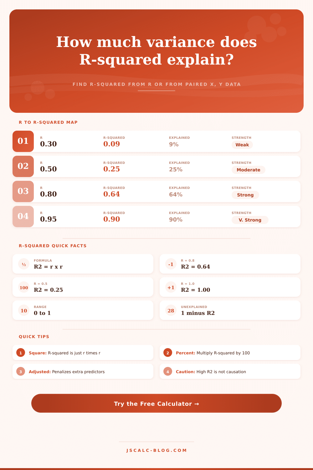
| Correlation r | R² = r×r | % Explained | % Unexplained | Typical Read |
|---|---|---|---|---|
| ±0.10 | 0.010 | 1.0% | 99.0% | Negligible link |
| ±0.30 | 0.090 | 9.0% | 91.0% | Weak |
| ±0.50 | 0.250 | 25.0% | 75.0% | Moderate |
| ±0.70 | 0.490 | 49.0% | 51.0% | Strong |
| ±0.80 | 0.640 | 64.0% | 36.0% | Strong |
| ±0.90 | 0.810 | 81.0% | 19.0% | Very strong |
| ±0.95 | 0.9025 | 90.3% | 9.7% | Very strong |
| ±1.00 | 1.000 | 100.0% | 0.0% | Perfect fit |
🗂R-Squared vs Correlation Comparison Grid
| Scenario | r | R² | % Explained | % Unexplained | Strength |
|---|---|---|---|---|---|
| Almost none | 0.15 | 0.0225 | 2.3% | 97.7% | Negligible |
| Weak positive | 0.30 | 0.090 | 9.0% | 91.0% | Weak |
| Moderate | 0.50 | 0.250 | 25.0% | 75.0% | Moderate |
| Fairly strong | 0.65 | 0.4225 | 42.3% | 57.7% | Moderate |
| Strong | 0.80 | 0.640 | 64.0% | 36.0% | Strong |
| Very strong | 0.90 | 0.810 | 81.0% | 19.0% | Very strong |
| Near perfect | 0.98 | 0.9604 | 96.0% | 4.0% | Very strong |
| Negative strong | –0.85 | 0.7225 | 72.3% | 27.7% | Strong |
📏R-Squared Strength Interpretation
| R² Range | % Variance Explained | Fit Reading | What It Suggests |
|---|---|---|---|
| 0.00 – 0.04 | 0% – 4% | Negligible | x barely explains y |
| 0.04 – 0.25 | 4% – 25% | Weak | Small share explained |
| 0.25 – 0.49 | 25% – 49% | Moderate | Useful but incomplete |
| 0.49 – 0.81 | 49% – 81% | Strong | Most variance explained |
| 0.81 – 1.00 | 81% – 100% | Very strong | Model fits closely |
⚙Adjusted vs Regular R-Squared
| Measure | Formula | Adds Predictor Penalty | Best Used For |
|---|---|---|---|
| R² | r² or 1 – SSres/SStot | No | Simple regression fit |
| Adjusted R² | 1 – (1–R²)(n–1)/(n–k–1) | Yes | Multiple predictors |
| Explained % | R² × 100 | No | Reporting share of variance |
| Unexplained % | (1 – R²) × 100 | No | Residual variance left over |
🧮Full Formula Breakdown
💡R-Squared Tips
You’ve probably heard people say “correlation doesn’t imply causation.” That’s true, and it’s a useful phrase taught in stats classes, but it don’t tell us very much about what’s strong enough to qualify as a real relationship. That’s where the coefficient of determination comes in.
The coefficient of determination turn abstract association into something more concrete: variation explained. If you hear that two variable are highly correlated, then your intuitive sense will likely be that there points on a scatterplot fit snugly onto a line. That’s an intuitive feeling, but the coefficient of determination assign a definite numerical value to that intuition. It tells you how much one variable’s movement accounts for the others.
What is the Coefficient of Determination?
This idea come up a lot, and it’s understandable: It’s a simple bit of math. Take the Pearson correlation coefficient and square it. Suppose you have an r value of 0.8. Squaring it produces 0.64. That decimal is the amount of variance in the dependent variable that can be predicted from the independent variable. (In plainer English: 64 percent of the changes in Y are explained by changes in X.)
All the rest, including measurement error, other factors, or just plain randomness; is left unexplained. This difference between explained and unexplained variance is where many people gets tripped up intuitively. They think their correlation is strong, say, a 0.7, because that sounds high, but it explains only 49 percent of the variance. Almost half of the story remain untold.
To do this stuff ourselves would of been tedious arithmetic; thankfully there’s a calculator up top that takes care of it for us (and gets out of your way so you can worry about interpreting what the numbers mean). Simply type in the correlation value you know (or paste in two column of paired data and let the calculator figure out the stats for you).
There are also some handy presets for common use cases that show just how fast the ability to explain things decreases with weaker correlations. It look pretty moderate at 0.5, but already leaves three-quarters of the variance unexplained. That’s the difference between knowing you’ve got something that works, versus really having a predictive model that does work.
Oh, and the tool spits out an adjusted R-squared, which punishes models for including irrelevant predictors. This is important: Throwing more variables at the problem almost certainly increases the raw R-squared score, even if those variables don’t really explain anything in terms of prediction. Only meaningful improvements in fit get rewarded, and adjusted R-squared reward honesty.
Once you grasp what explained variance means, you begin to judge the strength of a relationship different depending on whether the field is psychology or engineering. Correlations is typically quite weak (by engineering standards) in social science. If you’re accustomed to the kinds of equations in physics, an R-squared of 0.25 may seem disappointing. However, this is a large chunk of the variance in human behavior. That implies there are lots of thing influencing the result, yet your particular predictor have a large impact.
The table below breaks out those ranges and assigns labels like “strong,” “moderate” and “weak.” Those terms is somewhat subjective, but they can serve as a common frame of reference when talking about the performance of models. It’s not necessary to remember the precise cut-offs; just know that larger numbers corresponds to lower amounts of noise in your signal.
The problem arises when people confuse how well a model fits the data with proof that one thing causes another. That’s not true at all. It merely measures how well a model fit the data. A model could have a perfectly good fit even though the variables is falsely related. For example, the number of drownings can be highly correlated to the sale of ice cream, since both are caused by the same thing: temperature. In this case, the relationship is spurious. The model fits the data perfectly, yet there is no causal relationship.
Don’t accept the strength of statistics as evidence of causation until you have some theoretical reason to believe that it exists. The numbers are given to you from the tool; it’s up to you to judge what they mean in context. In the end, it’s about what piece of your result you can anticipate and have some influence over. It could be the impact of ad spending on sales. Or the effect of studying time on exam results. Being able to state exactly X percent of the variation is explained by Y lets you create reasonable expectations.
However good your moddern model gets, there will always be an unknown component that you simply can’t predict. That bound is as valuable a metric as the power of the relationship itself. And the correlation, squared, provides you with that insight. It transforms a fuzzy feeling of linkage into a measured slice of the world around you.