Screen Aspect Ratio Calculator
Enter a screen width and height in pixels, millimeters, or inches and this tool reduces the ratio by the greatest common divisor to a clean form like 16:9, shows the decimal ratio and the X:1 form, reports orientation, and snaps to the closest standard aspect ratio with the percent deviation.
🖥Real Resolution Presets
📏Screen Dimensions
Horizontal size of the display.
Vertical size of the display.
Ratio is unitless, but rounding differs by mode.
Useful when physical measurements are imprecise.
If rounding is on and a standard is within this, use it.
Controls the decimal ratio display.
🔢Ratio Snapshot
📋Standard Aspect Ratios and Resolutions
| Aspect Ratio | Decimal (W/H) | Common Resolution | Typical Use |
|---|---|---|---|
| 4:3 | 1.333 | 1024 x 768 | Old monitors, tablets |
| 5:4 | 1.250 | 1280 x 1024 | Legacy SXGA displays |
| 3:2 | 1.500 | 2160 x 1440 | Surface, some laptops |
| 16:10 | 1.600 | 1920 x 1200 | Productivity monitors |
| 16:9 | 1.778 | 1920 x 1080 | HDTV, most screens |
| 1.85:1 | 1.850 | 1998 x 1080 | Cinema flat |
| 64:27 (21:9) | 2.370 | 2560 x 1080 | Ultrawide monitors |
| 2.39:1 | 2.390 | 2048 x 858 | Cinema scope |
| 32:9 | 3.556 | 3840 x 1080 | Super ultrawide |
| 1:1 | 1.000 | 1080 x 1080 | Square social posts |
🎯Marketing Name vs True Reduced Ratio
| Marketing Name | Resolution | True Reduced Ratio | Decimal |
|---|---|---|---|
| 21:9 ultrawide | 2560 x 1080 | 64:27 | 2.370 |
| 21:9 ultrawide | 3440 x 1440 | 43:18 | 2.389 |
| 21:9 ultrawide | 5120 x 2160 | 64:27 | 2.370 |
| 16:9 HD | 1366 x 768 | 683:384 | 1.779 |
| 32:9 super | 5120 x 1440 | 32:9 | 3.556 |
| 2:1 univisium | 2560 x 1280 | 2:1 | 2.000 |
🔄GCD Reduction Examples
| Width x Height | GCD | Divide By GCD | Reduced Ratio |
|---|---|---|---|
| 1920 x 1080 | 120 | 1920/120, 1080/120 | 16:9 |
| 2560 x 1440 | 160 | 2560/160, 1440/160 | 16:9 |
| 1024 x 768 | 256 | 1024/256, 768/256 | 4:3 |
| 1280 x 1024 | 256 | 1280/256, 1024/256 | 5:4 |
| 2560 x 1080 | 40 | 2560/40, 1080/40 | 64:27 |
| 3440 x 1440 | 80 | 3440/80, 1440/80 | 43:18 |
| 3840 x 2160 | 240 | 3840/240, 2160/240 | 16:9 |
🗃Resolution Comparison Grid
| Name | Width | Height | Reduced | Decimal | Orientation |
|---|---|---|---|---|---|
| XGA | 1024 | 768 | 4:3 | 1.333 | Landscape |
| SXGA | 1280 | 1024 | 5:4 | 1.250 | Landscape |
| WXGA | 1280 | 800 | 16:10 | 1.600 | Landscape |
| Full HD | 1920 | 1080 | 16:9 | 1.778 | Landscape |
| QHD | 2560 | 1440 | 16:9 | 1.778 | Landscape |
| UW-FHD | 2560 | 1080 | 64:27 | 2.370 | Landscape |
| UW-QHD | 3440 | 1440 | 43:18 | 2.389 | Landscape |
| 4K UHD | 3840 | 2160 | 16:9 | 1.778 | Landscape |
| Super UW | 3840 | 1080 | 32:9 | 3.556 | Landscape |
| Phone Portrait | 1080 | 2340 | 18:39 | 0.462 | Portrait |
⚙Formula Breakdown
💡Aspect Ratio Tips
And then, once you’ve got this sixteen-to-nine screen, you put your video in and realize: whoops, there’s all these black bars! But why? Because when you’re talking about screens, it isn’t just “how wide,” and “how high.” It’s the mathematical relationship between those two numbers that matters.
Most people mistake resolution for an image size, i.e., a fixed thing, and therefore get tripped up on the idea of proportion. You could have a small little four-hundred-by-three-hundred image, and a huge big one at thirty-eight-hundred by two-thousand-one-hundred-and-sixty; but so long as their proportions matches, they’ll plug right into each other perfectly, with no need to crop or stretch.
Why Aspect Ratio Matters for Your Screen
After plugging your dimensions into the calculator above, it will do all the math for you. You won’t have to guess if a number like one thousand three hundred sixty-six divided by seven hundred sixty-eight is good enough for standard high definition, and you won’t have to reduce fractions yourself.
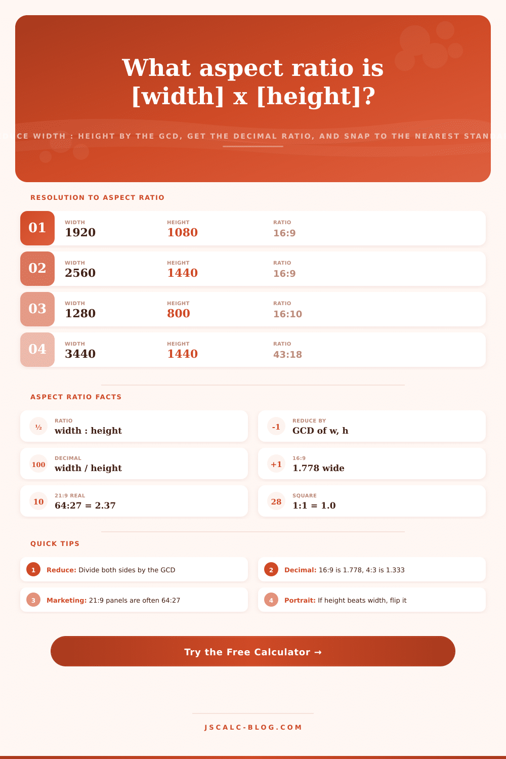
What is an aspect ratio? It is nothing more than a set of two whole numbers (with no common factors) representing the width over height. A monitor with full HD resolution are really nineteen twenty by one thousand eighty, although we don’t say it that way; both numbers is divisible by one hundred twenty. Get rid of that greatest common divisor, and what do you have? It is sixteen to nine.
Why does this matter? Human brains are good at spotting simple ratios (like sixteen-to-ten), but they are not so good when it comes to seeing any kind of relationship between big integers. This tool takes a big integer (a resolution) and whittles down to something simpler (a ratio). The algorithm is called Euclid’s method, and it’s super old and works like this: Take two numbers. Divide the larger by the smaller, then replace the larger number with the remainder until one side reach zero. Whatever’s left is your divisor. In our example of nineteen twenty and one thousand eighty, the divisor is one hundred twenty, which easily simplifies to sixteen up-top and nine on the bottom.
So what’s that mean to you in real life? To get back to why software should care about the decimal version, if you’re working on a podcast thumbnail or creating a banner ad, you’ll need to provide your creative package with a ratio like two or one point six. That’s simply the width-to-height without rounding down to whole numbers. And those couple-hundredths-of-a-percentage-point will determine if your image spans the full frame or must be letterboxed with ugly black bars at either side. Your tool takes that decimal and spits it out to let you see how weird ratios compare to standard industry norms quickly. It also knows immediately if it’s a landscape or portrait shot. Is the width larger then the height? It is a landscape shot. Is the height larger? It is a portrait shot. Are they the same? It is a square. Turns out squares are pretty popular these days as social media graphics, short attention spans and tighter spaces.
Almost everybody gets tripped up by the difference between marketing names and mathematics. Take ultrawide monitors. They’re advertised as having a twenty-one-to-nine aspect ratio. This means two point three three three. In practice, they don’t deliver precisely that. For example, a monitor with two thousand five hundred sixty pixels across by one thousand eighty tall has an aspect ratio of 64:27, or roughly 2.37. That’s not far off, but it’s enough that if you use it to display genuine twenty-one-to-nine video, you’ll get black bars down one side. The calculator reveals the truth by displaying both the actual reduced ratio and the nearest standard equivalent. It lets you know that even though your monitor might say “twenty-one-to-nine,” in fact it’s slightly wider, so you have an idea what will fit.
Additionally, there’s some noise introduced by taking physical measurements. Rulers aren’t perfect, after all. You’re bound to end up with some sort of messiness when measuring something like the distance between two monitor bezel in millimeters. They won’t break down nicely. For such cases, the tool has a rounding toggle. Here, you’ll enter a tolerance percentage (e.g., one and a half). The tool will snap the resulting decimal value to a standard ratio if it lands anywhere near it. This avoids awkward fractions if you obviously have, say, a sixteen-to-nine panel. It’s a little thing, but it helps close the loop between abstract theory and real-world hardware.
It’s what designers will use to verify a client asset before they send it off to web or print. Gamers will inspect it to see if that old title will letterbox in their ultrawide setup, which was designed for narrower frames. What developers rely on when they’re creating responsive layout CSS and setting an aspect-ratio rule.
Those pesky decimals help establish a common ground between those who need to know. They help reduce the guesswork behind a number that determines how something looks to the rest of the world. It distills a confusing mess of pixels down to a clear geometric truth that we can actualy work with.