Aspect Ratio Resize Calculator
Resize any image or video while keeping its exact proportions. Enter the original width and height, then set a new width, a new height, a fit box, or a scale percent, and this tool returns the missing dimension, the scale factor, and how much the total pixel area changes so nothing ever looks stretched or squashed.
🖼Choose a Resize Mode
🎯Real Resize Job Presets
📝Resize Inputs
The current pixel width of your image or video.
The current pixel height, used to hold the ratio.
Target width; height is solved to match.
Target height; width is solved to match.
Widest the result may be inside the box.
Tallest the result may be inside the box.
Fit letterboxes; fill covers and trims overflow.
100 keeps size, 50 halves, 200 doubles each side.
Off lets width and height move independently.
Even is safest for video codecs that need 2 px steps.
🔢Formula Snapshot
📋Common Resize Targets and Results
| Original | New Width | New Height | Use Case |
|---|---|---|---|
| 3840x2160 | 1920 | 1080 | 4K down to 1080p |
| 1920x1080 | 1280 | 720 | 1080p to 720p HD |
| 1920x1080 | 640 | 360 | Web preview clip |
| 1200x628 | 728 | 381 | Link banner ad |
| 1080x1080 | 512 | 512 | Square avatar |
| 1080x1350 | 540 | 675 | Instagram portrait |
| 2048x1536 | 1024 | 768 | Tablet 4:3 photo |
| 1600x900 | 300 | 169 | Thumbnail strip |
📊Scale Percent to Pixel Area Factor
| Scale Percent | Scale Factor | Each Side | Pixel Area | Direction |
|---|---|---|---|---|
| 25% | 0.25 | Quarter side | 0.0625x area | Downscale |
| 50% | 0.50 | Half side | 0.25x area | Downscale |
| 75% | 0.75 | Three quarter | 0.5625x area | Downscale |
| 100% | 1.00 | Same side | 1x area | No change |
| 150% | 1.50 | 1.5x side | 2.25x area | Upscale |
| 200% | 2.00 | Double side | 4x area | Upscale |
| 300% | 3.00 | Triple side | 9x area | Upscale |
📏Fit Box vs Fill Box Behavior
| Mode | Scale Chosen | Result | Cropping | Best For |
|---|---|---|---|---|
| Fit inside | min(W/ow, H/oh) | Whole image shown | None, letterbox | Full artwork visible |
| Fill or cover | max(W/ow, H/oh) | Box fully covered | Overflow trimmed | Backgrounds, banners |
| Stretch off | W/ow and H/oh | Exact box size | None, distorts | Only when ratio equal |
| Set width | nW/ow | Width exact | None | Fixed column width |
| Set height | nH/oh | Height exact | None | Fixed row height |
🗃Resize Comparison Grid
| Original | Mode | Target | New Width | New Height | Scale | Area Factor |
|---|---|---|---|---|---|---|
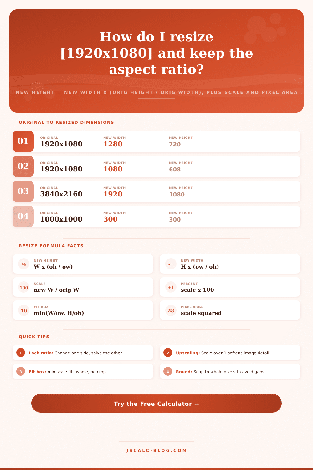
| 1920x1080 | Set width | 1280 px | 1280 | 720 | 66.7% | 0.444x |
| 1920x1080 | Set width | 1080 px | 1080 | 608 | 56.3% | 0.316x |
| 3840x2160 | Set width | 1920 px | 1920 | 1080 | 50.0% | 0.25x |
| 1000x1000 | Set width | 300 px | 300 | 300 | 30.0% | 0.09x |
| 1200x628 | Set width | 728 px | 728 | 381 | 60.7% | 0.368x |
| 800x600 | Percent | 50% | 400 | 300 | 50.0% | 0.25x |
| 1080x1350 | Set height | 675 px | 540 | 675 | 50.0% | 0.25x |
| 1500x1000 | Fit box | 1080x1080 | 1080 | 720 | 72.0% | 0.518x |
| 1500x1000 | Fill box | 1080x1080 | 1620 | 1080 | 108% | 1.166x |
| 640x480 | Percent | 200% | 1280 | 960 | 200% | 4x |
⚙Formula Breakdown
💡Resize Quality Tips
Why do most image edits go wrong? Because somebody made an image too small (or big) but forgot to lock aspect ratio. Stretch a logo into a banner, now it’s all wonky and stretched out. Shrink a portrait down for a sidebar, and boom, they is all squished up. It’s a mistake that everyone makes at some point; where we think of “width” and “height” as two independent variables rather than always livig together in a locked relationship with each other. This page prevents that mistake by calculating the right size so that your image keeps its original proportions, no matter how much you resize it.
What’s aspect ratio? Just the width-to-height relationship, written as a fraction. For instance, standard HD video is 1080 pixels high and 1920 wide; 1.778 (we say “16:9”). An Instagram post in square format is 1080 by 1080; 1.0 (yes, realy). That’s the aspect ratio; it doesn’t refer to any specific size at all, but just to the relative proportions of width versus height. A huge billboard and a teeny thumbnail could both be said to be in same aspect ratio.
How to Resize Images Without Stretching
What happens when you resize an image? You want to maintain the same division, but change overall scale. Double the width, and you need to double the height too. Cut the width in half, and you do the same to the height. The calculator above does that math for you at once; no guessing, no reaching for a spreadsheet.
The most confusing thing is that people assume if they scale up or down equally in all dimensions, it will be linear everywhere, but it isn’t. “The scale factor only affects the dimensions. The scale factor affects both dimensions and the pixel count. The number of pixels goes up and down exponentially, which is what most people don’t get. If you make something 50% of its original width/height, then some people would assume that amount of data/density should be cut in half. Actualy it’s squared, because area is scaled by the square of the factor. So half the length on a side = one quarter of the total area. Twice as long = four times as many pixels. That has implications for storage and bandwidth. To help you predict that, we show you the areal change explicitly so you know how light/heavy the file will get before you export.
Upscaling is another beast altogether. If you’re pushing the scale factor past 100 percent, you’re asking software to create detail that isn’t there. Shooting a photo at 640 by 480 pixels means you’ve got a limited number of pixels in your image. Push it out to 200 percent, and you spread those same old pixels across a far greater area of canvas. The outcome is softness. Fine details become mush; edges blur. There’s no magic algorithm for adding back sharpness where none existed. Keep images crisp by starting with the largest original you can get and shrinking down from there, averaging pixels together while you downsize still maintains sharpness. Enlarge them, and they never does.
Other times you’re given a container rather than a dimension. For example, instructions might say, “The image must appear in a 1080 by 1080 square area on our website.” This creates two options. In the first strategy, the “fit” mode, it’ll calculate the minimum scale necessary for the whole image to display inside the box, with blank bars at the top, bottom, left or right. (This is letterboxing.) You maintain a complete view of the composition, but sacrifice some screen space.
In the second strategy (the “fill” or “cover” mode), it does the exact opposite, scaling the image until it completely covers the box, cropping parts of its edges along the way. You gain no background space, but you may crop out some vital detail. Pick whichever you value more: fullness or visibility.
Rounding up is less important if you’re just a casual photographer, but very much so for web developers and video editors. Many video formats (like H.265 and H.264) needs their dimensions to be even numbers and multiples of two. So if you calculate something with 607.5 pixels height, it won’t work. There’s no such thing as half a pixel on a screen. While photos can round to the nearest whole number without any issue, it’s better to round up to next even number when dealing with video encoded using H.264 or H.265. This helps avoid rendering errors and the dreaded odd green lines along the edges of frames we all know from time to time. The tool offers an option to automatically snap your results to these safe values.
So in the end, it’s all about respecting original geometry. The right proportion ensures logos keep their identity. Faces also won’t look like cartoons, whether they are used for a landing page background or a blog post thumbnail. Just let the ratio be your guide and you’ll be able to transform the size while leaving the soul of the image intact.