Contrast Ratio Calculator
Measure display contrast as white luminance divided by black luminance to get a ratio like 1000:1 and its dynamic range in stops, or switch to WCAG mode to compute the sRGB text contrast between two colors and check it against the AA and AAA accessibility thresholds.
🌓Choose a Mode
🎯Real Contrast Presets
📝Contrast Inputs
Peak brightness of full white, in cd/m squared.
Brightness of full black. Use 0 for a perfect OLED black.
The color of the text or icon in the foreground.
Six digit sRGB hex like #2D3436.
The color behind the text or icon.
Six digit sRGB hex like #FFFFFF.
Large text has lower WCAG thresholds.
Controls rounding on every result card.
🔢Formula Snapshot
🖥Display Contrast Examples
| White nits | Black nits | Contrast Ratio | Stops |
|---|---|---|---|
| 100 | 1 | 100:1 | 6.6 |
| 250 | 0.5 | 500:1 | 8.97 |
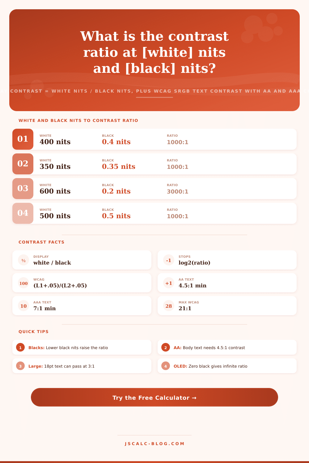
| 400 | 0.4 | 1000:1 | 9.97 |
| 600 | 0.2 | 3000:1 | 11.55 |
| 450 | 0.09 | 5000:1 | 12.29 |
| 800 | 0.008 | 100000:1 | 16.61 |
| 1000 | 0 | Infinite | Infinite |
| 120 | 0.4 | 300:1 | 8.23 |
♿WCAG Text Contrast Thresholds
| Level and Text | Minimum Ratio | Applies To | Example Pair |
|---|---|---|---|
| AA large text | 3.0:1 | 18pt or 14pt bold | #767676 on white |
| AA normal text | 4.5:1 | Body copy | #595959 on white |
| AA UI and graphics | 3.0:1 | Icons, borders | #949494 on white |
| AAA large text | 4.5:1 | 18pt or 14pt bold | #595959 on white |
| AAA normal text | 7.0:1 | Body copy | #464646 on white |
| Pure black on white | 21.0:1 | Maximum sRGB | #000000 on white |
🎨Foreground on White Contrast Chart
| Foreground Hex | Contrast on White | AA Normal | AAA Normal | Best Use |
|---|---|---|---|---|
| #000000 | 21.0:1 | Pass | Pass | Maximum legibility |
| #2D3436 | 12.4:1 | Pass | Pass | Primary body text |
| #464646 | 7.5:1 | Pass | Pass | Comfortable body |
| #595959 | 5.9:1 | Pass | Fail | Secondary text |
| #767676 | 4.5:1 | Pass | Fail | Minimum body text |
| #949494 | 3.0:1 | Fail | Fail | Large headings only |
| #AAAAAA | 2.3:1 | Fail | Fail | Decorative only |
🗄Contrast Comparison Grid
| Panel / Use | Typical Ratio | Black Level | Stops | Tier | Notes |
|---|---|---|---|---|---|
| Office IPS LCD | 1000:1 | 0.4 nits | 9.97 | Standard | Even color, gray blacks |
| VA LCD panel | 3000:1 | 0.2 nits | 11.55 | High | Deeper blacks, slower |
| OLED / QD-OLED | Infinite | 0 nits | Infinite | Reference | Pixels switch fully off |
| E-paper reader | 15:1 | Reflective | 3.91 | Paper-like | Ambient light, no glow |
| Cinema DCI projector | 2000:1 | 0.024 nits | 10.97 | High | Dark room mastering |
| HDR1000 monitor | 50000:1 | 0.02 nits | 15.61 | Extreme | Mini-LED local dimming |
| WCAG AA body text | 4.5:1 | sRGB | 2.17 | Accessible | Normal text minimum |
| WCAG AAA body text | 7.0:1 | sRGB | 2.81 | Enhanced | Best readability |
| Black on white | 21.0:1 | sRGB | 4.39 | Max sRGB | Ceiling for web text |
⚙Formula Breakdown
💡Contrast Practical Tips
That’s it, contrast, just a single concept that trips folks up, as if there were only one hat when there are two. One is contrast as measured on hardware level, the brightness of your screen’s black compared to white. The other is contrast as measured in web design, does the text stand out sufficiently from the background to be read? They are two very different problems with their own math, but they both work toward common goal of clarity.
The calculator covers both uses in one space, so that you can test a color pairing for accessibility and rate a monitor’s contrast at the same time without having to change calculators. Type in some numbers, hit the button, then see the ratio, dynamic range, and yes-or-no verdict in plain language.
Understanding Contrast Ratio and Web Accessibility
The contrast ratio is expressed in pairs, such as 1000:1. That’s to say the display shows a white that is 1000 times brighter then the darkest black it displays at the same time. How does it work? It’s not rocket science. The white level gets divided by the black level. For example, if a panel has a maximum white of 400 nits and a black level of only.4 nits, the ratio is 1000:1, or 1000.
The larger this number, the deeper (and seemingly more believable) the blacks appear. The image also seems more punchy and three-dimensional. Even two displays of equal peak white will look radically different when one have far less black. What many people don’t realize is that a higher-contrast display isn’t necessarily one with a brighter screen. Contrast is determined mostly by the black level; if you cut it in half, contrast goes up by factor of two. If you double the brightness of whites, it also just gets doubled and you burn twice as much heat and power.
The reason organic LED (OLED) displays are prized; and QD-OLED ones too, is because each pixel can turn itself all the way off, bringing luminance of black down to zero. Divide by zero… a mathematician’s infinity! No wonder they market those screens as having infinite contrast. On a conventional LCD, the light from the backlight seeps through even in the darkest of pixels, it’s not truly black, just realy dark gray. That limits the ratio to something like several thousand to one or even hundreds to one.
The calculator returns not only the raw ratio but also the number of stops, a term photographers and video engineers use when discussing dynamic range instead of raw ratios. Because a stop represent twice as much light, the number of stops corresponds to the base-2 logarithm of the contrast ratio. So, for example, a 1000:1 display has approximately 9.97 stops; that’s about 3 stops less than what you get with a 3000:1 VA panel (about 11.55 stops). Then you have those high dynamic range monitors with 50000:1 that reach over 15 stops.
The higher the stop count, the more levels of shadows can be split off from true black on screen. This is precisely why HDR content appears so much richer than regular stuff on an equivalent-sized screen.
Another related but separate question this mode addresses is whether anyone can read what you typed. According to the Web Content Accessibility Guidelines, contrast between two colors should be measured in terms of their relative luminance, not just their raw brightness. To get the relative luminance of each color, we linearize each of its sRGB channels. If the scaled (from 0 to 1) channel value is less than or equal to 0.03928, divide that value by 12.92; otherwise raise it by that value plus a tiny offset and take its power 2.4. Then combine those linear channels with weights of 0.2126 for red, 0.7152 for green, and 0.0722 for blue. Why these weights? Because our eyes is most sensitive to green light and least to blue light.
That’s the relative brightness L of the color, which is used to measure contrast. The contrast ratio is (lighter + 0.05) / (darker + 0.05). The 0.05 part accounts for the ambient light which causes a flare around anything with an actual screen. Without that term the ratio would of been truly infinite. Contrast ranges from 1:1 when the colors are equal to 21:1 when comparing absolute white to absolute black.
This calculator will let you enter two hex color codes and it will break each one down into a linearized channel. Then it calculates the two luminances. It runs through the equation and displays the plugged-in values below so you can follow the process step-by-step.
WCAG has explicit standards. Level AA is at least 4.5:1 for normal text sizes (e.g., body text) while more stringent level AAA is at least 7:1. Large text, which includes anything 14 pt/18 pt in bold or larger, becomes legible down to 3:1 for AA and 4.5:1 for AAA. Images of significance and user interface elements must meet a minimum of 3:1. Higher numbers are better because text is more legible when there is more contrast.
The contrast ratio checker runs your two colors through all these bars. This includes the ones for large text that might only qualify for user interface use. It then outputs a badge indicating if they pass the easier AA standard, pass the harder AAA standard, only pass for large text/interface use, or fail completely. It also shows a live sample swatch so you can eyeball the combination at once.
There are ten presets for real starting points. Then there’s what is on display. A typical office IPS monitor has a 1000:1 ratio. A VA panel at 3000:1. An OLED has an infinite contrast ratio. There is an HDR1000 mastering monitor. There is an e-reader. There is also a cinema DCI projector. On the other end of the accessibility spectrum, presets range from pure black on white at the 21:1 ceiling; a mid gray that barely scrapes the 4.5:1 AA minimum; a brand link blue; to a deliberately low pairing that falls short so you can see it in action. Each of these presets fills out the form and recalculates instantaneously. So they give you something to adjust based off as a benchmark.
This is a display mode for reading a spec sheet or comparing screens. A quoted static ratio is measured in a dark room. The ambient light of a real office reduces its effective contrast, lowering the actual ratio you’ll see. Use WCAG mode if you’re picking colors on a slide deck or in your app or website. Think of 4.5:1 as a floor, not a goal. 7:1 or higher is clear-cutting design. It survives cheap displays and bright sunlight. It helps people with dimmed screens and people who read the text. Whether you’re tuning a palette or rating a monitor, the ratio of light to dark is the number that decides how good it looks, and how many people can read it.